Understanding visual weight in photography transformed how I approach composition. After years of wondering why some images felt harmonious while others seemed slightly off, I discovered that visual weight was the missing piece in my understanding.
Visual weight in photography refers to how strongly elements within your frame attract the viewer’s attention. Every component in your photograph carries a certain amount of visual mass, and learning to balance these elements is what separates snapshots from compelling images.
When you master visual weight, you gain precise control over how viewers experience your photographs. You direct their gaze, create emotional responses, and communicate your visual intent with clarity.
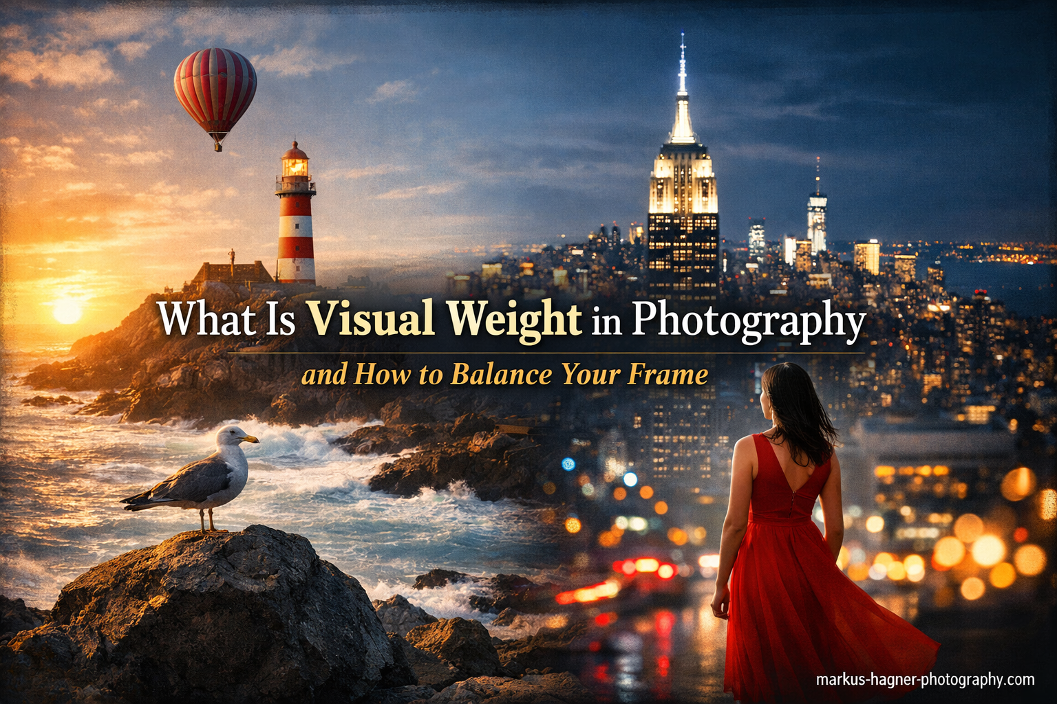
What Is Visual Weight in Photography?
Visual weight in photography is the perceived importance or visual impact that elements within an image have on the viewer. It’s not about physical size or actual weight, but rather how much attention different parts of your photograph demand.
Think of visual weight as a magnetic force that pulls the viewer’s eye. Some elements in your frame act like strong magnets, immediately grabbing attention, while others are weaker and receive less notice.
Visual weight differs from visual balance, though they’re closely related. Visual weight refers to individual elements’ pulling power, while visual balance describes how these weighted elements relate to each other across the frame. You can have elements with high visual weight, but if they’re positioned thoughtfully, they create balance rather than tension.
Understanding this concept helps you create intentional compositions. Instead of hoping the viewer looks where you want, you arrange elements to guide their attention precisely where it belongs.
What Is Visual Weight in Photography: Key Factors
Multiple factors influence how much visual weight an element carries. Let me break down the most important ones based on what I’ve learned through practice and study.
Size and Scale
Larger elements naturally carry more visual weight than smaller ones. A mountain dominates a scene more than a tree, and a tree commands more attention than a flower. This seems intuitive, but photographers often overlook how size affects perception.
However, placement matters too. A small element positioned centrally can compete with larger elements near the edges. The rule of thirds exists partly because it acknowledges this relationship between size and position in creating visual weight.
I’ve found that size alone isn’t enough. A massive empty sky might have less visual weight than a small, detailed building. Scale works in combination with other factors, which we’ll explore next.
Color and Brightness
Color dramatically affects visual weight. Warm colors like red, orange, and yellow generally carry more weight than cool colors like blue and green. This is why a small red flower can balance a large green field in your composition.
Brightness plays an equally important role. Light tones are visually heavier than dark tones. A bright white area draws the eye more strongly than a dark shadow area. This is why backlighting silhouettes work so well – the bright background pulls attention, making the dark subject stand out through contrast rather than brightness.
Saturation matters too. Highly saturated colors demand more attention than muted ones. A vivid red car will outweigh a pastel building of similar size.
Contrast and Sharpness
High-contrast objects carry more visual weight than low-contrast ones. This explains why a subject in bright sunlight stands out against a shadowed background. The difference between light and dark creates visual impact that pulls the eye.
Sharpness works similarly. Our eyes are naturally drawn to what we can see clearly. A sharp subject against a blurred background immediately attracts attention. This is why selective focus through wide apertures is such a powerful compositional tool.
I use this principle constantly in my work. By opening up my aperture to create shallow depth of field, I can make a small subject carry tremendous visual weight simply by keeping it sharp while blurring everything else.
Texture and Detail
Texture adds visual weight by creating complexity and interest. Rough, detailed surfaces attract more attention than smooth, simple ones. A weathered wooden door pulls the eye more than a smooth metal one of similar size.
Detail density matters too. Areas with intricate patterns or lots of small elements carry more weight than simple, uniform areas. This is why a field of wildflowers might compete with a mountain despite the massive size difference.
In my landscape work, I often use foreground texture to anchor the composition. A detailed rock formation in the foreground gives the image visual weight and depth, even when mountains dominate the background.
Isolation and Negative Space
Isolated elements gain visual weight through their solitude. When you surround an element with empty space, it stands out more clearly. This is why negative space is such a powerful compositional tool.
Think of a single tree in a snowy field or a lone boat on a vast lake. The isolation amplifies the subject’s importance, giving it visual weight far beyond its physical size.
I’ve learned that negative space isn’t empty – it’s an active compositional element that shapes how we perceive the main subject. Sometimes, what you don’t include matters as much as what you do.
Human Figures and Faces
Human figures carry tremendous visual weight. We’re hardwired to notice people, and a person in a photograph almost always becomes the focal point regardless of other elements. This is why including a human in a landscape immediately changes the composition’s dynamics.
Faces are particularly powerful. Eye contact multiplies this effect even further. A subject looking directly at the camera creates an immediate connection that’s nearly impossible for viewers to ignore.
I use this knowledge intentionally. Sometimes I want the human element to dominate the frame, while other times I position people so they balance rather than overpower other elements.
How to Balance Visual Weight in Your Frame
Now that we understand what creates visual weight, let’s explore how to balance these elements for compelling compositions.
Symmetrical vs Asymmetrical Balance
Symmetrical balance places elements with equal visual weight on opposite sides of the frame. Think of a reflection in still water or a face centered directly. This creates stability, calm, and formal order.
Asymmetrical balance uses elements with different visual weights positioned to create equilibrium. A large element on one side might balance multiple smaller elements on the other. This approach feels more dynamic and engaging.
Neither approach is inherently better. Symmetrical balance works well for formal portraits, architecture, and when you want to convey stability. Asymmetrical balance creates more interest and energy, making it ideal for most other situations.
Practical Balancing Techniques
One effective technique is using multiple lighter elements to balance a single heavy element. A large mountain on the right might balance against a group of trees and some foreground interest on the left.
Positioning matters too. Elements farther from the center gain visual weight. A small subject near the edge can balance a larger subject closer to the center. This is why off-center placement often feels more dynamic than centering everything.
Consider visual pathways through your image. Leading lines, directional light, and the gaze of subjects all create visual movement. Heavy elements should be positioned to work with these pathways rather than against them.
Practical Exercises to Train Your Eye
Understanding visual weight intellectually is different from seeing it intuitively. Here are exercises I’ve used to train my eye:
Exercise 1: The Squint Test
Look at a scene and squint until details blur. What stands out? The brightest, largest, most contrasty areas will remain visible. These are your heaviest visual elements. Practice identifying them before you even raise your camera.
Exercise 2: Subject Isolation
Find a subject and photograph it against different backgrounds. Notice how the same subject changes perceived weight when placed against dark vs light, simple vs complex backgrounds. This teaches you how context affects visual weight.
Exercise 3: Visual Weight Audit
Review your existing images. For each photo, identify the three heaviest visual elements. Trace how your eye moves through the image. Does it flow smoothly or get stuck? This helps you understand your current patterns and improve future compositions.
Common Mistakes to Avoid
Through trial and error, I’ve identified several mistakes that commonly plague photographers learning visual weight:
Overlooking the edges – Elements near frame edges carry disproportionate weight. Check your corners and edges for distracting elements that pull attention away from your main subject.
Ignoring background brightness – A bright background can steal attention from your subject. Watch for bright skies, light sources, or reflective surfaces behind your main subject.
Cluttering with equal-weight elements – When everything competes for attention, nothing wins. Too many elements with similar visual weight creates confusion rather than interest.
Forgetting about color temperature – Warm colors advance and appear heavier, while cool colors recede. Use this knowledge intentionally rather than accidentally.
Assuming size equals weight – Remember that small, sharp, bright, warm elements can outweigh large, blurry, dark, cool ones. Consider all factors, not just size.
Frequently Asked Questions
What is visual weight and balance in photography?
Visual weight refers to how strongly elements attract attention based on factors like size, color, brightness, contrast, and sharpness. Visual balance is the arrangement of these weighted elements to create harmony in the frame. Balance can be symmetrical (equal weight on both sides) or asymmetrical (different weights positioned to create equilibrium).
What is the difference between balance and visual weight?
Visual weight is the pulling power of individual elements – how much attention they demand from the viewer. Balance is the relationship between these weighted elements across your composition. Think of visual weight as the strength of individual magnets, while balance is how you arrange them so the image feels stable rather than lopsided.
Is it better to have high or low visual weight?
Neither is inherently better – it depends on your creative intent. High visual weight elements create strong focal points and grab attention immediately. Low visual weight elements support and recede. Effective compositions typically mix both, using high-weight elements as focal points and low-weight elements as supporting context. The key is intentional placement rather than absolute weight.
What are the factors that influence visual weight?
The primary factors include: 1) Size – larger elements carry more weight, 2) Color – warm and saturated colors are heavier than cool and muted ones, 3) Brightness – light tones are heavier than dark tones, 4) Contrast – high contrast areas draw more attention, 5) Sharpness – in-focus elements outweigh blurred ones, 6) Texture – detailed surfaces have more weight than smooth ones, 7) Isolation – isolated subjects gain weight through solitude, 8) Human presence – people and faces naturally command attention.
How can I practice visual weight composition?
Start with the squint test – squint at scenes to see which elements remain visible as the brightest, most prominent areas. Practice isolating subjects against different backgrounds to see how context changes perceived weight. Audit your existing images by identifying the three heaviest elements in each photo. Use intentional exercises like placing one small, bright, sharp element against a large, dark, blurry background to experience the balancing act firsthand.
Conclusion
Visual weight in photography is the invisible force that guides your viewer’s eye through your image. By understanding how size, color, brightness, contrast, sharpness, texture, and isolation affect perceived importance, you gain precise control over how your photographs are experienced.
Mastering visual weight isn’t about following rigid rules. It’s about developing an intuitive sense of how elements relate to each other within the frame. The more you practice identifying and balancing visual weight, the more naturally it will inform your compositions.
Remember that effective visual weight creates intentional viewing experiences. Every element in your frame either supports your vision or competes with it. Choose and position your elements with purpose, and your images will communicate with clarity and impact.
The next time you raise your camera, take a moment to assess the visual weight in your scene. Ask yourself which elements demand attention and whether they’re balanced to support your creative intent. This simple practice will transform your photography from snapshots to intentional, compelling compositions.