Have you ever spent hours perfecting a photograph on your computer, only to receive a print that looks nothing like what you saw on screen? The colors might be dull, the skin tones off, or the shadows completely blocked up. This frustrating experience is something I dealt with for years before understanding color management.
The culprit is usually a lack of proper ICC profiles. These small but powerful files act as translators between your devices, ensuring that the vibrant sunset you captured with your camera looks the same on your monitor as it does in your final print.
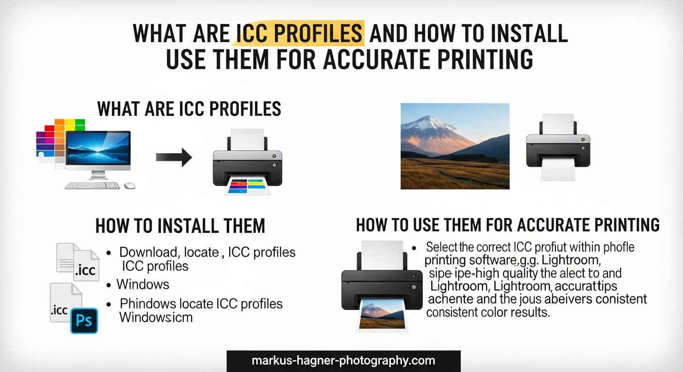
In this guide, I will explain exactly what ICC profiles are, why they matter for ICC profiles printing workflows, and walk you through installing and using them on both Windows and macOS. By the end, you will have everything you need to achieve accurate printing results in 2026.
What Are ICC Profiles?
An ICC profile is a standardized digital file that describes how a device captures, displays, or reproduces color. Created by the International Color Consortium, these profiles serve as a universal language that allows different devices to communicate color information accurately.
Think of an ICC profile as a color translator. Your camera sees color one way, your monitor displays it another, and your printer reproduces it differently still. Without profiles to bridge these gaps, each device would interpret the same color values differently, leading to unpredictable results.
How ICC Profiles Work
ICC profiles work by using a reference color space called the Profile Connection Space (PCS). This intermediate space uses either L*a*b* or XYZ color models, which can represent all colors visible to the human eye.
When you convert colors between devices, the process flows through this connection space. Your source profile (like Adobe RGB from your camera) translates color values into the PCS. Then the destination profile (like your printer’s CMYK space) translates from the PCS to the output device. This two-step translation ensures accurate color matching regardless of the source and destination color spaces.
The Profile Connection Space is essential because it provides a standardized reference point. Without it, converting directly from one device space to another would require a unique translation for every possible combination of devices. The PCS simplifies this by serving as a common intermediary.
Why Devices Interpret Color Differently
Every device has a unique color gamut, which is the range of colors it can capture, display, or print. A camera sensor captures color differently than a monitor displays it, and both differ from how a printer reproduces color with ink on paper.
Your monitor might be able to display bright, saturated blues that your printer simply cannot reproduce with its CMYK inks. Without an ICC profile, your software has no way of knowing this limitation and will send colors to the printer that fall outside its gamut, resulting in unexpected shifts and dull prints.
This difference in gamut is fundamental to understanding why color management matters. RGB devices like monitors use additive color (red, green, and blue light combine to create white). Printers use subtractive color (cyan, magenta, yellow, and black inks absorb light to create colors). These fundamentally different approaches mean direct translation is impossible without profiling.
The Role of ICC in Color Management
Color management is the system that controls color reproduction across devices, and ICC profiles are its foundation. A complete color management system uses input profiles for cameras and scanners, display profiles for monitors, and output profiles for printers.
When all three are properly configured, you can trust that the colors you see on screen will closely match what comes out of your printer. This consistency is essential for photographers, graphic designers, and anyone who needs accurate color reproduction in their work.
Modern operating systems include built-in color management support. Windows uses the Windows Color System (WCS), while macOS uses ColorSync. Both systems recognize ICC profiles and apply them automatically when properly configured applications request color-managed output.
Types of ICC Profiles
ICC profiles fall into three main categories based on their function in the color workflow. Understanding these types helps you choose the right profile for each stage of your process.
Input Profiles
Input profiles describe how capture devices like digital cameras and scanners record color. When you take a photo, your camera captures raw sensor data and converts it to a standard color space like sRGB or Adobe RGB.
Some advanced workflows use custom input profiles created specifically for a particular camera body and lens combination. These profiles account for the unique color response of that specific equipment, providing more accurate color from the moment of capture.
For most photographers, the built-in camera profiles or standard working spaces like Adobe RGB work well. The key is understanding which color space your camera uses and ensuring your editing software is set to match.
Scanner input profiles work similarly. A profiled scanner produces more accurate reproductions of printed photographs or artwork. Professional scanning services often create custom profiles for each scanner to ensure faithful color reproduction.
Display Profiles
Display profiles characterize how your monitor reproduces color. This is arguably the most critical profile type because every editing decision you make is based on what you see on screen.
A properly calibrated display profile ensures that the colors you see accurately represent the values in your image file. Without it, you might be adjusting colors that look wrong on your monitor but are actually correct in the file.
Creating a display profile requires a colorimeter or spectrophotometer that measures your monitor’s output and generates a profile specific to that display. I recommend recalibrating every few weeks for critical work, as monitors drift over time.
Wide-gamut monitors (often labeled as Adobe RGB or P3 capable) require particular attention to display profiles. Without proper profiling, these monitors can display oversaturated colors that look incorrect. A good display profile ensures the wide gamut is used appropriately without exaggerating colors.
Output Profiles
Output profiles describe how printers reproduce color on specific paper types. These profiles account for the printer’s ink set, the paper’s surface characteristics, and how the two interact.
This is where most printing problems occur. Each combination of printer model, ink type, and paper requires its own ICC profile. Using the wrong profile, or no profile at all, leads to color shifts and inaccurate prints.
Printer manufacturers provide generic profiles for their papers, but custom profiles created for your specific printer will always produce better results. The investment in a custom profile pays off quickly if you print regularly.
Different paper surfaces dramatically affect how ink is absorbed and how colors appear. Glossy papers produce vibrant, saturated colors with high contrast. Matte papers offer softer results with lower dynamic range. Fine art papers have unique textures that influence color reproduction. Each paper type needs its own profile.
Understanding Color Spaces: sRGB vs Adobe RGB vs ProPhoto RGB
Before diving into installation, you need to understand color spaces, also called working spaces. These device-independent spaces define the range of colors available for editing and storing your images.
What Is a Color Space?
A color space is a mathematical model that defines a specific range of colors. Think of it as a container that holds all the colors available for your image. Some containers are small (sRGB), some are medium-sized (Adobe RGB), and some are enormous (ProPhoto RGB).
The size of your color space affects how many colors you can capture and edit, but also influences how smoothly gradients transition. Larger spaces offer more colors but can show banding in 8-bit files.
Color spaces are typically visualized as three-dimensional shapes. The gamut of a color space determines which colors it can represent. Colors outside this gamut cannot be stored in that space without being mapped to the nearest in-gamut color.
sRGB Color Space
sRGB is the smallest of the three main working spaces, designed to match the color response of typical consumer monitors. It covers about 35% of the colors visible to the human eye.
This space is the default for most cameras and web browsers. If you share images primarily online or print at consumer labs, sRGB is a safe choice. Everything will display consistently across devices.
However, sRGB cannot contain many saturated colors that better printers can reproduce. If you shoot vibrant scenes and print on high-quality paper, sRGB may limit your results.
For web use, sRGB remains the standard. Most browsers and devices assume sRGB if no profile is embedded. Uploading images in other color spaces without conversion often results in flat, dull appearance on the web.
Adobe RGB Color Space
Adobe RGB is a medium-sized color space that covers about 50% of visible colors. It includes more saturated greens and cyans than sRGB, making it better for printing on wide-gamut printers.
This is my recommended working space for most photographers who print their work. It captures more color information without the overhead and potential issues of ProPhoto RGB.
The trade-off is that you must manage color carefully. Images in Adobe RGB will look dull if displayed on non-color-managed applications or uploaded to the web without conversion.
Adobe RGB was specifically designed for prepress workflows. It encompasses most colors that CMYK printers can reproduce, making it an excellent choice when print is your final output.
ProPhoto RGB Color Space
ProPhoto RGB is the largest commonly used working space, encompassing about 90% of visible colors plus some colors that no device can reproduce. It is essential for raw workflow and archival purposes.
Professional photographers working with raw files often use ProPhoto RGB to preserve maximum color information during editing. This gives the most flexibility for adjustments and future output.
The downside is that ProPhoto RGB requires 16-bit files to avoid banding, and you must convert to a smaller space for output. It is not a set-it-and-forget-it solution.
Because ProPhoto RGB includes imaginary colors (colors that exist mathematically but cannot be seen or reproduced), careful handling is required. Converting from ProPhoto RGB to smaller spaces needs appropriate rendering intents to maintain image quality.
Which Color Space Should You Choose?
For web-only work, sRGB is the practical choice. For printing, I recommend Adobe RGB as the best balance of color range and manageability. For raw workflows and maximum flexibility, ProPhoto RGB paired with 16-bit editing gives the best results.
Remember that your working space and ICC profiles are separate things. Your working space is where you edit, while ICC profiles translate between that space and your devices.
You can change working spaces during editing. Many photographers edit in ProPhoto RGB for maximum flexibility, then convert to Adobe RGB or sRGB for final output. The key is understanding what each conversion does to your colors.
How to Install ICC Profiles on Windows 11
Installing ICC profiles on Windows 11 is straightforward once you know where to look. Here are two methods you can use to get profiles onto your system and ready for use.
Method 1: Right-Click Install (Quickest)
Step 1: Download your ICC profile file. It will typically have a .icc or .icm file extension. Save it to a location you can easily find, like your Downloads folder or Desktop.
Step 2: Locate the downloaded file in File Explorer. It is usually in your Downloads folder unless you specified a different location.
Step 3: Right-click on the ICC profile file and select “Install profile” from the context menu. Windows recognizes these file types and offers this option automatically.
Step 4: Windows will copy the profile to the system color folder automatically. You may see a brief confirmation message, or it may complete silently depending on your settings.
Step 5: The profile is now available system-wide. Restart any open applications to ensure they recognize the new profile, as many programs only scan for profiles at startup.
Method 2: Color Management Settings (More Control)
Step 1: Press the Windows key and type “Color Management.” Click on “Color Management” in the search results to open the control panel.
Step 2: In the Color Management window, check the box that says “Use my settings for this device.” This allows you to add and manage profiles manually.
Step 3: Click the “Add…” button to open the Associate Color Profile window where you can browse for profile files.
Step 4: Click “Browse…” and navigate to your downloaded ICC profile file. Select it and click “Add” to include it in your available profiles.
Step 5: The profile will appear in your profiles list. Select it and click “Set as Default Profile” to make it active for the selected device.
Step 6: Close Color Management. Your profile is now installed and active for the device you selected.
Where Windows Stores ICC Profiles
Windows stores ICC profiles in a system folder. The default location is C:WindowsSystem32spooldriverscolor. You can navigate here directly if you need to manually copy or delete profiles.
If you cannot find a profile after installation, check this folder. Sometimes profiles with special characters in the filename cause installation issues. Files must have proper permissions to be installed in this protected location.
For user-specific profiles that do not require administrator access, Windows also supports profiles in user directories. However, the system color folder is the standard location for printer and display profiles.
Verifying Your Installation on Windows
After installation, verify the profile is working correctly. Open Color Management again and check that your profile appears in the list associated with the correct device.
You can also open an image in a color-managed application like Photoshop and check that the profile appears in the color settings or print dialog. If the profile does not appear, try restarting the application or your computer.
Another verification method is to check the profile properties. Right-click the profile file before installation and select Properties. The Details tab should show information about the profile including its creation date, device class, and color space.
How to Install ICC Profiles on macOS
macOS makes ICC profile installation simple with its built-in ColorSync technology. Here are the steps for macOS Sonoma, Ventura, and earlier versions.
Method 1: Double-Click Install (Easiest)
Step 1: Download your ICC profile file. It will have a .icc extension. Safari and other browsers typically save downloads to your Downloads folder.
Step 2: Locate the file in Finder, usually in your Downloads folder. You can click the Downloads icon in the Dock or navigate to the folder directly.
Step 3: Double-click the ICC profile file. ColorSync Utility will open automatically and display information about the profile.
Step 4: You will see a prompt asking to install the profile. Click “Install” to copy it to your user profile folder.
Step 5: The profile is copied to your user profile folder and is immediately available to applications.
Step 6: Close ColorSync Utility. The profile is now ready to use in any color-managed application.
Method 2: Manual Copy to Profiles Folder
Step 1: In Finder, press Shift+Command+G to open the “Go to Folder” dialog. This keyboard shortcut works from anywhere in Finder.
Step 2: Type ~/Library/ColorSync/Profiles/ and press Enter. This opens your user profiles folder where personal profiles are stored.
Step 3: Drag your ICC profile file into this folder. You may need to authenticate with your password if the system requests it.
Step 4: The profile is now installed and available to all applications running under your user account.
Step 5: For system-wide installation available to all users, copy the profile to /Library/ColorSync/Profiles/ instead. This requires administrator authentication.
Where macOS Stores ICC Profiles
macOS has multiple profile locations for different purposes. User profiles go in ~/Library/ColorSync/Profiles/ and are available only to your account. System profiles go in /Library/ColorSync/Profiles/ and are available to all users.
The system also has built-in profiles in /System/Library/ColorSync/Profiles/, but you should not modify these. macOS uses these profiles for system displays and printers. Use the user or library locations for your custom profiles.
ColorSync automatically scans all these locations when applications request available profiles. You do not need to register profiles manually after placing them in the correct folder.
Verifying Your Installation on macOS
Open ColorSync Utility from your Applications > Utilities folder. Click on the “Profiles” tab in the toolbar to see all installed profiles organized by category.
Your newly installed profile should appear in the list, typically under the appropriate category (Display, Output, or Input). Click on it to view details and confirm it loaded correctly. ColorSync Utility will display warning icons if a profile has problems.
You can also check in System Settings > Displays on newer versions of macOS. Some versions allow you to select display profiles directly from this menu, showing all available profiles for your current display.
How to Use ICC Profiles for Accurate Printing
Installing profiles is only the first step. Using them correctly in your printing workflow is where you achieve accurate color results that match your screen.
Setting Up ICC Profiles in Photoshop
Photoshop has robust color management built in. Here is how to configure it for printing with ICC profiles.
Step 1: Open your image in Photoshop. Go to Edit > Color Settings to verify your working space is set appropriately for your workflow.
Step 2: For most printing work, select “North America Prepress 2” from the Settings dropdown, or customize with Adobe RGB as your RGB working space. This ensures consistent color handling.
Step 3: When ready to print, go to File > Print. In the print dialog, look for the Color Management section on the right side of the window.
Step 4: Select “Photoshop Manages Colors” from the Color Handling dropdown. This tells Photoshop to perform the color conversion using your selected ICC profile.
Step 5: In the Printer Profile dropdown, select the ICC profile that matches your printer and paper combination. This is crucial for accurate output and is the profile you installed earlier.
Step 6: Make sure “Normal Printing” is selected and that you have disabled color management in your printer driver settings. Having both Photoshop and the printer driver managing colors causes double profiling and wrong results.
Step 7: Click Print to send the file with proper color management to your printer. The printer driver will receive already-converted color values.
Setting Up ICC Profiles in Lightroom
Lightroom Classic handles color management differently than Photoshop. The print module has specific settings for ICC profiles.
Step 1: Select the image you want to print and switch to the Print module by clicking “Print” in the top right or pressing Command+P (Mac) or Control+P (Windows).
Step 2: In the right panel, scroll down to the “Print Job” section near the bottom.
Step 3: Set “Print to” to your printer (not JPEG file). This ensures actual printing rather than exporting a file.
Step 4: Under Color Management, select “Profile” from the dropdown menu rather than “Managed by Printer.”
Step 5: Choose your printer and paper ICC profile from the Profile dropdown. Lightroom will list all installed profiles alphabetically.
Step 6: Set your rendering intent. For most photographs, “Perceptual” or “Relative” works well. The choice affects how out-of-gamut colors are handled.
Step 7: Make sure the printer driver is set to “Off (No Color Adjustment)” or similar, so only Lightroom manages color conversion.
Step 8: Click “Print One” or “Print” to output your image with proper color management applied.
Understanding Soft Proofing
Soft proofing lets you preview how your image will look when printed, right on your calibrated monitor. This powerful feature saves paper and ink by catching problems before you print.
In Photoshop, go to View > Proof Setup > Custom. Select your printer profile and choose a rendering intent. Check “Simulate Black Ink” and “Simulate Paper Color” for the most accurate preview of the printed result.
In Lightroom, enable soft proofing by pressing “S” or clicking the soft proofing button below the image. The background will change to white, simulating paper, and you can toggle the printer profile preview on and off.
Pay attention to colors that shift or become dull when soft proofing is enabled. These are colors outside your printer’s gamut. You can adjust these areas before printing for better results. The goal is not to eliminate all shifts, but to understand and compensate for them.
Soft proofing is especially valuable for images with highly saturated colors. Blues and purples often shift noticeably when printed. Seeing this preview allows you to make targeted adjustments rather than discovering problems in the final print.
Choosing the Right Rendering Intent
Rendering intent determines how colors outside the destination gamut are handled. There are four options defined by the ICC specification, but two are most relevant for photography.
Perceptual rendering compresses all colors to fit within the destination gamut while preserving the relationship between colors. This is ideal for images with many out-of-gamut colors, as it maintains smooth transitions but may slightly shift all colors. The entire tonal range is adjusted to maintain relative differences.
Relative Colorimetric maps in-gamut colors exactly and clips out-of-gamut colors to the nearest reproducible value. This preserves accuracy for colors the printer can reproduce but may cause banding where colors are clipped. It is the default for most color conversions.
Absolute Colorimetric works like Relative but also adjusts the white point to match the destination. This is primarily used for proofing and rarely for final output in photography.
Saturation prioritizes vivid colors over accuracy, typically used for business graphics rather than photographs.
For most photographs with saturated colors, Perceptual works well. For images with subtle skin tones and mostly in-gamut colors, Relative Colorimetric may give more accurate results. Try both and compare soft proofs to decide.
The Importance of Monitor Calibration
All your ICC profile work is useless if your monitor is not calibrated. You cannot make accurate editing decisions if you do not know whether the colors you see are correct.
Use a hardware colorimeter like the X-Rite i1Display or Datacolor Spyder to calibrate your monitor. These devices measure your display’s output and create a profile that corrects any color errors, ensuring what you see matches the actual values in your file.
Calibrate to D65 white point (6500K) and a gamma of 2.2 for most printing work. Aim for a luminance of 80-120 cd/m2, which is bright enough to see detail but not so bright that it fatigues your eyes or skews your perception of print brightness.
Recurring calibration is essential. Monitors drift over time, so calibrate every two to four weeks for critical work, or monthly for general use. Many calibration tools can remind you when recalibration is due.
Wide-gamut monitors deserve special attention. Their expanded color range is valuable for editing, but only when properly calibrated. An uncalibrated wide-gamut display shows oversaturated colors that will not match your prints.
Using Paper-Specific ICC Profiles
Different papers interact with ink differently. A glossy photo paper produces different colors than a matte fine art paper, even with the same printer and inks.
Always use the ICC profile specific to your paper. Printer manufacturers provide profiles for their branded papers. Third-party paper makers like Hahnemuhle, Canson, and Red River also provide profiles for popular printers on their websites.
For the best results, invest in custom profiles. These are created using your actual printer, measuring test prints with a spectrophotometer. Custom profiles account for variations between individual printers and deliver superior accuracy compared to generic profiles.
When downloading profiles from paper manufacturers, be sure to select the exact printer model. Even similar models within the same product line may have different color characteristics requiring different profiles.
Common ICC Profile Problems and How to Fix Them
Even with proper installation, ICC profiles can cause headaches. Here are the most common problems I have encountered and their solutions based on real user experiences from photography forums.
ICC Profile Not Appearing in Software
You installed a profile, but it does not show up in Photoshop, Lightroom, or your printer driver. This is one of the most frustrating issues photographers face.
First, restart the application. Many programs only scan for profiles at startup. Closing and reopening the application forces it to refresh its profile list.
If that does not work, restart your computer to refresh the system profile cache. Windows and macOS both cache profile information, and sometimes this cache becomes stale.
Check that the profile is in the correct folder. On Windows, verify it is in C:WindowsSystem32spooldriverscolor. On macOS, check ~/Library/ColorSync/Profiles/ or /Library/ColorSync/Profiles/.
Profile names with special characters like slashes, quotes, or punctuation can cause issues. Rename the file using only letters, numbers, spaces, and underscores, then reinstall.
Colors Missing When Using ICC Profiles
Sometimes enabling a printer ICC profile causes entire color channels to disappear. Your print might lack magenta entirely, or blues might turn purple or green.
This usually happens when both the application and the printer driver are managing color. Double profiling causes extreme shifts. Make sure color management is disabled in your printer driver when using application-managed color.
Also verify you are using the correct profile for your paper. Using a glossy paper profile with matte paper, or vice versa, will produce wildly incorrect results because the profile expects different ink absorption characteristics.
Some printers have multiple black ink modes (photo black vs matte black). Using the wrong black ink with a profile designed for the other mode will cause color problems. Check your printer manual for how to switch black ink modes.
Invalid ICC Profile Errors
If you receive an error that an ICC profile is invalid or corrupt, the file may be damaged or have compatibility issues with your software version.
Download the profile again from the source. File corruption can occur during download, especially with slow or unstable connections. Compare the file size to what the source specifies.
Also check that the profile was created for your operating system. Some older profiles have compatibility issues with newer OS versions. Contact the profile provider if problems persist.
The profile format itself might be the issue. Profiles should be version 2 or version 4 ICC format. Very old profiles in deprecated formats may not work with current software. ColorSync Utility on Mac can validate profile format.
How to Verify Your ICC Profile Is Working
You installed a profile and selected it, but how do you know it is actually being applied to your output?
Print a test image with known colors, like a color checker chart or a reference photo you know well. Compare the print to the on-screen version with soft proofing enabled. The colors should match closely when viewed under appropriate lighting.
You can also print the same image twice, once with the ICC profile and once with printer color management disabled entirely. The difference should be obvious if the profile is working correctly.
On Windows, open Color Management and verify the profile is set as default for your printer. On macOS, use ColorSync Utility to inspect the profile and confirm it loads without errors. Both tools show detailed profile information.
Another verification method is to check the print dialog. When you select a printer profile in Photoshop or Lightroom, the application should display the profile name without errors. If the profile name is grayed out or shows an error, something is wrong.
Profile Naming Conventions
Proper naming prevents many installation issues. Use only alphanumeric characters, spaces, and underscores in profile names.
Avoid slashes, colons, quotes, and other punctuation that operating systems interpret as special characters. A name like “Epson_P900_Premium_Glossy.icc” works fine, but “Epson/P900 Premium Glossy” will cause problems on most systems.
Include the printer model, paper type, and possibly the date in your profile names. This helps you identify the correct profile quickly when printing. A good naming convention might be: PrinterModel_PaperType_YYYYMMDD.icc
Keep profile names reasonably short while still being descriptive. Extremely long names can cause problems in some applications, particularly older software with filename length limitations.
Frequently Asked Questions About ICC Profiles
How to use ICC profile for printing?
To use an ICC profile for printing, first install the profile on your operating system. Then, in your printing software (like Photoshop or Lightroom), select the ICC profile that matches your specific printer and paper combination from the printer profile dropdown. Make sure color management in your printer driver is disabled so only the application manages colors. This ensures the profile correctly translates colors from your working space to your printer’s output.
How do I know what ICC profile to use?
Choose the ICC profile that matches your exact printer model and the specific paper you are printing on. Printer manufacturers provide profiles for their branded papers, and third-party paper makers offer profiles for popular printers. The profile name typically includes the printer model and paper type. For best results, use custom profiles created specifically for your individual printer, as each printer has slight variations in color output.
How to properly install an ICC profile?
On Windows 11, right-click the ICC file and select Install Profile, or use Color Management settings to add the profile manually. On macOS, double-click the ICC file and ColorSync Utility will prompt you to install it. After installation, restart any open applications so they recognize the new profile. Verify installation by checking Color Management (Windows) or ColorSync Utility (macOS) to confirm the profile appears in the list.
Which ICC profile for print?
For printing, use the output profile that matches your printer model and paper type. If you shoot in sRGB for consumer lab printing, sRGB works fine. For professional printing, work in Adobe RGB or ProPhoto RGB, then convert to the specific printer profile at output. The printer profile translates your working space colors to the printer’s CMYK ink values. Never use display profiles or input profiles for printing output.
Conclusion
ICC profiles are the foundation of accurate color printing. These small files translate color information between your camera, monitor, and printer, ensuring that what you see on screen matches what appears on paper.
Understanding ICC profiles and how to install and use them for accurate printing transforms frustrating print mismatches into predictable, professional results. Install profiles correctly on your operating system, select the right profile for your printer and paper combination, and use soft proofing to preview output before committing ink to paper.
Remember that monitor calibration is essential to this workflow. Without a calibrated display, you cannot make accurate editing decisions. Combine regular calibration with proper ICC profile usage, and your prints will finally match your vision.
Start with the manufacturer profiles for your printer and paper. As you gain experience, consider investing in custom profiles for even better accuracy. The improvement in your prints will be immediately visible and well worth the effort for any photographer serious about their output quality.