Colors speak louder than words in photography. When I first started shooting seriously, my images looked flat and lifeless. Everything changed once I understood color contrast. Suddenly, my photos had impact, energy, and that “wow” factor I’d been chasing. Learning how to use color contrast to create more striking photographs transformed my work from snapshots to compelling visual stories.
In this guide, I’ll share everything I’ve learned about color contrast photography over years of shooting and experimenting. You’ll discover practical techniques you can apply today, backed by real examples and clear explanations. Whether you shoot landscapes, portraits, or street photography, these color contrast techniques will help you create images that stop viewers in their tracks.
Understanding Color Contrast in Photography
Color contrast happens when opposing colors appear together in an image. Think of a red autumn leaf against green foliage, or golden hour sunlight painting blue mountains in warm orange. These color combinations create visual tension that draws the eye and holds attention.
The farther apart two colors sit on the color wheel, the stronger their contrast. This principle is the foundation of color theory for photography. When you place complementary colors (opposites on the wheel) next to each other, both colors appear more vibrant and intense than they would alone.
Why Color Contrast Creates Striking Photographs
Our brains are wired to notice differences. When we see contrasting colors, our visual system pays attention. This biological response makes color contrast one of the most powerful compositional tools available to photographers.
Strong color contrast does several things for your images. It separates your subject from the background, creating clear visual hierarchy. It adds depth and dimension to flat scenes. Most importantly, it creates emotional impact that resonates with viewers on a subconscious level.
The Psychology of Contrasting Colors
Different color combinations evoke different emotional responses. Blue and orange feel cinematic and dramatic. Red and green suggest energy and tension. Yellow and purple create a sense of playfulness or luxury. Understanding these associations helps you choose color combinations that support your creative vision.
Warm colors (reds, oranges, yellows) tend to advance toward the viewer, while cool colors (blues, greens, purples) recede. This perceptual effect means warm-cool contrast adds natural depth to your compositions without any special techniques.
The Color Wheel and Complementary Colors
The color wheel is your roadmap for finding contrasting color pairs. Sir Isaac Newton developed the first color wheel in 1666, and photographers have been using it ever since to create harmonious and contrasting color schemes.
How the Color Wheel Works
Imagine a circle with red at the top, then moving clockwise through yellow-orange, yellow, yellow-green, green, blue-green, blue, blue-purple, purple, and red-purple back to red. Colors directly across from each other are complementary pairs with maximum contrast.
The three primary complementary pairs every photographer should know are red-green, blue-orange, and yellow-purple. These combinations create the strongest possible color contrast and appear frequently in nature and urban environments.
Complementary Color Pairs in Practice
Red and Green: This pairing appears everywhere from Christmas scenes to nature photography. A red flower against green leaves is a classic example. Be careful with saturation, as this combination can feel overwhelming if pushed too far.
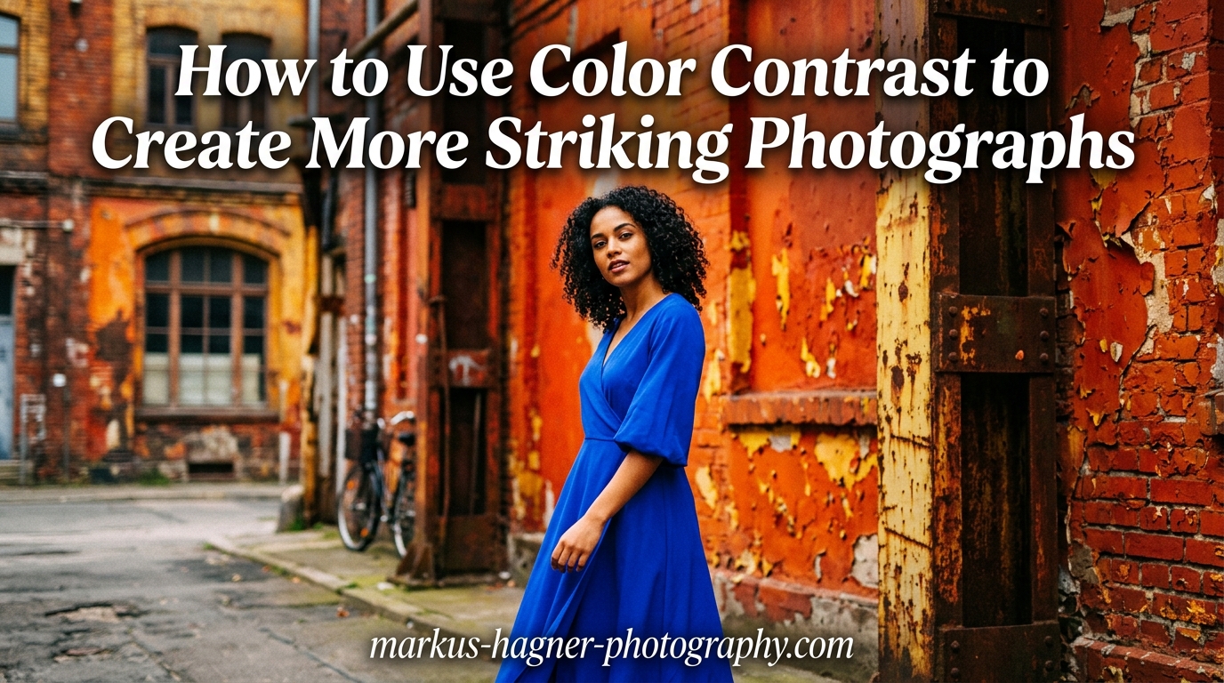
Blue and Orange: The most popular combination in cinema and commercial photography. Blue sky with orange sunset light, blue water with orange cliff faces, or blue shadows with warm highlights all use this powerful pairing.
Yellow and Purple: Less common but striking when you find it. Yellow flowers against purple blooms, or golden light on lavender fields create memorable images.
Beyond Complementary: Other Color Harmony Schemes
While complementary colors create the strongest contrast, other schemes offer different effects. Analogous colors (neighbors on the wheel) create subtle, harmonious images. Triadic schemes (three equally spaced colors) offer balanced energy. Split-complementary pairs one color with the two neighbors of its complement for slightly softer contrast.
How to Use Color Contrast in Photography: 7 Proven Techniques
Now let’s get practical. Here are seven techniques I use regularly to incorporate color contrast into my photography. Each approach works across different genres and skill levels.
1. Subject vs Environment Contrast
The most direct way to use color contrast is positioning a colorful subject against a contrasting background. A person in a red jacket walking through a blue-toned cityscape immediately draws attention. This technique works because our eyes naturally gravitate toward areas of maximum contrast.
Look for subjects that naturally contrast with their surroundings. A yellow raincoat on a gray, rainy day. A blue umbrella against orange brick walls. Train your eye to spot these opportunities by consciously scanning for color pairs during your shoots.
2. Complementary Color Compositions
Actively seek out or create compositions using complementary pairs. In landscape photography, blue hour meeting city lights creates natural blue-orange contrast. Portrait photographers can use colored gels on lights to paint backgrounds with complementary colors to clothing or props.
I once photographed a dancer in a blue dress against an orange sunset. The color contrast was so strong that minimal post-processing was needed. The image won a local competition because the colors did the heavy lifting.
3. Warm and Cool Tone Balance
Not all color contrast needs to be between specific hues. The contrast between warm and cool tones creates equally powerful images. This approach works particularly well in landscape and architectural photography.
Golden hour photography excels at warm-cool contrast. The warm sunlight illuminates one side of your subject while blue sky fills shadows on the other. This natural color split adds dimension and visual interest without requiring any special equipment or techniques.
4. Neutral Background Technique
Sometimes the best way to highlight color contrast is eliminating competing colors entirely. A neutral gray, white, or black background lets your subject’s colors pop without distraction. This technique works beautifully for product photography, portraits, and still life work.
Even in nature photography, you can seek out neutral backgrounds. Overcast skies, stone walls, or shadow areas provide clean canvases for colorful subjects to shine against.
5. Limited Color Palette Approach
Paradoxically, limiting your color palette often creates stronger color contrast than including many hues. When you restrict an image to two or three main colors, each one has more visual weight and impact.
Before pressing the shutter, identify the dominant colors in your scene. Ask yourself which ones support your vision and which distract. Then compose and expose to emphasize the colors that matter while minimizing or eliminating others.
6. White Balance as a Creative Tool
Most photographers use white balance to achieve “correct” color. But deliberately choosing non-neutral white balance creates intentional color contrast. Shifting white balance cooler in post-processing while keeping warm-toned subjects creates separation and mood.
I often shoot with slightly warmer white balance during blue hour. This exaggerates the natural warm-cool contrast between artificial lights and the deep blue sky, creating more dramatic results than “accurate” white balance would produce.
7. Seasonal Color Contrast Opportunities
Each season offers unique color contrast possibilities. Spring brings pink blossoms against new green foliage. Summer offers vibrant flowers against blue skies. Autumn delivers red and orange leaves against evergreen backgrounds. Winter provides white snow making any colorful subject pop dramatically.
Plan shoots around seasonal color opportunities. Scout locations in advance and return when conditions align. A red barn that looks ordinary in summer becomes extraordinary surrounded by white snow.
Camera Settings for Capturing Accurate Colors
Getting color right in-camera saves hours of post-processing and produces better final results. Here are the settings I recommend for capturing color contrast accurately.
White Balance Settings
Shoot in RAW format and use custom white balance when accuracy matters. The auto white balance on most cameras does well, but can be fooled by dominant colors in scenes. For critical work, use a gray card or white balance target to establish a neutral baseline.
Remember that you can always warm up or cool down images in post-processing when shooting RAW. Starting with neutral white balance gives you maximum flexibility later.
Picture Style and Profile Adjustments
Most cameras offer picture styles or profiles that affect color saturation and contrast. For color contrast work, I prefer neutral or flat profiles. These preserve maximum color information and dynamic range, giving more flexibility for targeted color adjustments later.
Avoid vivid or saturated picture styles if you shoot JPEG. These baked-in adjustments cannot be undone and often push colors into unrealistic territory.
RAW vs JPEG for Color Control
RAW files contain significantly more color information than JPEGs. This matters enormously for color contrast work because RAW gives you the latitude to selectively enhance colors without degrading image quality.
If you must shoot JPEG, use the highest quality setting and be conservative with in-camera color adjustments. You’ll have less room for enhancement in post.
Enhancing Color Contrast in Post-Processing
Post-processing is where good color contrast becomes great. The key is enhancement without crossing into artificial-looking territory. Here’s my approach to color contrast in editing.
Color Grading Basics
Color grading tools in Lightroom, Capture One, and similar programs let you add color tints to shadows, midtones, and highlights independently. Adding complementary colors to different tonal ranges creates subtle but effective color contrast.
Try adding blue to shadows and orange to highlights. This mimics natural warm-cool contrast and works on almost any image. Keep the adjustments subtle, usually under 10 points of saturation.
Selective Color Adjustments
Targeted color adjustments let you enhance specific hues without affecting others. In landscape images, I often boost blue saturation in skies while warming foreground elements. This increases color contrast while maintaining natural appearance.
The HSL (Hue, Saturation, Luminance) panel in most editors is your best friend for selective color work. Adjust hue to shift colors toward their complementary partners, saturation to increase intensity, and luminance to control brightness.
Avoiding Common Editing Mistakes
The biggest mistake photographers make with color contrast is overdoing it. Oversaturated colors look artificial and fatiguing to view. A good rule of thumb: make your adjustments, then dial them back by 20-30%.
Watch skin tones carefully when increasing color contrast. Orange and teal looks great on landscapes but can make people look sickly. Use adjustment brushes to protect skin tones from aggressive color shifts.
Common Color Contrast Mistakes to Avoid
Through years of teaching photography, I’ve seen the same color contrast mistakes repeatedly. Here’s what to watch out for in your own work.
Over-saturating colors: Vibrant doesn’t mean better. Oversaturated images look artificial and lose subtlety. Enhance colors enough to support your vision, then stop.
Ignoring skin tones: High contrast color grading that works for landscapes often ruins portraits. Always check how your color adjustments affect human subjects.
Too many competing colors: Strong color contrast requires restraint. When every color screams for attention, none wins. Choose your palette and edit out competing hues.
Harsh contrast without purpose: Color contrast should serve your story, not exist for its own sake. Ask yourself what emotion you want to evoke, then choose color approaches that support that goal.
Frequently Asked Questions
How to use color contrast in photography?
To use color contrast in photography, identify complementary colors (opposites on the color wheel like blue-orange or red-green), position contrasting colors next to each other in your composition, use warm-cool tone separation for depth, and enhance color separation in post-processing through targeted HSL adjustments. Start by training your eye to spot natural color contrasts in your environment, then actively compose to emphasize these pairings.
What is the 60 30 10 rule in photography?
The 60-30-10 rule in photography suggests dividing your image’s color palette into three parts: 60% dominant color (usually a neutral or background tone), 30% secondary color (supporting the subject), and 10% accent color (for visual interest and contrast). This ratio creates balanced, visually pleasing compositions with intentional color contrast.
What is the 20-60-20 rule in photography?
The 20-60-20 rule divides your image into three tonal zones: 20% highlights, 60% midtones, and 20% shadows. This balance creates images with good contrast and detail throughout the tonal range. For color contrast work, this principle ensures your contrasting colors have room to breathe within a well-exposed image.
What is the 3/4 rule in photography?
The 3/4 rule in photography refers to lighting angles where light hits your subject at approximately 45 degrees (three-quarters of the way between front and side lighting). This angle creates natural dimension and reveals texture. For color contrast, this lighting pattern often produces warm highlights and cool shadows, creating natural color separation.
Start Creating More Striking Photographs Today
Color contrast is one of those skills that transforms your photography immediately once you understand it. You’ll start seeing complementary color pairs everywhere, from city streets to mountain vistas. The techniques in this guide give you practical tools to create more striking photographs with intentional, impactful color.
Start simple. Pick one technique from this article and practice it on your next shoot. Train your eye by identifying color contrasts in everyday scenes. Before long, incorporating color contrast will become second nature, and your images will have that visual impact you’ve been seeking.
Remember: great color contrast isn’t about having the most vibrant colors or the highest saturation. It’s about thoughtful color choices that serve your creative vision. Use these techniques as starting points, then develop your own color signature that makes your photographs uniquely yours.