I have spent years perfecting cinematic color grading techniques for portraits, and I can tell you that the transformation from a flat, lifeless image to a dramatic, film-like masterpiece happens in the color grading stage. When I first started experimenting with color grading in Lightroom and Photoshop, I struggled with over-saturated skin tones and muddy shadows. But after testing dozens of workflows and analyzing hundreds of cinematic portraits, I developed a reliable system that works for any portrait style.
In this guide, I will walk you through exactly how to create a cinematic color grade for portraits using both Lightroom and Photoshop. You will learn the difference between color correction and color grading, discover which tool works best for your workflow, and master techniques like the teal and orange look while keeping skin tones natural. By the end, you will have a complete framework for achieving that professional, movie-like aesthetic in your portrait photography.
What Is Cinematic Color Grading for Portraits?
Cinematic color grading is the post-production process of manipulating colors in your portraits to create a specific mood or atmosphere similar to what you see in films. Unlike basic color correction, which fixes technical issues, color grading is a creative decision that transforms the emotional impact of your image.
When I grade portraits cinematically, I am not just making colors look nice. I am telling a story through color. A cold blue tint might suggest isolation or melancholy. Warm golden tones could evoke nostalgia or romance. The goal is to make viewers feel something before they even analyze the composition.
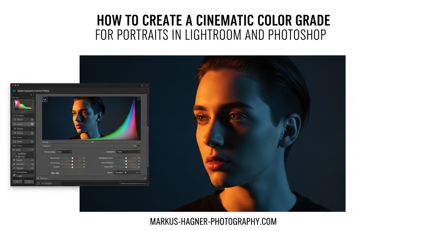
Most cinematic portraits share common characteristics: controlled contrast, muted highlights, rich shadows, and intentional color casts in specific tonal ranges. The famous teal and orange look works so well because skin tones naturally fall in the orange range, while complementary teal in shadows creates visual depth and separation.
Color Correction vs Color Grading: Understanding the Difference
Many photographers confuse these two processes, but understanding the distinction transformed my editing workflow. Color correction comes first and fixes technical problems: incorrect white balance, exposure issues, and color casts from mixed lighting. Think of it as making your image technically accurate.
Color grading happens after correction and adds creative intent. This is where you push colors in artistic directions that might not be realistic but serve your vision. You might add blue to shadows even though the original scene had neutral shadows. You might warm up highlights to create a golden hour feeling from a midday shot.
I always complete color correction before touching color grading tools. If you skip this step, you end up building creative decisions on top of technical problems, which creates messy results that are hard to replicate or adjust later.
Preparing Your Portrait for Color Grading
Before diving into the Color Grading panel or Camera Raw filter, you need a properly prepared image. I have tested this workflow on hundreds of portraits, and skipping these preparation steps always leads to frustration later.
Start with RAW Files
RAW files contain significantly more color information than JPEGs, giving you flexibility to push colors without banding or artifacts. When I grade JPEGs, I always hit limitations in the shadow and highlight regions. RAW files let me make dramatic shifts while maintaining smooth gradients.
Correct White Balance First
Use the White Balance Selector tool to click on a neutral gray or white area in your image. If no neutral reference exists, adjust Temperature and Tint sliders until skin tones look natural. I typically aim for skin tones in the 5-15 range on the Magenta/Green tint axis.
Set Basic Exposure and Contrast
Adjust Exposure so your midtones fall around 50% brightness. Set highlights and shadows to recover detail without crushing blacks or blowing whites. Add moderate Contrast after these adjustments. I usually keep Contrast between +10 and +25 for portraits destined for cinematic grading.
Check Your Histogram
Ensure your histogram shows data across the full tonal range without clipping on either end. A well-exposed portrait with balanced tonal distribution responds much better to color grading than an image with crushed shadows or blown highlights.
How to Create a Cinematic Color Grade for Portraits in Lightroom
Lightroom’s Color Grading panel replaced the old Split Toning panel and offers significantly more control. I use this workflow for about 70% of my cinematic portraits because it is fast, intuitive, and produces excellent results.
Understanding the Color Grading Panel
The Color Grading panel contains three color wheels: Shadows, Midtones, and Highlights. Each wheel lets you add a specific color to that tonal range. A fourth wheel, Global, affects the entire image. The key insight is that these adjustments are additive and cumulative.
Each wheel has three controls: the color itself (determined by where you drag the point on the wheel), saturation (how far from center you drag), and luminance (the slider below each wheel). The Blending slider controls how smoothly the three tonal ranges transition into each other.
Step-by-Step Lightroom Cinematic Grading Workflow
Step 1: Open the Color Grading Panel
Navigate to the Develop module and scroll down to the Color Grading panel. If you are using an older version of Lightroom, look for Split Toning instead, though I highly recommend updating to access the more powerful Color Grading tools.
Step 2: Add Color to Shadows
Start with the Shadows wheel. For a classic cinematic look, drag toward teal or blue. I typically aim for a hue around 200-210 degrees with saturation between 15-30. The exact values depend on your image, but these are reliable starting points.
Step 3: Add Complementary Color to Highlights
Move to the Highlights wheel and drag toward a warm tone. Orange or gold works beautifully for portraits because it enhances skin tones. Keep saturation subtle, around 10-25. The goal is complementing the shadow color, not overpowering the image.
Step 4: Fine-tune Midtones
The Midtones wheel requires a light touch. I often add a small amount of color that bridges the gap between shadows and highlights. Alternatively, leave midtones neutral if your shadows and highlights adjustments are creating the look you want.
Step 5: Adjust Blending and Balance
The Blending slider controls how smoothly the three tonal ranges transition. Higher values create smoother blends, while lower values create more distinct color separation. The Balance slider shifts the dividing point between shadows and highlights. I usually work with Blending around 50-60 and adjust Balance based on where I want the color transition to occur.
Preserving Skin Tones in Lightroom
The biggest challenge with cinematic grading is keeping skin tones natural. When you add teal to shadows and orange to highlights, skin can quickly look unnatural. I use two techniques to solve this.
First, I keep highlight saturation conservative. Skin tones often fall in the highlight and midtone range, so aggressive color in these wheels directly affects faces. Second, I use the HSL panel to protect skin tones. Navigate to the Hue tab and adjust Orange and Red sliders slightly to counter any unwanted color shifts in skin.
How to Create a Cinematic Color Grade for Portraits in Photoshop
Photoshop offers multiple approaches to color grading, and I often combine several techniques in a single edit. The flexibility of layers and masks makes Photoshop ideal for complex portraits where I want selective control over different image areas.
Method 1: Camera Raw Filter
The Camera Raw filter provides the same Color Grading panel as Lightroom but works on any layer in Photoshop. I use this when I want Lightroom-style grading with the option to mask specific areas.
To access it, go to Filter > Camera Raw Filter (or press Ctrl+Shift+A / Cmd+Shift+A). Navigate to the Color Grading panel using the icon that looks like three overlapping circles. Apply the same shadow, midtone, and highlight adjustments described in the Lightroom section.
The advantage of using Camera Raw in Photoshop is that you can apply it to a duplicate layer and add a layer mask. This lets you paint the color grading effect onto specific areas while protecting others. I use this technique to add heavy grading to backgrounds while keeping faces more neutral.
Method 2: Gradient Maps
Gradient maps offer precise control over color mapping across tonal ranges. This technique creates some of the most film-like results I have achieved.
Step 1: Create a Gradient Map Adjustment Layer
Click the adjustment layer icon at the bottom of the Layers panel and select Gradient Map. This initially maps your image to a black-to-white gradient.
Step 2: Edit the Gradient
Click the gradient preview to open the Gradient Editor. For cinematic looks, I create custom gradients with three to five color stops. A teal-to-orange gradient might have deep teal in the shadows (left), a muted teal-gray in the lower midtones, a neutral tone in the midtones, warm orange in highlights, and a subtle cream in the brightest areas.
Step 3: Adjust Blend Mode and Opacity
Change the layer blend mode from Normal to Color, Soft Light, or Overlay. Each creates different effects. I usually start with Color blend mode at 40-60% opacity and adjust from there. Soft Light adds contrast along with color, which can enhance the cinematic feel.
Method 3: Curves Adjustments
Curves offer the most surgical control over color grading. By adjusting individual color channels, you can create precise looks that are difficult to achieve with other tools.
Step 1: Create a Curves Adjustment Layer
Add a Curves adjustment layer from the adjustment layer menu.
Step 2: Adjust Individual Channels
Use the channel dropdown to select Red, Green, or Blue. For a teal and orange look, I typically add Blue to the shadows (pull the Blue curve up in the lower left) and remove Blue from highlights (pull the Blue curve down in the upper right). This creates the complementary relationship that defines cinematic looks.
Step 3: Fine-tune the RGB Curve
Switch back to the RGB composite curve and create a subtle S-curve to add contrast. Be gentle here. Overdoing contrast destroys the subtle color relationships you just created.
Method 4: Selective Color Adjustments
For precise skin tone control, the Selective Color adjustment layer is invaluable. This tool lets you adjust individual colors independently, which is perfect for fixing skin tones that have been affected by your color grading.
Create a Selective Color adjustment layer and choose Reds or Yellows from the Colors dropdown. These are the primary colors in skin tones. Subtle adjustments to Cyan, Magenta, Yellow, and Black sliders can restore natural-looking skin while keeping your cinematic color grading intact in the rest of the image.
Lightroom vs Photoshop for Portrait Color Grading
I use both tools regularly, and each has distinct advantages. Here is how I decide which to use for a given project.
Use Lightroom when:
You need speed and efficiency. Lightroom’s integrated workflow handles basic adjustments and color grading in one place. The Color Grading panel is intuitive and produces excellent results quickly. I use Lightroom for client work with tight deadlines, batch processing multiple images, and situations where consistency across a series matters.
Use Photoshop when:
You need precise, localized control. Layer masks let you apply different grading to different areas. Multiple techniques can be combined for unique looks. I use Photoshop for hero images, fine art portraits, and any situation where I need to match a specific reference or create a truly unique aesthetic.
My hybrid workflow:
I often start in Lightroom for basic correction and initial color grading. Then I right-click and choose Edit in Photoshop. In Photoshop, I add gradient maps, curves, or selective color adjustments for fine-tuning. The layered file saves back to Lightroom alongside the original. This combines Lightroom’s speed with Photoshop’s precision.
Cinematic Color Theory for Portraits
Understanding why certain color combinations work helps you make confident creative decisions rather than blindly copying settings.
Complementary Colors
Colors opposite each other on the color wheel create maximum contrast and visual tension. Teal (around 180 degrees) and orange (around 30 degrees) are nearly opposite, which is why this combination appears in countless films. The teal adds depth to shadows while orange enhances skin tones naturally.
Color Temperature and Mood
Cool colors (blues, teals, greens) create feelings of isolation, melancholy, or mystery. Warm colors (oranges, yellows, reds) evoke comfort, nostalgia, or energy. Most cinematic portraits mix both temperatures, using cool shadows and warm highlights to create depth and emotional complexity.
Saturation and Drama
Highly saturated colors feel vibrant and energetic. Desaturated colors feel moody and cinematic. I typically reduce overall saturation slightly after color grading, then use Vibrance to bring back intensity in muted colors while protecting skin tones.
Common Mistakes to Avoid When Color Grading Portraits
After reviewing hundreds of color-graded portraits and making plenty of mistakes myself, I have identified the most common pitfalls.
Mistake 1: Skipping Color Correction
Color grading on top of incorrect white balance or exposure problems always produces disappointing results. I learned this the hard way. Take time to correct technical issues first, and your grading will be more predictable and easier to adjust.
Mistake 2: Over-saturating
Cinematic looks are typically subtle. When you first discover color grading, the temptation is to crank up saturation to see obvious effects. But film-like aesthetics rely on muted, controlled color. I recommend applying your grading, then walking away for five minutes. When you return, if the effect jumps out at you immediately, it is probably too strong.
Mistake 3: Ruining Skin Tones
Skin is remarkably sensitive to color shifts. Heavy teal in shadows can make faces look sickly. Aggressive orange in highlights can make skin look like bad fake tan. Always check skin tones after each adjustment, and use HSL or Selective Color tools to correct any problems.
Mistake 4: Inconsistency Across a Series
If you are editing multiple portraits from the same session, inconsistent grading looks unprofessional. I create a preset after grading my first image, then apply it to all images from that session as a starting point. Individual adjustments come after establishing a consistent base.
Mistake 5: Ignoring the Original Vision
Color grading should enhance your creative intent, not replace it. Before starting, I always ask myself what mood I want the final image to convey. The answer guides every grading decision. Without this clarity, I end up chasing trends instead of creating meaningful work.
Creating Reusable Color Grading Presets
Once you develop looks you love, saving them as presets dramatically speeds up future editing.
Lightroom Presets
After completing your color grading, click the plus icon in the Presets panel and choose Create Preset. Check the Color Grading box to include your grading settings. I name my presets by the look they create rather than the settings used, for example, “Cinematic Teal Orange” or “Moody Blue Shadows.”
Photoshop Actions
In Photoshop, open the Actions panel (Window > Actions). Click the Create New Action icon, give it a name, and click Record. Perform your complete color grading workflow using adjustment layers. Click Stop when finished. This action can now replay your entire grading process on any image with one click.
Organizing Your Presets
I organize presets by mood rather than technique. Folders like “Warm Cinematic,” “Cool Dramatic,” and “Film Emulation” help me quickly find the right starting point for any portrait. Review and refine your preset collection regularly, deleting ones you never use and updating others as your style evolves.
Frequently Asked Questions
How to get cinematic color grading in Lightroom?
How to do cinematic color grading in Photoshop?
What is the best color grade for cinematic look?
Is it better to color grade in Lightroom or Photoshop?
How do I preserve skin tones when color grading?
What is the teal and orange technique?
Final Thoughts on Cinematic Color Grading for Portraits
Cinematic color grading has transformed my portrait work from technically correct images into emotionally compelling photographs. The techniques I have shared here, from the Color Grading panel in Lightroom to gradient maps and curves in Photoshop, give you complete control over the mood and atmosphere of your portraits.
Remember that color correction always comes before color grading. Start with a properly exposed, white-balanced image before adding creative color. Protect skin tones throughout the process using HSL adjustments or selective color tools. And most importantly, develop your own signature looks rather than blindly copying trends.
Practice these techniques on several portraits to build muscle memory and develop your eye for color. Save your best looks as presets to speed up future editing. Over time, you will develop an intuitive understanding of which colors work together and how to achieve specific moods through color grading.
The most powerful cinematic color grading is often subtle. Viewers should feel the mood before they consciously notice the color treatment. When done well, your color grading disappears into the story your portrait tells. That is the mark of a true cinematic look.