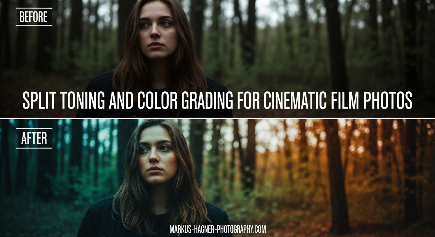
There is something undeniably captivating about the cinematic film look in photography. That rich, moody atmosphere. The sophisticated color palette that draws viewers into the scene. The good news is you do not need expensive equipment or a film camera to achieve this aesthetic. With split toning and color grading techniques in Adobe Lightroom, you can transform ordinary digital photos into cinematic masterpieces. In this guide, I will walk you through exactly how to apply split toning and color grading to create a film look in your photos, step by step.
After editing photos professionally for over a decade, I have found that split toning is one of those techniques that separates amateur-looking edits from professional results. The concept is surprisingly simple, but the impact on your final image can be dramatic. Whether you shoot portraits, landscapes, or street photography, mastering split toning will elevate your editing workflow and help you develop a consistent visual style.
What is Split Toning?
Split toning is a color grading technique where you apply different color casts to the highlights and shadows of an image independently. Instead of adding a single color tint across your entire photo (like a sepia effect), split toning lets you make the bright areas warm and the dark areas cool, or vice versa. This creates visual depth and sophistication that flat color grading cannot achieve.
The technique has its roots in traditional film photography and darkroom processing. Photographers discovered that different chemical toning processes affected highlights and shadows differently, creating distinctive looks that became associated with specific film stocks. When you see a photo with that classic cinematic quality, warm golden skin tones against cool blue shadows, split toning is often the secret ingredient.
Many photographers confuse split toning with simple white balance adjustments, but they serve different purposes. White balance corrects color temperature across the entire image uniformly. If your photo is too yellow, you cool it down globally. Split toning, on the other hand, adds creative color effects selectively to different tonal ranges. You can have perfectly neutral white balance and still apply split toning for artistic effect.
What makes split toning so powerful for creating a film look is how it mimics the color behavior of motion picture film. Cinematographers have used this technique for decades to establish mood and visual storytelling. The famous orange and teal color scheme you see in Hollywood blockbusters works because warm and cool tones complement each other on the color wheel, creating visual tension that draws the eye.
Understanding the Tools: Split Toning vs Color Grading Panel
Before diving into the technique, you need to know where to find these tools in Lightroom. If you are using an older version of Lightroom, you will see a dedicated Split Toning panel in the Develop module. However, in Lightroom Classic version 10.0 and later, Adobe replaced the Split Toning panel with a more powerful Color Grading panel. This newer panel gives you more control and flexibility, so I recommend updating if you have not already.
To access the Color Grading panel in Lightroom Classic, open your image in the Develop module and scroll down the right panel until you find it between Tone Curve and HSL/Color. The panel contains three color wheels: one for Shadows, one for Midtones, and one for Highlights. Each wheel lets you select a hue (the actual color) and saturation (the intensity of that color) independently.
Here is how each component works. The Shadows wheel affects the darkest areas of your image, typically the bottom 25% of your tonal range. The Highlights wheel affects the brightest areas, the top 25% of your tonal range. The Midtones wheel, which was not available in the old Split Toning panel, affects everything in between. This additional control is what makes the modern Color Grading panel so much more powerful.
Each wheel has two controls you need to understand. Moving the point in the center of the wheel selects your hue, think of it like a color picker. The further you move the point from the center, the higher the saturation. If you keep the point near the center, you get subtle color effects. Move it to the edge, and the effect becomes much more pronounced.
The Balance slider below the wheels controls how Lightroom defines what counts as highlights versus shadows. Sliding it to the right expands the highlight range, meaning more of your image gets the highlight color treatment. Sliding left expands the shadow range. I typically start with this slider in the middle and adjust only if needed.
There is also a Global wheel at the bottom that applies a color tint across the entire image. I rarely use this for film looks because it defeats the purpose of split toning, but it can be useful for creative effects or correcting color casts.
One pro tip that took me years to discover: hold down the Alt key (Option on Mac) while clicking and dragging in any color wheel. This gives you a preview of your selected color overlaid on a neutral gray, making it easier to see exactly what hue you are selecting. This technique is incredibly helpful for fine-tuning your split toning without guessing.
How to Apply Split Toning and Color Grading to Create a Film Look
Now let’s get into the actual workflow. I will walk you through my step-by-step process for creating a cinematic film look using split toning. This is the same approach I use for my professional work, refined over thousands of edits.
Step 1: Start with Proper Exposure and Basic Adjustments
Before touching split toning, make sure your base edit is solid. Correct your exposure so the image is properly lit. Adjust your highlights, shadows, whites, and blacks to create good tonal separation. Add a touch of contrast if needed. Split toning works best on well-exposed images with good dynamic range. If your photo is severely underexposed or blown out, no amount of color grading will save it.
Step 2: Set Your White Balance Correctly
White balance should be your first color adjustment, before any creative grading. Make sure your whites are actually white and your overall color temperature feels neutral. This gives you a clean canvas for split toning. If your white balance is off, your split toning effects will interact unpredictably with the existing color cast.
Step 3: Choose Your Highlight Color
For a classic film look, start by adding a warm color to your highlights. Click on the Highlights color wheel and drag the center point toward the orange-yellow area. I typically aim for a hue value around 30-45 degrees on the color wheel, which gives a golden amber tone. Keep saturation low to start, around 10-15%. You can always increase it later.
The reason warm highlights work so well for film looks is that they mimic how our eyes perceive natural light. Golden hour photography naturally has warm highlights, and our brains associate this warmth with pleasant, cinematic moments.
Step 4: Choose Your Shadow Color
Now move to the Shadows wheel and select a cool color. Drag toward the blue or blue-green (teal) area of the wheel. A hue value around 180-210 degrees typically works well. Again, keep saturation low, starting around 8-12%. The goal is subtle color separation, not an obvious color cast.
This warm highlights plus cool shadows combination is the foundation of the cinematic look. The complementary colors create visual tension and depth that makes images feel more three-dimensional and engaging.
Step 5: Keep Saturation Low
I cannot stress this enough: subtlety is the key to professional-looking split toning. Saturation values between 5-15% are typically plenty for a natural film look. If you go above 20%, the effect starts to look obviously edited and loses that professional quality. Many beginners make the mistake of cranking up saturation because they want to see the effect clearly, but this usually results in an overprocessed appearance.
Step 6: Fine-Tune with the Balance Slider
Use the Balance slider to adjust how much of your image receives highlight treatment versus shadow treatment. If you want more of the image to have that warm golden feel, slide it toward highlights. If you want more cool tones throughout, slide toward shadows. For most film looks, I keep this close to neutral or slightly toward highlights.
Step 7: Add Midtones Adjustment If Needed
The Midtones wheel is your secret weapon for refined film looks. Sometimes after adjusting highlights and shadows, the middle tones feel disconnected. Adding a subtle adjustment to midtones can bridge the gap. For film looks, I often add a very slight warm tint to midtones as well, keeping saturation under 5%. This creates a cohesive color story throughout the entire tonal range.
Step 8: Check Before and After Frequently
Toggle the Before/After view constantly as you work. It is easy to lose perspective when you stare at an edit for too long. The before view reminds you where you started and whether your adjustments are actually improving the image. If the effect looks too strong in comparison, dial it back.
Color Theory: Why Complementary Colors Work
Understanding basic color theory will make you significantly better at split toning. The reason orange and teal combinations look so good together is not arbitrary. They are complementary colors, meaning they sit opposite each other on the color wheel. When placed next to each other, complementary colors create maximum contrast and visual impact.
Think about the color wheel as a clock. Red sits at 12 o’clock. Moving clockwise, you pass through orange, yellow, green, cyan (teal), blue, purple, and back to red. Colors directly across from each other are complementary pairs. Orange is across from blue. Yellow is across from purple. Green is across from magenta.
When you apply complementary colors to different tonal ranges in your image, you create visual interest without chaos. The colors work together harmoniously because of their relationship on the color wheel. This is why the orange-teal cinematic look became so popular in Hollywood. It creates visual depth and separation while remaining aesthetically pleasing.
You do not have to stick with orange and teal, though. Once you understand complementary color pairs, you can create your own signature looks. Try magenta highlights with green shadows for a vintage feel. Or purple highlights with yellow shadows for something more dramatic. The key is choosing colors that complement rather than clash.
Another consideration is the mood you want to create. Warm colors (orange, yellow, red) feel energetic, inviting, and nostalgic. Cool colors (blue, teal, purple) feel calm, mysterious, and cinematic. By combining warm highlights with cool shadows, you get the best of both worlds. The warmth draws viewers in while the cool tones add sophistication.
Film Look Recipes: Starting Points for Popular Styles
After years of experimenting with split toning, I have developed several reliable starting points for different film looks. Think of these as recipes you can use as a baseline, then adjust to taste based on your specific image. These values assume you are using the Lightroom Color Grading panel.
Classic Cinematic (Orange/Teal)
Highlights: Hue 35, Saturation 12 | Shadows: Hue 195, Saturation 10 | Balance: +5 toward highlights. This is the Hollywood blockbuster look. Works great for portraits, urban scenes, and any photo where you want that big-screen feel.
Kodak Portra Style
Highlights: Hue 45, Saturation 8 | Shadows: Hue 225, Saturation 6 | Balance: Neutral. Portra film was known for warm, flattering skin tones with subtle cool shadows. This recipe mimics that beloved film stock. Perfect for portraits and wedding photography.
Vintage Faded Film
Highlights: Hue 40, Saturation 15 | Shadows: Hue 260, Saturation 12 | Midtones: Hue 50, Saturation 5 | Balance: -5 toward shadows. This creates that nostalgic, slightly faded look of old color photographs. The purple-blue in shadows adds to the vintage feel.
Magenta Zen
Highlights: Hue 330, Saturation 10 | Shadows: Hue 180, Saturation 8 | Balance: Neutral. This creative look adds a subtle magenta warmth to highlights with teal shadows. It works beautifully for moody landscapes and artistic portraits.
Warm Only (Subtle)
Highlights: Hue 40, Saturation 12 | Shadows: No adjustment | Balance: +10 toward highlights. Sometimes the best film look is simply warm golden highlights. This approach works well when you want a sun-kissed feel without the complexity of complementary colors.
Remember, these are starting points. Every photo is different based on its original colors, lighting conditions, and subject matter. Use these recipes as your foundation, then adjust to suit your specific image and personal taste.
Tips for Natural-Looking Split Toning and Common Mistakes to Avoid
The biggest mistake I see photographers make with split toning is overdoing it. When you first discover this technique, it is tempting to crank up the saturation because you want to see the effect clearly. But professional color grading is almost always subtle. The viewer should feel the mood without consciously noticing the color manipulation.
Here is my golden rule: if someone can immediately tell you used split toning, you probably went too strong. The best color grading enhances the image without calling attention to itself. Keep your saturation values under 15%, and you will avoid 90% of overprocessing problems.
Another common mistake is neglecting the Balance slider. Photographers often adjust their highlight and shadow colors but forget that the Balance slider dramatically affects how those colors interact with the image. If your split toning looks wrong no matter what colors you choose, try adjusting the Balance before changing your hue or saturation.
Check your work with fresh eyes. After editing, walk away for at least 10 minutes, then come back and look at the image again. You will often notice that your split toning is stronger than you thought. Our eyes adapt as we edit, making effects seem more subtle than they really are.
Know when NOT to use split toning. Some images do not need it. Photos with already-strong color palettes, high-key bright images, or scenes with dramatic natural lighting might look worse with added split toning. If the image already works, do not force the technique just because you know it.
Finally, consider your genre. Portraits generally benefit from subtle, warm split toning that flatters skin tones. Landscapes can handle stronger color grading for dramatic effect. Street photography often looks best with very minimal split toning or none at all. Let the subject and mood guide your decisions.
Frequently Asked Questions
What is split toning?
Split toning is a color grading technique where you apply different color casts to the highlights and shadows of an image independently. This allows you to create sophisticated, cinematic color effects that add mood and atmosphere to your photographs.
Where is split toning in Lightroom?
In modern Lightroom Classic (version 10.0+), split toning has been integrated into the Color Grading panel, located in the Develop module. The Color Grading panel includes three color wheels for Shadows, Midtones, and Highlights, offering more control than the old Split Toning panel.
What are the best split toning colors?
The most popular split toning combinations include orange highlights with blue shadows (cinematic), yellow highlights with blue shadows (classic film), magenta highlights with green shadows (vintage), and warm highlights only for a subtle mood effect.
How is split toning different from white balance?
White balance applies a single color cast uniformly across the entire image, while split toning lets you apply different colors to highlights and shadows independently. Split toning gives you creative control that white balance cannot achieve.
How do I avoid overdoing split toning?
Keep your saturation values low, typically between 5-15%. Check your before and after view frequently, walk away and return with fresh eyes, and remember that subtle effects often look more professional than dramatic ones.
Conclusion
Split toning and color grading are powerful techniques for creating that cinematic film look in your digital photos. By applying complementary colors to highlights and shadows independently, you can add depth, mood, and visual sophistication that transforms ordinary images into compelling visual stories. Remember to keep your saturation values low, check your before and after frequently, and let the specific image guide your creative decisions. With practice, split toning will become an intuitive part of your editing workflow, helping you develop a consistent, professional style that makes your photos stand out.