The paper you choose for printing your photographs matters just as much as the camera settings you used to capture them. After years of printing my work and testing countless paper types, I have learned that the right paper finish can make or break how your final image looks. Whether you are framing family portraits, creating gallery displays, or assembling photo albums, understanding the difference between matte glossy lustre photo paper finishes will help you make the right choice every time.
This guide explains exactly what sets these three paper finishes apart, when to use each one, and how to choose based on your specific needs. By the end, you will have a clear framework for selecting the perfect paper for any photo project.
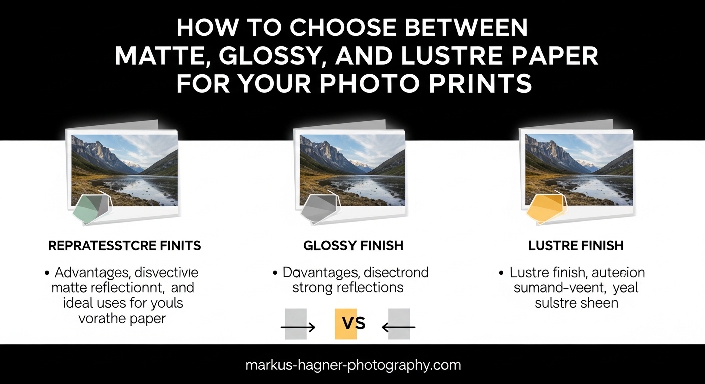
Quick Overview: The Three Main Photo Paper Finishes
Before diving into the details, here is a quick breakdown of what each paper type offers:
Matte paper has a non-reflective surface with little to no sheen. It produces soft, muted colors and works beautifully for fine art prints, black and white photography, and images displayed in brightly lit rooms where glare would be problematic.
Glossy paper features a highly reflective, smooth surface that delivers vibrant colors and sharp contrast. It is ideal for photos with bold colors and high detail, though it shows fingerprints and creates glare under direct lighting.
Lustre paper (also spelled luster) sits between matte and glossy, offering a subtle sheen with a textured surface that reduces glare while maintaining good color saturation. It is the professional standard for portraits and wedding photography.
What is Matte Photo Paper?
Matte photo paper has a flat, non-reflective finish that produces images with a soft, understated quality. The surface lacks the shiny coating found on glossy papers, which means it reflects very little light. This makes matte prints easy to view from any angle and in any lighting condition without dealing with glare or reflections.
The texture of matte paper can range from completely smooth to having a subtle tooth or grain. Fine art matte papers often use cotton rag or alpha cellulose bases, giving them a premium feel and excellent archival qualities. When I print black and white landscapes or moody portraits, matte paper is almost always my first choice.
Key Characteristics of Matte Paper
Matte finishes excel at hiding imperfections in your images. Because the surface does not reflect light the same way glossy does, minor dust spots, noise, or slight focus issues become less noticeable. The colors on matte paper appear more subdued and natural rather than punchy and vibrant.
One practical advantage I love about matte paper is its resistance to fingerprints. You can handle matte prints without leaving visible smudges, which makes them ideal for photo albums, portfolios, and prints that will be touched frequently.
Pros of Matte Photo Paper
Matte paper offers several distinct advantages that make it a top choice for specific applications:
- Non-reflective surface eliminates glare under any lighting condition
- Hides fingerprints, smudges, and minor image imperfections
- Professional, gallery-quality appearance for fine art prints
- Excellent for black and white photography with rich tonal range
- Works well displayed behind glass without creating double reflections
- Premium cotton rag options offer exceptional archival quality
- Ideal for brightly lit rooms where glossy would be unreadable
Cons of Matte Photo Paper
Despite its strengths, matte paper has some limitations to consider:
- Colors appear less vibrant and saturated compared to glossy
- Lacks the sharp contrast and deep blacks of glossy finishes
- May look dull or flat for certain image types
- Premium fine art matte papers can be more expensive
- Not ideal for photos that rely on punchy, vivid colors
When to Choose Matte Paper
Use matte paper when you want a refined, professional look without any glare concerns. It is the best choice for images that will be displayed in rooms with bright natural light or overhead lighting where reflections would be distracting.
Matte is also my go-to for black and white prints. The subtle surface enhances the tonal gradations and gives monochrome images a classic, timeless feel. Fine art photographers often prefer matte because it adds a museum-quality aesthetic to prints.
Choose matte when printing images for portfolios or photo albums that will be handled frequently. The fingerprint resistance makes it practical for these use cases.
Best Use Cases for Matte Paper
- Fine art photography and gallery exhibitions
- Black and white prints with rich shadow detail
- Portraits displayed in brightly lit offices or homes
- Photo albums and portfolios that will be handled
- Images framed behind glass in any lighting
- Wedding albums displayed in reception areas
- Moody or atmospheric landscape photography
What is Glossy Photo Paper?
Glossy photo paper features a smooth, highly reflective coating that gives prints a shiny, almost wet appearance. This finish maximizes color vibrancy and contrast, making images pop with intense saturation and deep, rich blacks. When I want my photos to look their most dramatic and eye-catching, glossy paper is often the answer.
The glossy coating consists of multiple polymer layers that create that characteristic sheen. This coating also helps the ink sit on the surface rather than absorbing into the paper, which contributes to the sharp detail and vivid color reproduction.
Key Characteristics of Glossy Paper
Glossy paper delivers the highest color saturation and contrast of any photo paper finish. Colors appear bold and punchy, and the deep blacks give images excellent perceived sharpness and depth. Small prints benefit especially from glossy finishes because the vibrant colors draw the viewer in when seen up close.
However, the high reflectivity that makes colors pop also creates practical challenges. Glossy prints show every fingerprint, smudge, and speck of dust. They also create significant glare under direct lighting, which can make images difficult to see from certain angles.
Pros of Glossy Photo Paper
Glossy paper excels in situations where maximum visual impact is the goal:
- Highest color vibrancy and saturation of any finish
- Deep blacks and excellent contrast
- Sharp detail reproduction with crisp edges
- Colors appear punchy and eye-catching
- Great for small prints viewed close-up
- Often the most affordable photo paper option
- Ideal for snapshots, gifts, and casual prints
Cons of Glossy Photo Paper
The drawbacks of glossy paper are significant enough that many photographers avoid it for professional work:
- Shows fingerprints and smudges very prominently
- Creates strong glare under direct lighting
- Can stick to glass when framed
- Reflective surface can obscure details in bright rooms
- Requires careful handling and storage
- Less sophisticated appearance for professional displays
When to Choose Glossy Paper
Select glossy paper when you want maximum color impact and your prints will not be displayed in challenging lighting conditions. It works best for smaller prints that people hold in their hands and view up close.
Glossy is ideal for casual prints, photo gifts, and snapshots where you want colors to look as vibrant as possible. Landscape photos with bold colors, sunset images, and nature photography with vivid greens and blues often look stunning on glossy paper.
Avoid glossy for framed prints that will hang in rooms with windows or overhead lights. The glare makes viewing difficult from many angles. Also reconsider glossy for prints that will be handled frequently.
Best Use Cases for Glossy Paper
- Small snapshot prints for albums or sharing
- Vibrant landscape photography with bold colors
- Sunset and sunrise images with intense color
- Commercial product photography for catalogs
- Photo gifts for friends and family
- Images displayed away from direct light sources
- Budget-conscious printing projects
What is Lustre (Luster) Photo Paper?
Lustre photo paper occupies the sweet spot between matte and glossy finishes, offering the best qualities of both while minimizing their drawbacks. The surface has a subtle sheen with a fine textured pattern that diffuses light reflections. This creates vibrant colors without the overwhelming glare of glossy paper.
You will encounter several names for this finish depending on the brand or region. Lustre (the British spelling) and luster (American) refer to the same thing. Other common terms include satin, pearl, semi-gloss, and E-surface, which is the industry term used by professional photo labs. These are not identical finishes, but they all occupy the same middle ground between matte and glossy.
Key Characteristics of Lustre Paper
Lustre paper combines good color saturation with reduced glare, making it exceptionally versatile. The textured surface breaks up light reflections, so you get the color benefits of a sheen without the mirror-like quality of glossy paper. This is why professional photo labs overwhelmingly choose lustre as their standard finish.
The texture on lustre paper is subtle enough that it does not obscure image detail, but it does slightly soften the appearance compared to glossy. Many photographers prefer this because it can hide minor imperfections while still delivering rich colors.
Fingerprints are far less visible on lustre than on glossy paper, though not as invisible as on matte. This makes lustre practical for prints that will be handled occasionally but not constantly touched.
Pros of Lustre Photo Paper
Lustre has become the professional standard for good reason:
- Balanced color saturation without overwhelming glare
- Textured surface reduces reflections significantly
- Resistant to fingerprints compared to glossy
- Professional appearance suitable for client work
- Works well in most lighting conditions
- Excellent for portraits with natural skin tones
- Versatile enough for most photography genres
- Industry standard for professional photo labs
Cons of Lustre Photo Paper
The main limitations of lustre paper are relatively minor:
- Colors less vibrant than glossy finishes
- More expensive than basic glossy options
- Texture may slightly soften fine detail
- Terminology can be confusing (luster, satin, pearl, semi-gloss)
When to Choose Lustre Paper
Lustre should be your default choice for most professional photography work. It delivers the color quality clients expect while avoiding the practical problems of glossy paper. When I print client work without specific instructions, lustre is almost always what I use.
This finish excels for portraits because it renders skin tones naturally while still showing good color in clothing and backgrounds. Wedding photographers overwhelmingly choose lustre for albums and prints because it looks professional under any lighting condition.
Choose lustre when you are unsure about the lighting conditions where your prints will be displayed. The reduced glare makes it work in bright rooms, offices, and galleries without the reflection issues of glossy.
Best Use Cases for Lustre Paper
- Portrait photography for professional clients
- Wedding photography albums and prints
- School and family photography
- General-purpose professional printing
- Images for sale to clients or galleries
- Prints displayed in variable lighting conditions
- Photo books and premium albums
- Event photography documentation
Matte vs Glossy vs Lustre: Direct Comparison
Understanding how these three finishes compare directly will help you make faster decisions. Here is a detailed breakdown of how each paper type performs across key categories.
Reflectivity and Glare
Glare is often the deciding factor when choosing paper. Glossy paper is highly reflective and can become difficult to view in bright rooms or under direct lighting. You may find yourself moving around trying to find an angle without reflections.
Matte paper has virtually no glare, making it readable from any angle in any lighting. This is why matte works so well for prints displayed in sunlit rooms or under gallery spotlights.
Lustre sits between the two. The textured surface diffuses light, significantly reducing glare while maintaining a subtle sheen. You get some of the visual richness of glossy without the practical problems.
Color Vibrancy and Saturation
If your image relies on bold, punchy colors, glossy paper delivers the most impact. The shiny surface makes colors appear saturated and intense. This is perfect for vibrant landscapes, colorful still life, or any image where color is the main attraction.
Matte produces more muted, natural colors. Some photographers describe matte colors as softer or more subdued. This works well for fine art and moody images but may disappoint if you want your colors to pop.
Lustre offers a middle ground with good color saturation that looks professional without appearing over-saturated. Colors are vibrant enough for most purposes while maintaining natural-looking skin tones.
Fingerprints and Handling
This practical consideration matters more than many photographers realize. Glossy paper shows every fingerprint and smudge prominently. Simply picking up a glossy print can leave visible marks that are difficult to remove.
Matte paper resists fingerprints almost completely. You can handle matte prints freely without leaving visible marks. This makes matte ideal for portfolios, photo albums, and any prints that will be touched frequently.
Lustre shows fingerprints less than glossy but more than matte. Occasional handling will not leave obvious marks, but repeated touching can create visible smudges over time.
Framing Considerations
How your print will be framed affects your paper choice significantly. Glossy prints can actually stick to glass over time, creating a permanent bond that ruins the print if you ever try to remove it. Use spacers or mats to prevent contact between glossy prints and glass.
Matte prints work perfectly behind glass because there is no double reflection effect. The non-reflective surface of matte combined with glass creates clean viewing without glare conflicts.
Lustre works well behind glass too. The reduced reflectivity means you do not get the compounding glare issues that glossy prints create when framed.
Perceived Quality and Professionalism
In my experience, matte and lustre prints are perceived as more professional and sophisticated. Gallery shows and museums almost exclusively use matte finishes for fine art prints. Lustre carries the same professional weight and is what clients expect from professional portrait and wedding photographers.
Glossy has a more casual, consumer feel. While this is not inherently negative, it may not communicate the premium quality that professional work demands.
How to Choose the Right Paper for Your Photo Prints
Now that you understand the differences, here is a step-by-step framework for making the right choice for any photo project.
Step 1: Consider Your Display Environment
Where will your print be displayed? This single question often determines the right answer.
For brightly lit rooms with windows or overhead lights, choose matte or lustre. Glossy will create frustrating glare that makes the image difficult to see.
For darker rooms or spaces with controlled lighting, glossy can work well since glare is less of an issue.
For galleries or professional displays, matte is the standard choice for fine art while lustre works for portraits and commercial work.
Step 2: Think About Your Subject Matter
Different subjects benefit from different finishes.
Portraits and people photography typically look best on lustre or matte. These finishes render skin tones naturally and avoid the overly-shiny appearance that glossy can give faces.
Landscapes with bold colors shine on glossy paper. The vibrant finish makes greens, blues, and sunset colors pop with intensity.
Black and white photography almost always looks best on matte. The soft surface enhances tonal gradations and gives monochrome prints a classic, timeless quality.
Fine art photography generally calls for matte paper, particularly cotton rag options that offer premium texture and archival quality.
Step 3: Factor In Framing Plans
If you plan to frame your print behind glass, avoid glossy unless you use spacers or mats to prevent contact. Matte and lustre both work well behind glass without special considerations.
For unframed displays or canvas wraps, any paper type works based on your aesthetic preference and lighting conditions.
Step 4: Consider Handling Frequency
Will people touch your prints frequently? Photo albums, portfolios, and displayed prints in high-traffic areas benefit from matte paper because it resists fingerprints so well.
For prints that will be framed and rarely touched, handling becomes less of a concern.
Step 5: Match Your Editing Style
Consider how you edit your photos. If you process images with bold, saturated colors and high contrast, glossy or lustre paper will match that aesthetic. If you prefer moody, subtle edits with muted tones, matte paper complements that style better.
Step 6: Test With Sample Packs
Before committing to large orders, I strongly recommend ordering sample packs from paper manufacturers or photo labs. Most professional paper brands offer sample packs containing multiple finishes. Print the same image on each paper type and compare them in your actual display environment.
This small investment saves money and disappointment in the long run. The way paper interacts with your specific printer, ink, and images can vary, so testing is invaluable.
Professional Photographer Insights
The photography community has strong opinions about paper finishes based on years of real-world experience. Here are some insights from professional photographers who have shared their preferences in forums and discussions.
Many professionals note that glossy excels for smaller prints held close to the face, while matte shines for larger displayed prints viewed from greater distances. This practical observation matches my own experience.
There is broad agreement that lustre looks more professional, similar to what photo studios use for school portraits. This makes lustre the safe choice for client work when you want to meet professional expectations.
Several photographers mention that they see more detail in highlights and shadows on matte paper compared to glossy. The surface texture of lustre can obscure some fine detail, while glossy shows all imperfections including noise and dust spots.
For framed prints, many professionals recommend satin or lustre as the best balance of color depth and minimal reflection. This avoids the glare problems of glossy while maintaining better color than matte.
Storage and Handling Tips
Regardless of which paper you choose, proper storage extends the life of your prints. Store prints flat in acid-free folders or boxes away from direct sunlight. Handle prints by the edges to minimize contact with the image surface.
For glossy prints specifically, consider wearing cotton gloves when handling to prevent fingerprints. Store glossy prints with protective interleaving paper between them to prevent sticking.
All photo papers benefit from controlled humidity and temperature. Avoid storing prints in damp basements or hot attics where moisture and heat can damage the paper and inks over time.
Frequently Asked Questions
Is luster photo paper better than glossy photo paper?
Luster (lustre) photo paper is generally better than glossy for professional work because it offers reduced glare and shows fewer fingerprints while maintaining good color saturation. Luster has become the industry standard for professional photo labs and portrait photographers. However, glossy may be preferable for images requiring maximum color vibrancy and contrast, especially smaller prints viewed up close in controlled lighting.
Do professional photographers use matte or glossy?
Professional photographers use both matte and glossy papers depending on the purpose of their prints. Many prefer lustre (luster) for general professional work like portraits and weddings because it balances color quality with practical considerations like reduced glare. Matte is the standard choice for fine art prints, gallery exhibitions, and black and white photography. Glossy is typically reserved for commercial work requiring maximum color impact or casual prints.
What is the best paper to print photographs on?
The best paper depends entirely on your specific use case. Glossy paper excels for vibrant, colorful images and small prints where you want maximum visual impact. Matte paper is ideal for fine art prints, black and white photography, and images displayed in brightly lit environments. Lustre paper offers the most versatility and is the professional standard for portraits and wedding photography. I recommend ordering sample packs from paper manufacturers to test different finishes with your specific images and printer before committing to large orders.
What is the best finish for photo prints?
The best finish varies by application: matte works best for fine art prints, black and white images, and wall art displayed in well-lit rooms. Glossy is ideal for high-contrast landscapes, vibrant nature photography, and prints that will not face challenging lighting. Lustre (luster) is the best all-around choice for portraits, wedding photography, and images displayed in variable conditions. Consider your display environment, subject matter, framing plans, and how often prints will be handled when making your decision.
Final Thoughts on Choosing Photo Paper
Choosing between matte glossy lustre photo paper finishes comes down to understanding your specific needs. Matte gives you glare-free viewing and a refined, professional appearance perfect for fine art and black and white work. Glossy delivers maximum color impact and contrast ideal for vibrant images and small prints. Lustre offers the best balance of color quality and practicality, making it the professional standard for portraits and wedding photography.
The most important step you can take is testing different papers with your own images. Order sample packs from paper manufacturers or your preferred photo lab. Print the same image on each finish and compare them in the actual environment where they will be displayed. This hands-on experience will teach you more than any article could.
Remember that there is no universally wrong choice. Each paper type serves specific purposes exceptionally well. Match the paper to your image, your display conditions, and your audience, and you will consistently produce prints that look their absolute best.