Nothing stings quite like spending hours editing a photo to perfection, sending it to print, and getting back something that looks completely different from what you saw on your screen. The colors are off, the shadows are too dark, and that beautiful warm tone you worked so hard to achieve has somehow turned muddy and lifeless. If this sounds familiar, you are not alone. This is one of the most common frustrations photographers face when moving from digital to print, and it is exactly why soft proofing in Lightroom exists.
In this guide, I will walk you through everything you need to know about using soft proofing in Lightroom to preview how your photos will look in print. You will learn what soft proofing actually does, why it is essential for getting accurate prints, and the exact step-by-step workflow I use to make sure my prints match my creative vision every single time. By the end, you will have the knowledge to save money on failed prints and produce work that looks exactly how you intended.
What Is Soft Proofing in Lightroom?
Soft proofing is the process of previewing how your photos will appear when printed before you actually print them. It works by simulating on your calibrated monitor how a specific printer, ink, and paper combination will reproduce your image. Think of it as a dress rehearsal for your print. Instead of guessing what the final output will look like, you get to see a close approximation right on your screen.
The key technology behind soft proofing is the ICC profile. An ICC profile (International Color Consortium profile) is a data file that describes how a particular device reproduces color. When you apply a printer profile in Lightroom’s soft proofing mode, the software uses that profile to simulate the color capabilities and limitations of that specific output device. It shows you which colors will reproduce accurately and which ones fall outside the printable range, known as being “out of gamut.”
Soft proofing differs from hard proofing in an important way. Hard proofing involves making an actual test print to evaluate the output. While this gives you the most accurate representation, it costs money and takes time every time you want to check something. Soft proofing gives you a digital preview that is usually close enough to make informed adjustments before committing to paper and ink.
It is worth noting that soft proofing in Lightroom is available in Lightroom Classic, which is the desktop-focused version most professional photographers use. The cloud-based Lightroom (formerly known as Lightroom CC) does not currently have full soft proofing capabilities, so this guide focuses on Lightroom Classic.
Why Soft Proofing Is Essential for Print Photography
Your monitor and your printer speak different color languages. Most monitors display colors in the sRGB or Adobe RGB color space, which can show millions of colors across a wide range. Printers, on the other hand, are limited by the physics of ink on paper. They simply cannot reproduce every color your monitor can display, especially in highly saturated blues, greens, and oranges. This fundamental difference is why prints often look different from what you see on screen.
Without soft proofing, you are essentially flying blind. You might spend hours perfecting an image, only to discover at print time that those vibrant sunset colors you loved are physically impossible to reproduce on your chosen paper. Soft proofing reveals these limitations upfront, giving you the chance to adjust your editing to work within the printable color range.
The financial benefits add up quickly. If you have ever made multiple test prints trying to get colors right, you know how expensive trial and error can be. Premium photo paper and quality ink cartridges are not cheap. Soft proofing lets you identify and fix potential problems before you spend a dime on printing supplies.
Beyond saving money, soft proofing helps you make creative decisions about paper selection. Different papers have different characteristics. A glossy paper might handle saturated colors differently than a matte fine art paper. By soft proofing with different profiles, you can see how your image will look on various papers and choose the one that best serves your creative vision.
Prerequisites: What You Need Before Soft Proofing
Before diving into soft proofing, there is one non-negotiable requirement: a calibrated monitor. If your monitor is not displaying accurate colors to begin with, soft proofing will not help you. In fact, it might make things worse. Monitor calibration ensures that the colors you see on screen are actually the colors in your file. Without it, you might be adjusting for a monitor problem rather than a print problem.
For calibration, you will need a hardware colorimeter like a Datacolor Spyder or X-Rite i1Display. These devices measure your monitor’s output and create a profile that corrects any color cast or brightness issues. I calibrate my display every two to four weeks because monitors drift over time. This small investment in equipment pays for itself quickly in saved prints.
The second prerequisite is ICC printer profiles. These profiles tell Lightroom how your specific printer, ink, and paper combination reproduces color. You have a few options for obtaining profiles. If you use a professional print lab, they will typically provide profiles for their printers and papers on their website. If you print at home, check your printer manufacturer’s website or the paper manufacturer’s website for downloadable profiles.
Installing ICC profiles is straightforward. On Windows, right-click the profile file and select “Install Profile.” The profile will be placed in the correct system folder automatically. On Mac, copy the profile to your user Library folder at: Users/[YourUsername]/Library/ColorSync/Profiles. After installation, restart Lightroom so it can detect the new profiles.
One important note about profiles: generic profiles that come with your printer driver are better than nothing, but they are not as accurate as custom profiles. Paper manufacturers often provide free profiles for popular printer models, and these are usually more accurate than the generic ones. For the most accurate results, you can have custom profiles made for your specific printer using a spectrophotometer, though this is typically only necessary for professional fine art printing.
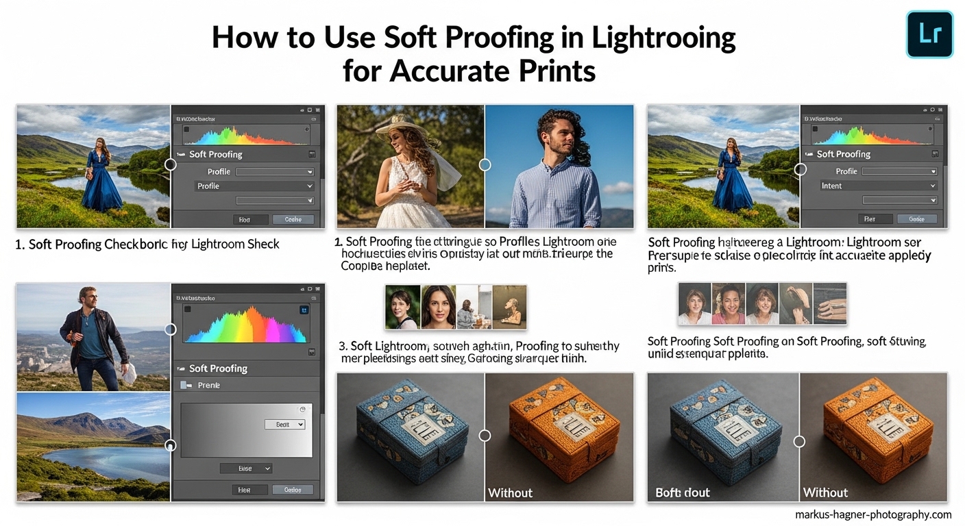
How to Enable Soft Proofing in Lightroom
Soft proofing in Lightroom lives in the Develop module, which is where all your editing happens. Open the photo you want to soft proof and make sure you are in the Develop module by clicking “Develop” in the top right or pressing the “D” key. This is the starting point for all soft proofing work.
Look at the toolbar at the bottom of the main image preview area. If you do not see the toolbar, press the “T” key to toggle it on. On the left side of this toolbar, you will see a checkbox labeled “Soft Proofing.” Click this checkbox to enter soft proofing mode. You can also toggle soft proofing on and off by pressing the “S” key, which is a useful shortcut to remember.
When you first enable soft proofing, Lightroom will prompt you to create a proof copy. This is a virtual copy of your image specifically for print adjustments. I highly recommend clicking “Create Proof Copy” because it keeps your original edit intact while allowing you to make print-specific adjustments. The proof copy appears in your filmstrip with a special icon indicating it is a soft proof version.
Once soft proofing is enabled, you will notice the background behind your image changes from the usual gray to white or a lighter gray. This is intentional because it simulates the white of the paper you will be printing on. You will also see a new panel appear on the right side called “Soft Proofing” with controls for Profile, Intent, and the Simulate Paper & Ink option.
The first thing to do in this panel is select your printer profile. Click the Profile dropdown and you will see a list of all installed ICC profiles. Choose the profile that matches your printer, ink, and paper combination. If you are printing through a lab, use the profile they provide. If you are printing at home on Epson Premium Glossy Photo Paper with an Epson P800, select that specific profile.
Take a moment to examine your image with soft proofing enabled. Do not panic if it looks different from your original. This is exactly what soft proofing is supposed to show you. The differences you see represent how the image will actually appear when printed with your chosen setup.
Understanding Soft Proofing Controls and Settings
The soft proofing panel contains several important controls that affect how your preview appears. Understanding each of these will help you get the most accurate preview possible and make better decisions about your print adjustments.
Simulate Paper & Ink
The “Simulate Paper & Ink” checkbox is one of the most important and most misunderstood features in soft proofing. When enabled, it simulates the dynamic range of the paper by adjusting the white point and black point of your image to match what the paper can actually reproduce. This often makes your image look flatter, darker, and less vibrant, which is exactly why many photographers refer to it as the “make my photo look terrible” button.
Here is the thing: that “terrible” look is actually accurate. It shows you what your print will really look like. White photo paper is not as bright as your monitor’s white, and black ink on paper is not as dark as your monitor can display. Simulate Paper & Ink accounts for these physical limitations.
Some photographers prefer to leave this option off because they find the preview too discouraging. However, if you want the most accurate preview possible, keep it enabled. The preview might look worse, but it will save you from disappointment when the actual print comes out.
If you find the Simulate Paper & Ink option grayed out, it usually means your selected ICC profile does not contain the required white point and black point information. Try a different profile or make sure you are using a profile from the paper manufacturer rather than a generic printer profile.
Rendering Intents Explained
Rendering intent determines how Lightroom handles colors that fall outside the printable color range (out of gamut). There are two main options for photographic printing: Perceptual and Relative Colorimetric. Understanding the difference is crucial for making the right choice for your images.
Perceptual rendering takes all the colors in your image and compresses them to fit within the printer’s color range while maintaining the relative relationships between colors. Think of it as shrinking everything proportionally. This is useful for images with many out-of-gamut colors because it preserves the overall feel and gradation of the image, even though individual colors might shift slightly. The downside is that even colors that could print accurately might be shifted slightly to maintain the overall balance.
Relative Colorimetric rendering takes a different approach. It maps all in-gamut colors exactly as they are and only adjusts the out-of-gamut colors to the nearest printable equivalent. This preserves color accuracy for everything the printer can reproduce, but the out-of-gamut colors might clip or block up, potentially losing detail in highly saturated areas.
So which should you use? For most images, Perceptual is the safer choice because it maintains smooth gradations and overall color harmony. Use Relative Colorimetric when color accuracy is critical and your image has only a few out-of-gamut colors. The best approach is to toggle between both options and see which looks better for your specific image.
Black Point Compensation works with Relative Colorimetric rendering to map the darkest black in your image to the darkest black the printer can produce. Always keep this enabled when using Relative Colorimetric to avoid losing shadow detail.
Gamut Warnings
The gamut warning feature highlights areas of your image that fall outside the printer’s color range. To enable it, click the small arrow in the top right corner of the histogram panel and select “Show Gamut Warning” or press “Ctrl+Shift+G” (Windows) or “Cmd+Shift+G” (Mac). Out-of-gamut areas will be highlighted in a contrasting color, usually bright red or blue.
Seeing large areas of your image flagged by the gamut warning can be alarming, but do not overreact. Some out-of-gamut colors are normal and expected, especially in highly saturated areas like vibrant skies or intense skin tones. The warning is simply information, not necessarily a problem you must fix.
Use the gamut warning as a guide to identify areas that might need attention. If critical parts of your image are out of gamut, consider reducing saturation slightly in those specific areas using the HSL panel or adjustment brush. Remember that your choice of rendering intent will affect how these areas are handled in the final print.
Complete Soft Proofing Workflow: Step-by-Step
Now that you understand all the components, here is the complete workflow I use every time I prepare an image for print. Follow these steps and you will get consistent, predictable results.
Step 1: Complete your initial editing in Lightroom without soft proofing enabled. Edit to your creative vision, focusing on how you want the image to look. Do not try to anticipate print limitations at this stage.
Step 2: Enter the Develop module and enable soft proofing by pressing “S” or checking the Soft Proofing box in the toolbar. When prompted, create a proof copy to preserve your original edit.
Step 3: Select the appropriate ICC profile for your printer, ink, and paper combination from the Profile dropdown in the Soft Proofing panel.
Step 4: Enable Simulate Paper & Ink for the most accurate preview. Accept that the image might look flatter and darker than your original.
Step 5: Toggle between Perceptual and Relative Colorimetric rendering intents to see which works better for your image. Look at how colors transition and how saturated areas are handled.
Step 6: Turn on the gamut warning to identify any problem areas. Decide if any out-of-gamut areas need adjustment or if you can live with how they will render.
Step 7: Use the Before/After view to compare your original with the soft proof. Press “Y” for side-by-side view or “Backslash” () to toggle between before and after. This helps you understand exactly what is changing.
Step 8: Make print-specific adjustments to your proof copy. You might need to slightly boost exposure, open up shadows, or adjust saturation to compensate for the print reproduction. Keep your original visible as a reference.
Step 9: Take breaks during editing. When toggling between soft proof and original, your eyes adapt quickly. Look away for 20 seconds or step back from the monitor before making critical decisions.
Step 10: Once satisfied, export your proof copy for printing. Make sure your export settings match your printer’s requirements for resolution, color space, and file format.
Troubleshooting Common Soft Proofing Issues
Even with everything set up correctly, you might encounter some common issues. Here are solutions to the problems photographers face most often.
Why Does My Image Look Darker and Worse in Soft Proofing?
This is not a problem; it is the expected behavior. Soft proofing is showing you the reality of print reproduction. Paper cannot display the same brightness range as your monitor, and ink has physical limitations. The preview looks “worse” because it is being honest about what you can achieve in print. Trust the preview and make adjustments from there.
Simulate Paper & Ink Is Grayed Out
This usually happens when your ICC profile lacks the required white point and black point information. Try using a profile from the paper manufacturer instead of a generic printer profile. If that does not work, you can still use soft proofing without this option, but your preview will be less accurate in the extreme highlights and shadows.
Soft Proofing Mode Is Not Working
First, make sure you are in the Develop module, not the Library module. Soft proofing only works in Develop. If the Soft Proofing checkbox does not appear in the toolbar, press “T” to make sure the toolbar is visible. If it still does not appear, check that you are using Lightroom Classic and not the cloud-based Lightroom application.
Common Mistakes to Avoid
Do not skip monitor calibration. This is the foundation of accurate color work. Do not edit in soft proof mode from the beginning. Complete your creative editing first, then soft proof for print-specific adjustments. Do not assume one profile works for all papers. Different papers have different characteristics, and using the wrong profile defeats the purpose of soft proofing. Finally, do not expect your print to match your screen exactly. Soft proofing gets you close, but there will always be subtle differences between transmitted light (your monitor) and reflected light (your print).
When comparing your actual print to your screen, view the print in proper lighting, not just next to your monitor. Use a daylight-balanced viewing light or take the print to a window with indirect natural light. Also, let inkjet prints dry for at least 20 minutes to an hour before making final color judgments, as colors can shift slightly as the ink cures.
Frequently Asked Questions
Why does my image look different when I enable soft proofing?
What rendering intent should I use in Lightroom?
Do I need to calibrate my monitor for soft proofing?
Why is Simulate Paper & Ink grayed out?
Can I use soft proofing in the new Lightroom (not Classic)?
Putting It All Together
Soft proofing in Lightroom is your bridge between the digital world of your monitor and the physical reality of print. By using ICC profiles, understanding rendering intents, and following a consistent workflow, you can predict how your photos will look in print with remarkable accuracy. The process might seem technical at first, but it quickly becomes second nature.
Remember that soft proofing is a tool to inform your decisions, not a magic solution that fixes everything automatically. Your artistic judgment still matters. Use the preview to identify potential issues, then apply your creative skills to make adjustments that serve your vision while working within the limitations of your chosen output.
The investment in learning soft proofing pays dividends every time you print. Fewer wasted test prints, more predictable results, and the confidence that comes from knowing your final print will match what you envisioned. Start with properly calibrated equipment, take the time to find and install the right ICC profiles, and practice the workflow until it becomes routine. Your prints will thank you for it.