Transforming a flat, lifeless image into something that evokes emotion is one of the most satisfying parts of photo editing. The Lightroom Color Grading Panel is your secret weapon for this transformation. It replaced the old Split Toning tool and gives you far more control over how colors affect different tonal ranges in your photos.
In this guide, I will walk you through exactly how to use the Color Grading Panel to add mood to your photos. You will learn what each control does, see specific color combinations for different moods, and avoid the common mistakes that leave images looking unnatural.
Whether you want dark and moody portraits, cinematic landscapes, or warm nostalgic memories, mastering color grading will take your editing to the next level. Let’s dive in.
What Is the Color Grading Panel in Lightroom?
The Color Grading Panel is a creative editing tool in Adobe Lightroom that lets you add color tints to specific tonal areas of your image. Think of it as painting with light and shadow. You can add warm colors to your highlights while keeping shadows cool and blue, or vice versa.
Adobe introduced this panel in late 2020, replacing the older Split Toning feature. While Split Toning only affected highlights and shadows, the Color Grading Panel adds control over midtones and includes a global adjustment option. This gives you four separate areas to work with instead of just two.
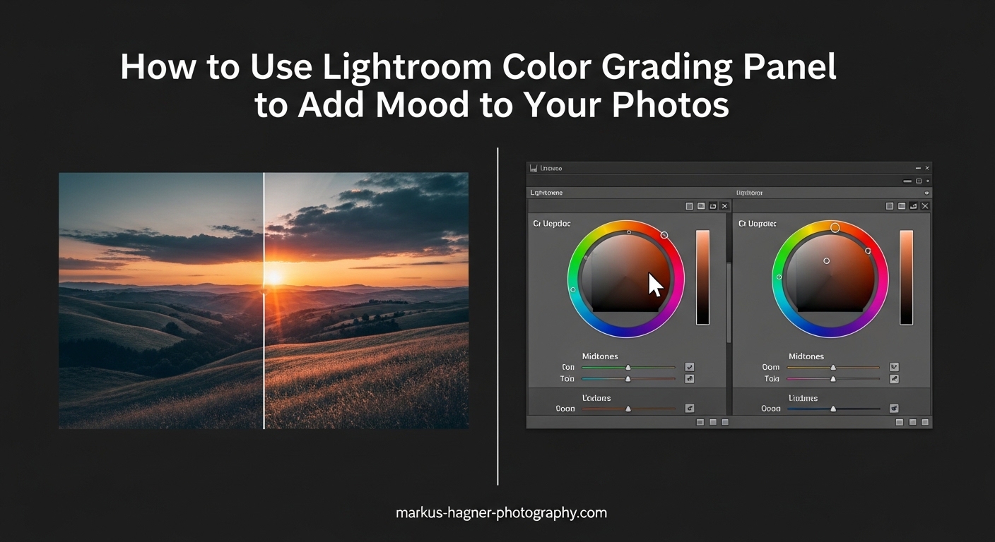
The Three Color Wheels Explained
The interface centers around three color wheels, each controlling a different tonal range:
Shadows: Affects the darkest parts of your image. This is where you add depth and mystery with cool blues or warm browns.
Midtones: Controls the middle brightness values. This wheel has the biggest impact on overall color mood since most pixels fall into this range.
Highlights: Targets the brightest areas. Warm highlights create a golden hour feel, while cool highlights suggest overcast or twilight conditions.
Each wheel has a small circle inside that you drag toward your chosen color. The further from center, the more saturated the effect. Simple in concept, powerful in practice.
Color Grading vs Split Toning: What Changed?
If you used Split Toning in older versions of Lightroom, you might wonder how Color Grading differs. The new panel offers several improvements:
Split Toning had separate hue and saturation sliders for highlights and shadows. Color Grading replaces this with visual color wheels that make selecting colors intuitive. You see exactly what color you are choosing rather than guessing at numbers.
The addition of midtone control is significant. Midtones make up most of many images, so having direct influence here changes everything. You can now create subtle, sophisticated color shifts that were difficult or impossible before.
The Global adjustment wheel lets you apply a color tint across all tonal ranges at once. Use this sparingly for overall color casts or to unify your grading.
How to Access the Color Grading Panel
Finding the panel is straightforward once you know where to look:
Step 1: Open Lightroom Classic and select the photo you want to edit.
Step 2: Click on the Develop module at the top right, or press D on your keyboard.
Step 3: Scroll down the right panel until you find Color Grading, located below Tone Curve and above Calibration.
Step 4: Click the triangle to expand the panel if it is collapsed.
In Lightroom Mobile, tap the Color Mix tool, then scroll to find Color Grading. The interface looks slightly different but functions the same way.
Understanding the Color Grading Interface
Before you start sliding things around, understanding what each control does will save you from frustration. Let me break down the complete interface.
Shadows Color Wheel
The Shadows wheel affects pixels in the darkest 25% of your tonal range. Drag the center circle toward any color to tint your shadows. Blue and teal are popular choices for moody, cinematic looks. Warm browns and oranges create earthy, nostalgic feels.
Below the wheel, you will find a Saturation slider and a Luminance slider. The Saturation slider controls how intense the color tint appears. Keep this subtle for natural results, usually between 10 and 30 for most looks.
The Luminance slider brightens or darkens your shadows independently. Lowering shadows luminance while adding cool colors creates deeper, more dramatic mood. Raising it with warm colors gives a softer, more inviting feel.
Midtones Color Wheel
The Midtones wheel has the most visual impact because it affects the largest portion of most images. This is where you establish your dominant color mood. A subtle push toward warm orange or cool blue here transforms the entire feeling of a photo.
Be careful with saturation in midtones. Because this wheel affects so many pixels, even moderate saturation values create strong effects. I rarely go above 15-20 saturation on midtones unless I want an obviously stylized look.
Highlights Color Wheel
The Highlights wheel targets the brightest 25% of your tonal range. This is where you add golden warmth to skies or cool tones to bright clouds. The principle is the same: drag toward your chosen color and adjust saturation to taste.
Highlights respond differently depending on your image content. A photo with large bright areas like skies will show obvious changes. Portraits with small highlight areas in skin tones need more restrained adjustments.
Global Adjustment
The Global wheel applies color across all tonal ranges simultaneously. Use this to add an overall color cast or to unify separate adjustments you made to shadows, midtones, and highlights.
I use Global adjustments sparingly. They can flatten the dimensionality created by separate shadow and highlight colors. Think of Global as a final polish rather than a starting point.
The Blending Slider Explained
The Blending slider sits below the three color wheels and controls how much your shadow, midtone, and highlight colors overlap. A value of zero keeps each tonal range completely separate. Higher values blend the colors together for smoother transitions.
Low blending values create distinct, separated color effects. This works well for dramatic cinematic looks where you want obvious contrast between warm highlights and cool shadows. High blending values create more unified, natural results.
Most of the time, I set blending between 40 and 60. This provides smooth transitions without muddying the separate color intentions. For subtle, natural looks, try 70 or higher. For dramatic stylized effects, stay below 30.
The Balance Slider
The Balance slider shifts the boundary between shadows and highlights. Moving it toward shadows expands the highlight range and shrinks the shadow range. Moving toward highlights does the opposite.
Use Balance when your image has unusual tonal distribution. A high-key image with mostly bright tones might need balance shifted toward highlights so the shadows wheel actually affects something.
How to Use Lightroom Color Grading Panel to Add Mood to Your Photos
Now for the main event. Here is my step-by-step workflow for using color grading to transform flat images into mood-filled masterpieces.
Step 1: Complete Your Basic Adjustments First
Never start with color grading. Your Basic panel adjustments establish the foundation. Set your exposure, contrast, highlights, shadows, whites, and blacks before touching color grading. Color grading works best on images that already have good tonal structure.
I typically lower highlights slightly, raise shadows to recover detail, increase contrast with the Tone Curve, and adjust clarity for my desired level of detail. Only then do I move to color grading.
Step 2: Decide on Your Mood Direction
Before adjusting anything, identify the mood you want. Look at your image and ask what emotion it should evoke. A misty forest might call for cool, mysterious tones. A sunset portrait wants warm, romantic colors. A gritty street scene could use desaturated, dramatic grading.
This decision guides every color choice you make. Without a clear direction, you will end up chasing random effects that never feel right.
Step 3: Start With the Shadows Wheel
I always begin with shadows because they anchor the mood. For dark and moody looks, drag toward blue or teal with saturation around 25-35. For warm, nostalgic feels, move toward orange or brown with lower saturation around 15-25.
Watch how the darkest areas of your image change. The mood should start emerging immediately. If it looks unnatural, reduce saturation.
Step 4: Add Complementary Color to Highlights
Now add color to highlights that complements your shadows choice. The classic cinematic look pairs blue shadows with orange highlights. Warm shadows pair nicely with slightly cool or neutral highlights.
Keep highlight saturation lower than shadow saturation, usually 10-20. Highlights are naturally more visible, so they need less color intensity.
Step 5: Use Midtones to Unify the Look
With shadows and highlights set, the midtones wheel bridges them together. Use a color that sits between your shadow and highlight choices. If you used blue shadows and orange highlights, try a subtle warm gray or desaturated orange in midtones.
Midtone saturation should be very subtle, rarely above 15. The goal is smooth color flow, not another obvious color layer.
Step 6: Adjust Blending for Smooth Transitions
Set your blending slider to control how the colors merge. Start at 50 and adjust by eye. If you see harsh boundaries between color zones, increase blending. If the colors look muddy and indistinct, decrease it.
Step 7: Fine-Tune With Luminance Adjustments
Each color wheel has a luminance slider below it. Use these to brighten or darken specific tonal ranges. Lowering shadow luminance while adding blue creates deeper, moodier shadows. Raising highlight luminance with warm colors enhances golden hour effects.
Step 8: Compare Before and After
Toggle the panel on and off using the switch at the top. This reveals whether your grading enhances the image or overpowers it. The best color grading feels like it was always there, not like an obvious filter.
Step 9: Save Your Look as a Preset
Once you create a color grading look you love, save it. Click the plus icon at the top of the Presets panel and check only the Color Grading box. Name it descriptively like “Moody Blue Shadows” or “Warm Nostalgic Grade.”
Color Combinations for Different Moods
Here are specific recipes for five popular mood styles. Use these as starting points and adjust to taste.
Dark and Moody (Cinematic Blue/Orange)
This classic look works beautifully for portraits, landscapes, and street photography.
Shadows: Drag toward blue at around 240 degrees on the color wheel. Saturation 30, Luminance -10.
Midtones: Subtle orange-brown at 35 degrees. Saturation 12, Luminance 0.
Highlights: Warm orange at 40 degrees. Saturation 20, Luminance +5.
Blending: 50
Balance: 0 or slightly toward highlights
The contrast between cool shadows and warm highlights creates visual interest and emotional depth.
Twilight and Atmospheric
Perfect for landscapes and moody outdoor scenes. This look mimics the blue hour.
Shadows: Deep blue-purple at 260 degrees. Saturation 35, Luminance -15.
Midtones: Soft blue at 220 degrees. Saturation 15, Luminance -5.
Highlights: Lavender-pink at 300 degrees. Saturation 18, Luminance 0.
Blending: 60
Balance: Slightly toward shadows
This creates a dreamy, ethereal quality that works especially well for misty or foggy scenes.
Warm and Nostalgic
Evokes memory and sentimentality. Great for family photos, vintage-style portraits, and travel images.
Shadows: Warm brown at 45 degrees. Saturation 20, Luminance +5.
Midtones: Golden yellow at 50 degrees. Saturation 18, Luminance 0.
Highlights: Creamy warm at 55 degrees. Saturation 15, Luminance +5.
Blending: 70
Balance: 0
Higher blending keeps this look soft and unified rather than dramatic.
Earthy and Natural
Works well for outdoor portraits, nature photography, and lifestyle images.
Shadows: Brown-green at 70 degrees. Saturation 15, Luminance 0.
Midtones: Subtle earth tone at 60 degrees. Saturation 10, Luminance 0.
Highlights: Warm cream at 55 degrees. Saturation 12, Luminance +5.
Blending: 65
Balance: 0
Combine this with desaturated greens in the HSL panel for a cohesive natural look.
Cinematic Teal and Orange
The Hollywood blockbuster look. Bold and stylized for maximum impact.
Shadows: Teal at 190 degrees. Saturation 40, Luminance -10.
Midtones: Neutral with slight teal at 200 degrees. Saturation 15, Luminance 0.
Highlights: Strong orange at 35 degrees. Saturation 35, Luminance +5.
Blending: 35
Balance: Slightly toward highlights
Low blending keeps the colors distinctly separated for that dramatic movie poster feel.
Common Color Grading Mistakes to Avoid
After years of experimenting with color grading, I have made every mistake possible. Here are the ones I see most often and how to fix them.
Over-Saturating Colors
The biggest mistake is cranking saturation too high. Color grading should feel like a whisper, not a shout. When your shadows look obviously blue or your highlights scream orange, you have gone too far.
Most natural-looking color grading uses saturation values between 10 and 30. Anything above 40 starts looking stylized and artificial. The exception is deliberate artistic choices where you want obvious color effects.
If you feel tempted to increase saturation, try the opposite. Reduce it by half and see if the mood still comes through.
Ignoring the Blending Slider
Leaving blending at its default is like cooking without salt. The ingredient matters. Low blending creates harsh color boundaries. High blending can muddy your carefully chosen colors into an indistinct mess.
Adjust blending every time you color grade. Watch how it changes the interaction between your shadow and highlight colors. Find the sweet spot where transitions feel smooth but distinct.
Skipping Basic Adjustments
Color grading cannot fix a poorly adjusted image. If your exposure is wrong, your contrast is flat, or your white balance is off, color grading will not save it. It might even make things worse.
Always complete your Basic panel work first. Get the tonal structure right. Then use color grading to add mood on top of a solid foundation.
Creating Muddy Colors
When your shadows, midtones, and highlights all use similar colors at high saturation, the result looks muddy and flat. The whole point of color grading is creating color separation and dimension.
Choose contrasting colors for shadows versus highlights. Keep midtones subtle. If the image starts looking flat, you probably need more color contrast, not more saturation.
Tips for Subtle and Natural Color Grading
Professional color grading often goes unnoticed. Viewers feel the mood without seeing obvious manipulation. Here is how to achieve that refined look.
Start Small and Build
Begin with saturation at 10 for every wheel. Make small increases until you see the mood emerge. Stop before it becomes obvious. You can always add more, but recovering from over-grading means starting over.
Use Before/After Views Constantly
Toggle the panel off and on frequently. Ask yourself: does this enhance the image or distract from it? If the grading draws attention to itself rather than the subject, pull back.
Save Variations as Presets
Create multiple presets with different intensity levels of the same look. One subtle version, one moderate version, one bold version. Apply them to see which strength works best for each image.
Presets also help you develop consistency. When all your images share similar color grading values, you develop a recognizable style.
Frequently Asked Questions
How to make photos moody in Lightroom?
To create moody photos in Lightroom, start by increasing contrast in the Tone Curve or Basic panel. Lower exposure slightly and crush blacks for depth. Then use the Color Grading Panel to add blue or teal to shadows (saturation 25-35) and warm orange to highlights (saturation 15-25). Add a subtle vignette to draw focus inward. The key is combining tonal contrast with complementary color contrast for that dark, atmospheric feel.
How to make your photos look moody?
Moody photos share common characteristics: increased contrast, lowered exposure, cool color tones in shadows, and selective lighting. In camera, shoot during overcast conditions or golden hour with dramatic light. In editing, darken shadows, add blue or teal color grading to shadows, and use vignettes. Desaturate slightly for a more subdued, atmospheric look. Remember that mood starts with your subject and lighting, with color grading enhancing what is already there.
How do you color grade your photos in Lightroom?
Open your image in the Develop module and scroll to the Color Grading Panel below Tone Curve. Start with the Shadows wheel by dragging the center circle toward your chosen color and adjusting saturation. Repeat for Midtones and Highlights. Use the Blending slider to control color transitions (40-60 for most looks). Adjust Balance if needed to shift tonal boundaries. Keep saturation subtle between 10-30 for natural results, and always complete basic tonal adjustments before color grading.
How to get earthy tones in Lightroom?
For earthy tones, start in the HSL/Color panel by shifting greens toward yellow and reducing their saturation. Then in Color Grading, add warm brown to shadows (hue around 45-70 degrees, saturation 15-20), subtle golden tones to midtones (saturation 10-15), and creamy warmth to highlights. Set blending around 65-70 for smooth transitions. Combine with a slight overall desaturation and warm white balance shift for authentic natural colors.
Conclusion
The Lightroom Color Grading Panel transforms ordinary edits into emotional experiences. By understanding how shadows, midtones, and highlights work together, you can create any mood from dark and cinematic to warm and nostalgic.
Remember the key principles: always complete basic adjustments first, start with subtle saturation values, use complementary colors for shadows and highlights, and adjust blending for smooth transitions. The specific recipes I shared give you starting points, but developing your own style comes from experimentation and practice.
Learning how to use the Lightroom Color Grading Panel to add mood to your photos takes time. Save your successful looks as presets and build a library of go-to grades for different situations. Most importantly, toggle your adjustments off and on frequently to ensure your grading enhances the image rather than overpowering it.
Now open Lightroom and start experimenting. Your moody masterpieces await.