I remember the first time I really understood white balance in photography. I was shooting a wedding reception, and all my indoor photos had this horrible orange tint that made everyone look like they’d been tanning too long. The bride wasn’t happy, and frankly, neither was I. That’s when I realized that mastering white balance wasn’t just some technical photography jargon – it was the difference between professional-looking images and amateur snapshots that scream “I don’t know what I’m doing!”
White balance in photography is the process of adjusting colors so that objects that appear white in person are rendered white in your photos. It’s about removing those annoying color casts that make your indoor shots look orange, your outdoor shade photos look blue, and your skin tones look completely unnatural. When you master white balance, you’re essentially teaching your camera to see colors the way your eyes do – automatically compensating for different lighting conditions.
What Is Color Temperature and Why Should You Care?
Let me break this down in simple terms. Color temperature is measured in Kelvin (K), and it’s basically a way to describe how “warm” or “cool” light appears. Here’s the crazy part that confused me for years: higher Kelvin numbers actually mean cooler (bluer) light, while lower Kelvin numbers mean warmer (more orange) light. I know, it seems backward, but stick with me.
When I first started photography, I couldn’t wrap my head around why 8000K produced blue light while 3000K produced orange light. It felt completely counterintuitive! But here’s the secret: your camera uses the opposite color temperature to neutralize the scene. So when you’re in cool, blue light (high Kelvin), your camera adds warmth to balance it out. When you’re in warm, orange light (low Kelvin), your camera adds coolness to neutralize it.
Common Light Sources and Their Kelvin Values
Through years of shooting in every lighting condition imaginable, I’ve learned these Kelvin values by heart. Trust me, knowing these will save you countless hours in post-processing:
- Candle flame: 1000-2000K (super warm, almost orange)
- Household incandescent bulbs: 2500-3500K (that familiar warm indoor glow)
- Sunrise/sunset: 3000-4000K (beautiful golden hour warmth)
- Fluorescent lighting: 4000-5000K (often has a green tint too)
- Midday sunlight: 5000-5500K (neutral, balanced light)
- Electronic flash: 5500K (designed to mimic daylight)
- Overcast sky: 6500-8000K (cool, blue light)
- Heavy shade: 8000-10,000K (very cool, often bluish)
I discovered this the hard way during a landscape photography workshop in May. We were shooting in deep forest shade, and I couldn’t figure out why all my images looked so blue. My instructor pointed out that shade can be as cool as 8000K, and once I adjusted my camera’s white balance accordingly, the colors popped beautifully!
How Your Eyes vs. Camera See Light
Here’s something that blew my mind when I first learned it: our brains are incredibly sophisticated at automatically adjusting for different color temperatures, but cameras? Not so much. Your eyes see a white piece of paper as white whether you’re looking at it under candlelight or fluorescent tubes, but your camera will capture it as orange under candlelight and green under fluorescent lighting.
I did a little experiment once that really drove this home. I put on yellow-tinted ski goggles and looked at snow. At first, the snow looked yellow, but after about 10 minutes, my brain adjusted and the snow looked white again! When I took the goggles off, the snow looked bluish for a few minutes until my brain readjusted. Cameras don’t have this automatic adjustment capability – that’s why we need to manually set white balance.
In-Camera White Balance Settings: Your Complete Guide
Most cameras offer several ways to control white balance, and I’ve used all of them extensively. Let me walk you through each option, from easiest to most advanced.
Auto White Balance (AWB)
Auto White Balance is where most beginners start, and honestly, it’s not bad these days. Modern cameras have gotten much better at analyzing scenes and guessing the correct white balance. I use Auto White Balance probably 70% of the time when I’m shooting in RAW format because I know I can fine-tune it later.
However, Auto White Balance can get confused in several situations:
- When there are no white or neutral colors in the scene
- When the scene is dominated by one color (like a field of green grass or blue ocean)
- In mixed lighting situations (like indoor lighting with window light)
- During sunrise and sunset when the warm colors might be mistaken for a color cast
I learned this lesson during a beach sunset shoot. My camera kept trying to “correct” the beautiful warm golden hour light, making the sunset look dull and neutral. Once I switched to a manual setting, I captured the true warmth of the scene.
White Balance Presets: When to Use Each One
Every camera comes with preset white balance settings, and understanding when to use each one is crucial. Here’s my practical guide based on years of real-world shooting:
Tungsten/Incandescent (Light bulb icon, ~3200K)
This is your go-to for indoor shooting under regular household bulbs. I use this setting all the time for real estate photography and indoor events. It adds blue to counteract the orange warmth of incandescent lighting.
Pro tip: If you’re shooting portraits indoors under regular lights, this preset will save your skin tones from looking too orange. I once shot a family reunion using Auto White Balance, and everyone looked like they had a bad spray tan. A quick switch to Tungsten preset fixed everything!
Fluorescent (Tube light icon, ~4000K)
Fluorescent lighting is tricky because it often has a green tint in addition to being cool. This preset adds warmth and sometimes a magenta tint to counteract the green. I use this in office environments, grocery stores, and any place with those typical ceiling tube lights.
Personal experience: I was shooting product photography in a warehouse with fluorescent lighting, and my images had this sickly green tint. The Fluorescent preset helped, but I still needed to fine-tune in post-processing because fluorescent lights can vary so much.
Daylight (Sun icon, ~5500K)
This is your neutral setting, designed for bright, midday sun. It’s great for outdoor shooting when the sun is high in the sky. I find this setting works well for beach photography and outdoor sports.
Flash (Lightning bolt icon, ~5500K)
Your camera flash is designed to mimic daylight, so this preset is similar to the Daylight setting but optimized for when you’re using flash. It adds a tiny bit of warmth because flash can sometimes look a bit cool.
Cloudy (Cloud icon, ~6000K)
This is one of my favorite presets for landscape photography! It adds warmth to counteract the cool, blue light of overcast days. I’ve found that even on partly cloudy days, this setting can make colors pop more beautifully than the Daylight preset.
Why I love it: During a landscape workshop in the Pacific Northwest, we had overcast conditions all week. The Cloudy preset added just enough warmth to make the greens and blues in my images look rich and vibrant instead of dull and gray.
Shade (House with shade icon, ~7000K)
Shade is even cooler than overcast light, so this preset adds even more warmth. It’s perfect for shooting in the shade of buildings or trees. I use this setting for forest photography and outdoor portraits in shaded areas.
Real-world example: I was shooting a family portrait session under a large oak tree at noon. The Auto White Balance made everyone look blue and cold. Switching to the Shade preset instantly warmed up their skin tones and made the image look much more natural.
Manual White Balance: Taking Control
While presets are great, sometimes you need precise control. That’s where manual white balance settings come in. I use these for professional work where color accuracy is critical.
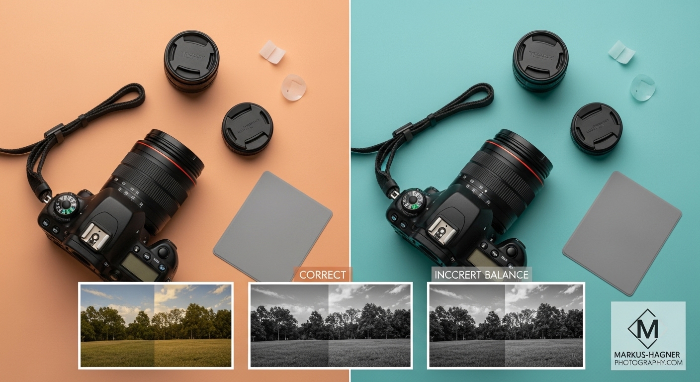
Custom White Balance with a Gray Card
This is the most accurate method for getting perfect white balance. Here’s exactly how I do it:
- Get a gray card: You can buy professional gray cards, but I’ve found that the underside of a Pringles lid or a white coffee cup lid works in a pinch!
- Position the card: Place it in the same light as your subject, filling most of the frame
- Take a reference shot: Your camera will use this to calculate the perfect white balance
- Set custom white balance: Go to your camera’s menu and select “Custom White Balance” or “PRE”
- Select the reference image: Choose the gray card shot you just took
- Start shooting: Your camera will now use this perfect white balance for all subsequent shots
Why this matters: I was shooting product photography for a client who needed exact color accuracy. The products were white, and any color cast would make them look off-color. Using a gray card for custom white balance ensured the whites were perfectly white, and the client was thrilled with the results.
Kelvin Mode (K)
This is my personal favorite method for landscape and artistic photography. Kelvin mode lets you directly set the color temperature value, giving you precise control over the warmth or coolness of your images.
How to use Kelvin mode effectively:
- Start around 5000K for neutral light
- Increase the value (make it warmer) for cool lighting conditions
- Decrease the value (make it cooler) for warm lighting conditions
- Use Live View to see the changes in real-time
My Kelvin cheat sheet:
- 2500-3000K: Tungsten lighting, very warm scenes
- 3000-4000K: Golden hour, candlelight, intimate indoor scenes
- 4000-5000K: Mixed indoor lighting, early morning/late afternoon
- 5000-5500K: Midday sun, flash photography
- 5500-6500K: Overcast days, open shade
- 6500-8000K: Heavy shade, twilight
- 8000-10,000K: Deep shade, blue hour, creative cool effects
Creative example: During a blue hour shoot in the mountains, I wanted to enhance the natural coolness of the scene. I set my Kelvin to 9000K, which made the blues even more dramatic and ethereal. The resulting image had this magical, otherworldly quality that Auto White Balance would have completely missed.
RAW vs JPEG: Why It Matters for White Balance
This is one of the most important lessons I’ve learned in my photography journey. If you’re serious about white balance and color accuracy, you need to be shooting in RAW format.
Why RAW is superior for white balance:
- Complete flexibility: RAW files contain all the original data from your camera sensor
- Non-destructive editing: You can adjust white balance without losing image quality
- Greater range: RAW files allow for more extreme white balance adjustments
- Better results: The adjustments are more precise and natural-looking
JPEG limitations:
- Baked-in settings: White balance is applied permanently to the image
- Limited adjustment: You can only make small changes before quality degrades
- Reduced quality: Each adjustment can introduce artifacts and reduce image quality
I learned this the hard way early in my career. I shot an entire wedding in JPEG, and the indoor reception lighting was terrible. I tried to fix the white balance in post-processing, but the colors looked unnatural and the image quality suffered significantly. Now I always shoot RAW for professional work, and it’s saved me countless times.
Post-Processing White Balance: Fixing It in the Digital Darkroom
Even with perfect in-camera settings, sometimes you need to fine-tune white balance in post-processing. Here are my go-to methods using popular software.
Adobe Lightroom: My Preferred Method
Lightroom makes white balance adjustment incredibly intuitive. Here’s my step-by-step process:
- Import your RAW files: Always work with RAW files for maximum flexibility
- Use the White Balance Selector tool: It looks like an eyedropper
- Click on a neutral area: Find something that should be white or gray in your image
- Fine-tune with sliders: Use the Temperature and Tint sliders for perfect adjustment
- Sync settings: Apply the same white balance to multiple shots from the same session
Pro tip: If there’s no neutral area in your image, look for something that should be neutral – like a white wall, gray concrete, or even the whites of someone’s eyes (in portraits).
Photoshop: For Precision Control
Sometimes I need more precise control than Lightroom offers, especially for complex images. Here’s how I approach white balance in Photoshop:
- Open as Camera RAW: Even JPEGs can be opened in Camera RAW for better white balance control
- Use the White Balance tool: Similar to Lightroom’s eyedropper
- Adjust Temperature and Tint: Fine-tune using the sliders
- Use Curves for advanced control: Sometimes I use individual color channel curves for precise color correction
Advanced technique: For images with mixed lighting, I sometimes use multiple adjustment layers with different white balance settings, then mask them to apply different corrections to different parts of the image.
Creative White Balance: Breaking the Rules for Artistic Effect
While accurate white balance is important for many types of photography, sometimes breaking the rules can create stunning artistic effects. I love using white balance creatively to enhance mood and atmosphere.
Warm White Balance for Intimate, Cozy Scenes
I discovered this technique during a lifestyle shoot for a coffee shop client. By intentionally using a warmer white balance (around 3000-3500K) even in daylight conditions, I created images that felt cozy, inviting, and intimate. The warm tones made the coffee look more appealing and the space feel more welcoming.
When to use warm white balance creatively:
- Romantic portraits
- Food photography (especially warm dishes)
- Interior design shots
- Golden hour landscapes (to enhance the warmth)
- Lifestyle photography
Cool White Balance for Dramatic, Moody Images
On the flip side, cool white balance can create dramatic, moody, and ethereal effects. I used this technique extensively during a fine art landscape project in Iceland. By setting my Kelvin to 8000-10,000K, I enhanced the natural coolness of the glaciers and created images that felt otherworldly and serene.
Perfect scenarios for cool white balance:
- Winter landscapes
- Architectural photography (modern buildings)
- Blue hour cityscapes
- Fine art nature photography
- Minimalist compositions
Mixed White Balance for Unique Effects
This is an advanced technique I’ve been experimenting with recently. By combining different white balance settings in post-processing (using masks and layers), I can create unique color effects that wouldn’t be possible in-camera.
Example: For a portrait session at sunset, I applied a warm white balance to the subject and a cool white balance to the background sky. The result was a striking contrast that made the subject pop while maintaining the dramatic sunset colors.
Common White Balance Problems and How to Fix Them
After years of shooting and teaching photography, I’ve identified the most common white balance problems photographers face. Let me share my solutions for each.
Problem 1: Mixed Lighting Situations
The scenario: You’re shooting indoors with window light mixed with overhead tungsten lighting. Part of your image looks natural, while another part has a horrible orange cast.
My solution:
- Identify the dominant light source: Which light is most important for your subject?
- Set white balance for the subject: Make your subject look natural first
- Use gels or filters: For professional work, I sometimes use color correction gels on lights to match color temperatures
- Fix in post-processing: Use adjustment layers and masks to correct different areas separately
Real-world fix: I was shooting a corporate headshot in an office with mixed window and fluorescent lighting. I set my white balance for the fluorescent lights (which were illuminating my subject), then used a reflector to bounce some window light as fill. In post-processing, I slightly warmed up the window-lit areas to match.
Problem 2: Auto White Balance Getting Confused
The scenario: Your camera keeps changing white balance between shots, or it’s completely wrong for the scene.
My solution:
- Switch to manual mode: Take control away from the camera
- Use a preset: Choose the preset that best matches your lighting
- Shoot in RAW: Give yourself flexibility to fix it later
- Use exposure lock: Some cameras let you lock white balance along with exposure
Lesson learned: During a fashion show, the Auto White Balance kept changing as models moved under different colored stage lights. I switched to manual Kelvin mode at 4500K and maintained consistent color throughout the event.
Problem 3: Skin Tones Look Unnatural
The scenario: Portrait subjects look too orange, too red, too green, or too blue.
My solution:
- Use a gray card: For critical portrait work, custom white balance with a gray card is unbeatable
- Check the lighting: Identify if the color cast is from the light source or reflections
- Use portrait presets: Many cameras have portrait-specific white balance settings
- Fine-tune in post-processing: Use the skin tone line in your editing software as a guide
Pro tip: I’ve found that slightly warmer white balance (around 5500K) often looks more flattering for portraits than technically “correct” white balance. The warmth adds a healthy, vibrant look to skin tones.
Also Read: 8 Best Memory Cards For Fujifilm Gfx 100 Ii
Advanced White Balance Techniques for Professionals
Once you’ve mastered the basics, there are several advanced techniques that can take your white balance skills to the next level.
Using a Color Meter for Precision
For commercial and professional work where color accuracy is absolutely critical, I sometimes use a color meter. This device measures the exact color temperature of the light and tells you the precise Kelvin and tint values to use.
When to use a color meter:
- Product photography requiring exact color matching
- Commercial work with strict brand color guidelines
- Fine art reproduction
- Professional studio work
My experience: I was shooting a product line for a cosmetics company, and the brand colors needed to be exact. Using a color meter ensured that the products’ colors were perfectly accurate across hundreds of images.
White Balance Bracketing
Some high-end cameras offer white balance bracketing, which takes multiple shots at different white balance settings. This is incredibly useful for high-stakes shooting where you can’t afford to get the white balance wrong.
How to use white balance bracketing:
- Enable bracketing in your camera menu
- Set the range: Choose how much variation you want between shots
- Shoot as normal: Your camera will take multiple images with different white balance settings
- Select the best in post-processing: Choose the perfect white balance later
Perfect for: Wedding photography, real estate, and any situation where you can’t reshoot.
Creating Custom White Balance Presets
Most professional cameras allow you to create and save custom white balance presets. This is incredibly useful for recurring shooting situations.
My custom presets:
- Studio lighting: Specific to my flash setup
- Favorite outdoor location: A local park where I often shoot
- Indoor venue: A specific event space I photograph frequently
- Golden hour: My preferred warm setting for sunset shoots
How to create custom presets:
- Set the perfect white balance using any method (gray card, Kelvin, etc.)
- Save to custom preset in your camera menu
- Name it descriptively so you’ll remember what it’s for
- Access quickly during shoots
White Balance for Different Photography Genres
Different types of photography have different white balance requirements. Let me share my genre-specific insights.
Portrait Photography
For portraits, I prioritize natural-looking skin tones above all else. Here’s my approach:
- Outdoor portraits: I often use the Cloudy preset (6000K) even on clear days. The slight warmth is flattering for skin tones.
- Indoor portraits: Tungsten preset (3200K) for regular household lights, or custom white balance with a gray card for professional results.
- Studio portraits: I always use custom white balance with a gray card for consistency across the entire shoot.
Pro tip: I’ve found that slightly warmer white balance (by about 200-300K) often looks more appealing than technically “correct” white balance for portraits. The warmth adds a healthy, vibrant quality to skin tones.
Landscape Photography
Landscape photography is where I get to be most creative with white balance. My approach varies by scene and mood:
- Sunrise/sunset: I often use Auto White Balance to preserve the natural warm colors, or slightly warm it up even more for dramatic effect.
- Daytime landscapes: Daylight preset (5500K) for neutral colors, or Cloudy preset (6000K) to add warmth and make colors pop.
- Overcast days: Cloudy preset (6000K) or Kelvin around 6500K to counteract the cool, flat light.
- Blue hour: I love using Kelvin mode around 8000-10,000K to enhance the natural coolness and create ethereal, moody images.
Personal favorite: During a trip to the Norwegian fjords, I shot the entire blue hour using Kelvin 9000K. The resulting images had this magical, almost otherworldly quality that perfectly captured the serene atmosphere.
Wedding Photography
Weddings are challenging because you’re constantly moving between different lighting conditions. Here’s my strategy:
- Preparation: I create custom presets for the specific venues ahead of time
- Ceremony: Usually Auto White Balance in RAW, with quick adjustments as needed
- Reception: Custom white balance with a gray card at the beginning, then maintain consistency
- Golden hour portraits: Cloudy or Shade preset to enhance the warm, romantic light
Critical advice: Always shoot RAW for weddings! I once shot a wedding in JPEG and had to do extensive color correction. The images never looked as good as they could have, and I learned my lesson.
Product Photography
For product photography, color accuracy is paramount. Here’s my professional approach:
- Always use RAW: Maximum flexibility for color correction
- Custom white balance: Use a gray card for every setup
- Color checker passport: For commercial work, I use a color checker passport for perfect color accuracy
- Consistent lighting: Control the lighting environment to minimize color temperature variations
Professional secret: I sometimes include a gray card or color checker in the edge of product shots (to be cropped out later). This gives me a perfect reference for post-processing color correction.
Also Read: 9 Best Memory Cards For Fujifilm X-H2
Equipment Recommendations for Perfect White Balance
Having the right tools can make a huge difference in your white balance accuracy. Here are my recommendations based on years of professional experience.
Essential Tools
Gray Cards:
- Basic option: A simple 18% gray card (under $20)
- My favorite: Lastolite Ezybalance (around $30) – it’s collapsible and has both gray and white sides
- Professional choice: X-Rite ColorChecker Passport (around $100) – includes multiple color patches for precise calibration
Why I recommend them: I carry a gray card in every camera bag. It’s saved me countless times, especially for portrait sessions and product photography where color accuracy is crucial.
Advanced Tools
Color Meters:
- Entry-level: Sekonic C-700 (around $600)
- Professional: Sekonic C-800 (around $1,000)
When you need one: I only use a color meter for commercial work where exact color matching is required. For most photography, a gray card is sufficient.
White Balance Lens Caps:
- How they work: These replace your regular lens cap and have a translucent white dome that helps set custom white balance
- My experience: I used one for a while but found it less accurate than a proper gray card. They’re convenient but not as precise.
Software Recommendations
For RAW processing:
- Adobe Lightroom Classic: My go-to for most white balance adjustments
- Capture One: Excellent color science, preferred by many studio photographers
- DxO PhotoLab: Great automatic corrections, including white balance
For advanced color work:
- Photoshop: For complex masking and layer-based corrections
- Phase One Capture One: Industry standard for commercial photography
FAQ: Answering Your White Balance Questions
What is the best white balance setting for beginners?
I recommend starting with Auto White Balance while shooting in RAW format. This gives you the safety net of automatic correction while maintaining the flexibility to adjust later in post-processing. As you get more comfortable, experiment with the different presets to understand how they affect your images.
Why do my indoor photos look orange?
Your indoor photos look orange because most household lighting (incandescent bulbs) has a very warm color temperature around 2700-3000K. Your camera’s Auto White Balance might not be compensating enough for this warmth. Try switching to the Tungsten preset (light bulb icon) or manually setting your Kelvin to around 3000K to neutralize the orange cast.
Can I fix white balance after taking the photo?
Yes, you can fix white balance in post-processing, but the results depend on your file format. If you shoot in RAW, you have complete flexibility to adjust white balance without any quality loss. If you shoot in JPEG, your adjustments will be limited and may reduce image quality. This is why I always recommend shooting in RAW for professional work.
What’s the difference between white balance and exposure?
White balance controls the color temperature of your image (how warm or cool it looks), while exposure controls the brightness (how light or dark it is). They’re separate settings that work together to create a properly exposed and color-balanced image. You can have a perfectly exposed image with terrible white balance, or perfect white balance with poor exposure.
How do I set custom white balance on my camera?
The exact steps vary by camera brand, but generally: 1) Set your camera to Custom White Balance mode (often labeled “PRE”), 2) Photograph a white or gray reference under the same lighting as your subject, 3) Go into your camera menu and select that image as your white balance reference, 4) Your camera will calculate and apply the perfect white balance for that lighting condition.
Why does my white balance keep changing between shots?
Your white balance might be changing if you’re using Auto White Balance mode, which analyzes each scene individually and adjusts accordingly. For consistent white balance across multiple shots, switch to a manual preset or custom white balance setting. This is especially important for portrait sessions or product photography where consistency is crucial.
What Kelvin should I use for golden hour?
For golden hour photography, I typically start around 5500K (Daylight preset) and adjust based on the specific warmth of the light. If I want to enhance the golden warmth, I might increase the Kelvin to 6000-6500K. If I want to maintain more neutral colors while still capturing the golden light, I’ll stay around 5000-5500K. The best approach is to experiment and see what looks best for your specific scene.
How does white balance affect RAW vs JPEG files?
With RAW files, white balance settings are just metadata instructions – the actual image data remains unchanged, giving you complete flexibility to adjust white balance in post-processing without any quality loss. With JPEG files, the white balance is “baked into” the image data, so adjustments are limited and can reduce image quality. This is why professional photographers almost always shoot in RAW.
Can I use white balance creatively?
Absolutely! While accurate white balance is important for many types of photography, creative white balance can enhance mood and atmosphere. I often use warmer white balance for intimate, cozy scenes and cooler white balance for dramatic, moody images. The key is to make intentional choices rather than accidental color casts.
What’s the best white balance for snow photography?
Snow photography can be tricky because snow reflects the color of the surrounding light, often appearing blue in shade or very warm during sunrise/sunset. I typically start with the Daylight preset (5500K) and adjust based on the specific lighting. For snowy landscapes in shade, I might use the Shade preset (7000K) to counteract the blue cast. During golden hour, I might use a warmer setting to enhance the beautiful light on the snow.
Pro Photography Tips for White Balance Mastery
After years of professional photography and teaching workshops, I’ve compiled these advanced tips that will take your white balance skills to the next level.
Tip 1: Use Live View for Real-time Feedback
One of the most powerful features of modern cameras is Live View with white balance preview. I use this constantly for landscape and portrait work. By switching to Live View and adjusting my white balance settings, I can see exactly how the colors will look before I even press the shutter. This is especially useful when using Kelvin mode for precise control.
Tip 2: Create a White Balance Reference Library
I maintain a personal library of white balance settings for different locations and lighting conditions. Whenever I shoot somewhere new, I take reference shots with different white balance settings and note which ones work best. Over time, this has become an invaluable resource that saves me time and ensures consistent results.
Tip 3: Understand the Green-Magenta Tint
Most photographers focus on the blue-yellow color temperature, but the green-magenta tint is equally important, especially under fluorescent lighting. I’ve learned to pay attention to both the Temperature and Tint sliders in post-processing. Sometimes an image needs tint adjustment even when the temperature looks correct.
Tip 4: Use White Balance Consistently Across Photo Series
When shooting a series of images that will be viewed together (like a wedding album or product catalog), consistency is crucial. I always establish a base white balance at the beginning of the shoot and maintain it throughout, only making adjustments when the lighting changes significantly. This ensures all images in the series have a cohesive look.
Tip 5: Experiment with Extreme White Balance for Artistic Effect
Don’t be afraid to push white balance to extremes for creative purposes. I’ve created stunning images by using very warm (2500K) or very cool (10,000K) settings intentionally. The key is to make it a deliberate artistic choice rather than an accident.
Tip 6: Learn to See Color Temperature Like Your Camera
Train yourself to see the color temperature of different light sources. Spend time observing how indoor lighting differs from daylight, how shade differs from direct sun, and how different times of day affect color temperature. This skill will help you anticipate white balance needs before you even raise your camera to your eye.
Tip 7: Keep a Gray Card Handy for Critical Shots
I never leave for a professional shoot without at least one gray card in my camera bag. For portrait sessions, product photography, or any situation where color accuracy is important, taking 30 seconds to set custom white balance with a gray card can save hours of post-processing and ensure perfect results.
Save This Guide for Future Reference
Photography is a journey of continuous learning, and mastering white balance is a crucial step in that journey. I recommend bookmarking this guide and referring back to it as you encounter different lighting situations in your photography.
Remember, the goal isn’t just technically perfect white balance – it’s about using white balance as a creative tool to express your vision and create images that resonate with viewers. Whether you’re going for absolute color accuracy or using white balance artistically to enhance mood, understanding these fundamentals will give you the confidence and control to create the images you envision.
Ready to Take Your Photography to the Next Level?
Now that you understand white balance, it’s time to put this knowledge into practice. Grab your camera, try different white balance settings, and see how they affect your images. Experiment with both technical accuracy and creative expression. The more you practice, the more intuitive white balance will become.
Remember, every professional photographer started exactly where you are now. The difference is practice, persistence, and a willingness to learn. I can’t wait to see the amazing images you’ll create with your newfound white balance mastery!
Happy shooting, and may your colors always be perfectly balanced!