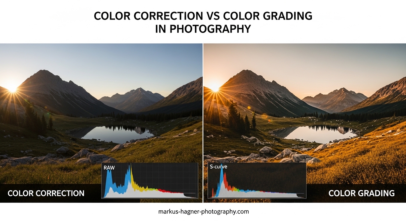
If you’ve ever felt confused about the difference between color correction and color grading in photography, you’re not alone. Many photographers use these terms interchangeably, but they refer to two distinctly different stages of the post-processing workflow. Color correction is a technical process that fixes color problems to make your image look natural and accurate, while color grading is a creative process that applies stylistic choices to evoke mood and establish your visual voice.
Understanding color correction vs color grading is essential for any photographer who wants to take their editing skills to the next level. In this guide, I’ll break down exactly what each process involves, when to use them, and how they fit into a professional photography workflow.
What Is Color Correction in Photography?
Color correction is the technical foundation of photo editing. Its primary goal is to fix color problems and make your image look as natural and accurate as possible. When you color correct a photo, you’re essentially asking: “Does this look like what I saw with my own eyes?”
The process typically addresses issues that occurred during capture. Mixed lighting conditions, incorrect white balance settings, and color casts from reflective surfaces can all introduce unwanted color shifts. Color correction neutralizes these problems.
Common Color Correction Tasks
White balance adjustment is usually the first step. If your camera recorded a scene as too warm (orange/yellow) or too cool (blue), you shift the color temperature until neutral tones appear truly neutral. A gray card or white object in your scene makes this process much more accurate.
Exposure and contrast corrections often go hand-in-hand with color work. An underexposed image might show muddy, desaturated colors, while an overexposed shot can lose color detail in highlights. Getting your tonal range right sets the stage for accurate color.
Saturation and vibrance adjustments help recover colors that got washed out during capture. The key difference: saturation boosts all colors equally, while vibrance prioritizes less-saturated colors and protects skin tones from looking unnatural.
Technical Tools for Color Correction
Most photo editing software provides similar correction tools. In Adobe Lightroom and Capture One, you’ll find white balance eyedroppers, temperature and tint sliders, and basic exposure controls. These tools let you make precise, targeted adjustments.
For more advanced correction, curves adjustments give you granular control over individual color channels. The histogram and scopes show you exactly where color problems exist, helping you make informed decisions rather than guessing.
Skin tone protection is a critical consideration during color correction. Nothing screams “amateur edit” like orange or green-tinted skin. Professional photographers often use HSL (Hue, Saturation, Luminance) panels to isolate and adjust specific color ranges while leaving skin tones untouched.
What Is Color Grading in Photography?
Color grading is where artistry enters the equation. Unlike correction, which aims for accuracy, grading is about creative expression. You’re no longer asking “Is this correct?” but rather “How do I want this to feel?”
In photography, color grading applies specific tones, contrasts, and color relationships to establish mood, enhance storytelling, or create a recognizable style. Think of it as painting with light after the shutter has closed.
Creative Approaches to Color Grading
Cinematic looks draw inspiration from film. Teal and orange color grading has become ubiquitous because complementary colors create visual tension and separation. Shadows might lean toward cool teals while skin tones and highlights stay warm.
Vintage or film-emulation grades replicate the characteristics of analog photography. Reduced contrast in highlights, subtle color shifts, and intentional imperfections give digital photos a nostalgic, organic feel.
Moody grades emphasize atmosphere over accuracy. Deep shadows, muted colors, and selective contrast draws viewers into an emotional space. Portrait photographers often use this approach to create intimate, contemplative images.
Tools for Color Grading
Color wheels (also called color grading panels) have become standard in photo editing software. These tools let you add color tints to shadows, midtones, and highlights independently. Adobe Lightroom introduced a dedicated color grading panel in recent versions, making these techniques more accessible.
Split toning was the predecessor to modern color wheels. It applies separate color tints to highlights and shadows, creating complementary or analogous color schemes. While less flexible than three-way wheels, split toning remains a quick way to add stylistic color.
LUTs (Lookup Tables) are preset color transformations you can apply with a single click. Originally developed for video, LUTs have become popular in photography for quickly achieving specific looks. Think of them as Instagram filters with professional-grade control.
Color curves offer the most precise grading control. By manipulating RGB curves, you can create complex color relationships impossible to achieve with simpler tools. The learning curve is steeper, but the creative possibilities expand dramatically.
Color Correction vs Color Grading: Key Differences
The distinction between these two processes comes down to intent and approach. Here’s how they compare across several important dimensions:
| Aspect | Color Correction | Color Grading |
|---|---|---|
| Purpose | Fix technical issues, achieve accuracy | Create mood, establish style |
| Approach | Objective, technical | Subjective, creative |
| When to Use | Always, on every photo | When style or mood matters |
| Primary Tools | White balance, exposure, HSL | Color wheels, curves, LUTs |
| Goal | Natural, neutral baseline | Intentional, stylized look |
| Workflow Position | First (foundational) | Second (after correction) |
Objective vs Subjective
Color correction has right and wrong answers. If your photo has a green color cast from fluorescent lighting, removing that cast is objectively correct. Skin tones that appear orange or magenta need to be brought back to natural hues. There’s a technical standard you’re trying to meet.
Color grading, conversely, has no correct answer. A teal-and-orange look isn’t “better” than a warm, golden grade. Your creative choices depend on your artistic vision, the story you’re telling, and the emotional response you want to evoke.
Technical vs Creative Mindset
When I color correct, I think like a technician. I analyze the histogram, check for color casts, and ensure exposure is balanced. The goal is consistency and accuracy across all images in a set.
When I color grade, I switch to an artistic mindset. What emotion does this scene evoke? How can color enhance that feeling? What does my personal style look like? These questions guide creative decisions that go beyond technical correctness.
When to Use Color Correction vs Color Grading
Every photo needs color correction. Not every photo needs color grading. Understanding when to apply each process helps you work efficiently and avoid over-processing your images.
Situations Requiring Color Correction
Mixed lighting scenarios almost always need correction. If you shot a portrait near a window with overhead tungsten lights, your subject’s face might show two different color temperatures. Balancing these competing light sources creates a natural foundation.
Incorrect in-camera white balance demands correction. Even experienced photographers sometimes forget to adjust white balance when moving between indoor and outdoor locations, or when shooting under unusual lighting like neon or colored LEDs.
Color casts from reflective surfaces can tint your entire image. A red brick wall, green grass, or blue sky bouncing light onto your subject can create unwanted color contamination that needs to be neutralized.
Underwater photography requires significant color correction. Water absorbs red wavelengths first, leaving images overly blue-green. Restoring warm tones brings underwater scenes back to visibility.
Situations Calling for Color Grading
Portrait and wedding photography often benefits from consistent color grading. Developing a signature look helps your work stand out and creates visual cohesion across albums and portfolios.
Landscape photography uses grading to enhance mood and atmosphere. A sunrise might be graded warm and golden, while a moody forest scene could lean toward cool, desaturated tones.
Fine art photography relies heavily on grading for artistic expression. The color treatment becomes part of the artwork itself, not just a technical necessity.
Commercial and editorial work may require grading to match brand guidelines or publication styles. A fashion magazine has different color expectations than a nature documentary.
The Critical Workflow Order
Always color correct before you color grade. This isn’t optional advice; it’s fundamental to getting good results. Here’s why.
Grading builds upon a neutral foundation. If you apply creative color to an already-color-cast image, you’re compounding problems rather than solving them. The unwanted colors interact with your intentional choices in unpredictable ways.
Working from a corrected baseline lets you see clearly what your grading is doing. You can make informed creative decisions because you know your starting point is accurate. Many photographers I’ve spoken with on forums emphasize this: grading from neutral gives you genuine insight into how your look affects the scene.
Consistency across a photo set requires correction first. If you grade without correcting, each image starts from a different color place, making it nearly impossible to achieve a unified look across multiple shots.
Tools and Software for Color Work in Photography
The software you choose shapes your color workflow. Each major photo editor approaches color differently, with distinct strengths and limitations.
Adobe Lightroom
Lightroom remains the most popular choice for photo color work. Its Develop module provides white balance controls, tone curves, HSL panels, and the newer color grading tool with three-way wheels. The non-destructive workflow preserves your original files while allowing extensive experimentation.
Lightroom excels at batch processing, making it ideal for wedding and event photographers who need to color correct hundreds of images efficiently. Presets and profiles let you save and apply color grading looks across your catalog.
Capture One
Capture One offers more sophisticated color tools than Lightroom, particularly for color grading. Its color editor provides precise control over specific hue ranges, and the skin tone tool makes protecting and adjusting flesh tones straightforward.
Many professional photographers prefer Capture One for its superior raw processing and color accuracy. The learning curve is steeper, but the results often justify the effort for commercial and fine art work.
Adobe Photoshop
Photoshop provides the most advanced color tools available, but with maximum power comes maximum complexity. Curves adjustment layers, channel mixing, and LAB color mode offer creative possibilities impossible in raw processors.
Photoshop is typically used for targeted color work on specific image areas, or for complex compositing where color matching between elements is critical.
Other Options
Luminar Neo offers AI-powered color tools that can accelerate workflows. DxO PhotoLab excels at automatic corrections based on your specific camera and lens combination. Free options like darktable and RawTherapee provide capable color tools without subscription costs.
Mobile apps like Lightroom Mobile and Snapseed have made serious color work possible on phones and tablets. While less precise than desktop software, these tools enable field editing and quick social media posts.
Practical Workflow Tips
Over years of editing photos, I’ve developed a reliable workflow that produces consistent results. Here’s my step-by-step process.
Step 1: Import and evaluate. Before touching any sliders, look at each photo and identify obvious color problems. What needs fixing? What mood does the scene suggest?
Step 2: Correct white balance first. Use the eyedropper tool on a neutral gray or white area, or manually adjust temperature and tint until whites look white.
Step 3: Adjust exposure and contrast. Get your tonal range right before addressing color further. This reveals color issues that were hidden by exposure problems.
Step 4: Fine-tune with HSL adjustments. Target specific color ranges that still need work. Protect skin tones while adjusting other elements.
Step 5: Apply creative grading. Only after correction is complete, add your stylistic color using wheels, curves, or LUTs.
Step 6: Evaluate and refine. Step away from the image for a few minutes, then return with fresh eyes. Does the grading serve the image, or does it distract?
Common Mistakes to Avoid
Over-grading is the most frequent error I see. Heavy color treatment can make photos look artificial and dated. Subtle grading often ages better than aggressive looks.
Neglecting skin tones while grading is another pitfall. Your creative color treatment should enhance, not fight against, natural flesh tones. Many photographers recommend grading the environment while protecting skin.
Skipping correction entirely leads to inconsistent results. Even if your final look is heavily stylized, starting from a neutral corrected base gives you control and predictability.
Frequently Asked Questions
What is the difference between color correction and color grading?
Color correction is a technical process that fixes color problems to make images look natural and accurate, addressing issues like white balance, color casts, and exposure. Color grading is a creative process that applies stylistic color choices to establish mood, enhance storytelling, or create a recognizable visual style. Correction comes first in the workflow, followed by grading.
Should I color correct or color grade first?
Always color correct before color grading. Color correction establishes a neutral, accurate baseline that serves as the foundation for creative work. If you grade without correcting first, unwanted color casts will interact unpredictably with your creative choices, making it difficult to achieve consistent results.
What is color correction in photography?
Color correction in photography is the technical process of adjusting white balance, exposure, saturation, and color casts to make an image look natural and accurately represent the real-world scene. It addresses problems introduced during capture, such as incorrect white balance settings, mixed lighting conditions, or color contamination from reflective surfaces.
Is color grading necessary in photography?
Color grading is not strictly necessary for every photo, but it adds significant value when you want to establish a mood, create a recognizable style, or enhance the emotional impact of your images. Portrait, wedding, landscape, and fine art photographers often benefit most from consistent color grading as part of their visual identity.
Conclusion
Understanding color correction vs color grading transforms your editing from random adjustments to intentional craft. Color correction gives you the technical foundation: accurate whites, balanced exposure, and natural skin tones. Color grading adds your artistic voice: mood, style, and emotional resonance.
Remember the workflow order: correct first, grade second. This approach gives you control, consistency, and predictability. Whether you’re editing wedding photos in Lightroom or creating fine art in Capture One, this fundamental principle applies.
The best way to develop your color skills is practice. Start by correcting images until they look natural, then experiment with subtle grading to see how color affects mood. Over time, you’ll develop an intuitive sense for when and how to apply each technique.