Golden hour photos have that magical quality every photographer chases. Warm tones, soft light, and an almost cinematic glow that makes portraits and landscapes look stunning. But what if I told you that you can recreate this look in Lightroom, even if you shot at noon on an overcast day?
The secret lies in the Color Grading Wheels. While most photographers reach for the temperature slider or HSL panel, Color Grading gives you precise control over highlights, midtones, and shadows separately. I have spent years refining this technique, and in this tutorial, I will show you exactly how to create a warm golden hour look in Lightroom using Color Grading Wheels.
By the end of this guide, you will have specific slider values, troubleshooting tips, and multiple golden hour styles you can apply to any photo. Let me walk you through the entire process step by step.
What Is the Golden Hour Look and Why Does It Matter?
Golden hour refers to the period shortly after sunrise or before sunset when the sun sits low on the horizon. During this time, sunlight travels through more atmosphere, scattering blue light and leaving behind warm orange and yellow tones. The result is soft, diffused light with rich golden hues that photographers love.
The golden hour look in editing replicates these characteristics: warm highlights, gentle contrast, flattering skin tones, and an overall sense of warmth and atmosphere. Whether you are editing portraits, landscapes, or street photography, adding this golden warmth can transform an ordinary image into something special.
Not every photo gets shot during actual golden hour. Weddings happen at noon, travel shots happen whenever you arrive, and sometimes the weather simply does not cooperate. That is where post-processing comes in. Using Lightroom Color Grading Wheels, you can add that golden warmth to photos taken at any time of day.
Understanding Color Grading Wheels in Lightroom
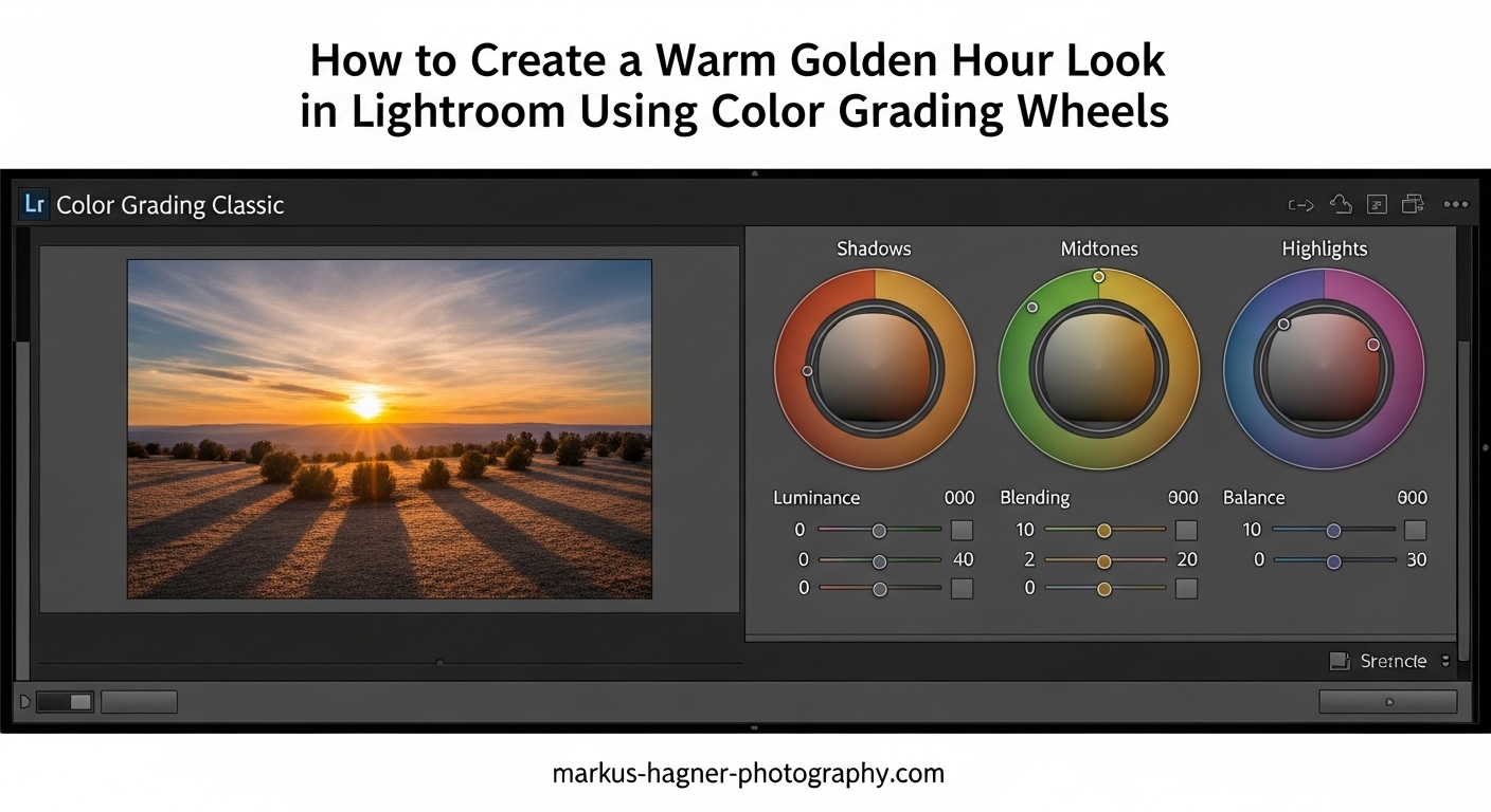
Before diving into the tutorial, let me explain what Color Grading Wheels are and why they are perfect for creating golden hour looks. You will find the Color Grading panel in the Develop module, located in the right panel between Tone Curve and HSL/Color.
The Three Wheels: Highlights, Midtones, and Shadows
Color Grading in Lightroom uses three color wheels, each controlling a different tonal range. The Highlight wheel affects the brightest parts of your image, perfect for adding golden warmth to skies and bright areas. The Midtone wheel controls the middle tones, which is where most of your subject typically lives. The Shadow wheel adjusts the darkest areas, allowing you to add cool or warm tones to shadows for color contrast.
Each wheel has three controls: Hue, Saturation, and Luminance. Hue determines the color you are adding, Saturation controls how intense that color is, and Luminance adjusts the brightness of that tonal range. By clicking and dragging inside the wheel, you simultaneously set Hue and Saturation, while the sliders below control Saturation and Luminance more precisely.
Blending and Balance Sliders
Below the wheels, you will find two important controls. The Blending slider determines how much the color grading from each wheel overlaps between tonal ranges. Higher blending creates smoother transitions, while lower blending keeps the effects more separate. The Balance slider shifts the tonal boundaries, letting you adjust what counts as highlight, midtone, or shadow.
Color Grading vs Split Toning
Color Grading replaced the old Split Toning panel in recent Lightroom versions. Split Toning only let you add color to highlights and shadows. Color Grading adds midtone control plus luminance adjustments, making it far more powerful for creating the golden hour look. If you learned on older tutorials mentioning split toning, know that Color Grading is the modern, more capable version.
How to Create a Warm Golden Hour Look in Lightroom Using Color Grading Wheels
Now for the main event. I will walk you through my complete golden hour editing workflow, starting with basic panel preparation and finishing with the Color Grading Wheels. Each step includes specific slider values you can use as starting points.
Step 1: Basic Panel Preparation
Before touching Color Grading, set a solid foundation in the Basic panel. Start with White Balance. Increase the Temperature slider to around +15 to +25 for a subtle warming effect. Go too high here and you lose the ability to fine-tune with Color Grading. For Tint, a slight move toward magenta (+5 to +10) often complements warm tones nicely.
Next, adjust Exposure if needed. Golden hour photos typically have slightly elevated midtones, so adding +0.1 to +0.3 exposure can help. For Contrast, I usually keep it neutral or slightly positive (+5 to +10) at this stage.
Highlights and Shadows are crucial. Pull Highlights down to -20 to -40 to recover sky detail and prevent blown-out bright areas. Lift Shadows to +20 to +40 to open up dark areas while maintaining that golden hour mood. This contrast reduction in the basic panel actually helps the Color Grading work more effectively.
Step 2: Color Grading the Highlight Wheel
Open the Color Grading panel and click on the Highlights wheel. This is where most of your golden warmth comes from. For a classic golden hour look, click and drag toward the orange-yellow area of the wheel.
Here are my recommended starting values for the Highlight wheel:
Hue: 35-45 (orange-yellow range)
Saturation: 25-40 (moderate intensity)
Luminance: +5 to +15 (slight brightening)
The exact Hue value depends on your photo. Portraits often benefit from warmer values around 35, while landscapes can handle slightly more yellow at 45. Start with Saturation at 30 and adjust based on how intense you want the effect. Too much saturation here makes photos look unnatural.
Step 3: Color Grading the Shadow Wheel
The Shadow wheel creates color contrast that makes golden highlights pop. For a complementary look, add cool tones to shadows. This mimics how real golden hour light works, where shadows often have a blue cast from the sky.
Recommended Shadow wheel values:
Hue: 200-230 (blue to blue-purple range)
Saturation: 10-25 (subtle, not dominant)
Luminance: 0 to -10 (slight darkening for depth)
Alternatively, for a warmer overall look, you can add subtle orange to shadows as well. Use Hue around 30-40 with Saturation at 10-15. This creates a cohesive warm tone throughout the image.
Step 4: Color Grading the Midtone Wheel
Most tutorials skip the Midtone wheel, but it is essential for a natural golden hour look. Midtones affect skin tones, foliage, and most of your subject. The goal here is subtle warmth that ties highlights and shadows together.
Recommended Midtone wheel values:
Hue: 40-50 (slightly more yellow than highlights)
Saturation: 10-20 (very subtle)
Luminance: 0 to +5 (neutral or slight lift)
The key with midtones is restraint. Too much saturation here makes the entire photo look oversaturated. Think of the Midtone wheel as a unifying element that bridges your highlight and shadow adjustments.
Step 5: Adjusting Blending and Balance
With your three wheels set, fine-tune the Blending and Balance sliders. Blending controls how smoothly the colors transition between tonal ranges. For golden hour looks, I prefer Blending around 40-60. Lower values create more distinct color separation, while higher values blend everything together more smoothly.
Balance shifts the tonal boundaries. Moving Balance toward Highlights (+10 to +30) means more of the image gets treated as midtones and shadows, which can be useful if your photo is overall bright. Moving toward Shadows (-10 to -30) expands the highlight range, giving more coverage to your golden warmth.
Step 6: Fine-Tuning with the HSL Panel
After Color Grading, head to the HSL/Color panel for targeted adjustments. The orange and yellow sliders are your friends here. In the Hue tab, shift Orange slightly toward yellow (-5 to -10) for more golden skin tones. Shift Yellow slightly toward orange (+5 to +10) for richer golden light.
In the Saturation tab, increase Orange saturation by +10 to +20 to enhance golden warmth. For Yellow, a similar increase of +10 to +15 works well. Be careful with skin tones here. If faces start looking too orange, back off the Orange saturation.
In the Luminance tab, increasing Orange luminance (+10 to +20) creates that glowing effect characteristic of golden hour light. This is especially effective for backlit portraits where you want skin to appear luminous.
Step 7: Optional Masking for Selective Application
Sometimes you want golden warmth on your subject but not on everything. This is where masking comes in. Create a Select Subject mask and apply additional Color Grading warmth just to your subject. Or use a Linear Gradient over the sky to enhance golden tones in highlights while leaving foreground more natural.
For portraits, I often create a Subject mask and increase Temperature by +10 to +15 just on the person. This adds extra warmth to skin tones while keeping the background cooler for color contrast.
Step 8: Final Touches
With Color Grading complete, add finishing touches in the Effects panel. Dehaze at +10 to +20 can add subtle contrast and atmosphere that complements golden tones. Clarity at +5 to +15 adds definition, but be careful with portraits as it can emphasize skin texture.
A subtle vignette can focus attention on your subject. Set Amount to -10 to -20 and Midpoint to 50-70 for a gentle darkening at the edges. For golden hour looks, a warm vignette (increase Temperature in the vignette settings) can enhance the overall mood.
Different Golden Hour Styles: Subtle vs Intense
Not every photo needs the same intensity of golden warmth. Here are three golden hour styles with specific settings for each.
Subtle Golden Hour
This style enhances existing warm light without looking processed. Perfect for photos that already have good light but need a gentle boost.
Highlight wheel: Hue 40, Saturation 15-20, Luminance +5
Shadow wheel: Hue 210, Saturation 8-12, Luminance 0
Midtone wheel: Hue 45, Saturation 8-10, Luminance 0
Blending: 50, Balance: 0
Medium Golden Hour
A balanced look that works for most situations. Warm and inviting without being overwhelming.
Highlight wheel: Hue 40, Saturation 30, Luminance +10
Shadow wheel: Hue 220, Saturation 15, Luminance -5
Midtone wheel: Hue 45, Saturation 15, Luminance +5
Blending: 50, Balance: +10
Intense Golden Hour
A dramatic, cinematic look for maximum impact. Great for artistic portraits or moody landscapes.
Highlight wheel: Hue 35, Saturation 45, Luminance +15
Shadow wheel: Hue 200, Saturation 25, Luminance -10
Midtone wheel: Hue 40, Saturation 20, Luminance +5
Blending: 40, Balance: +20
Remember, these are starting points. Every photo is different, so adjust based on your specific image and personal taste.
Troubleshooting Common Golden Hour Editing Problems
Even with specific settings, things can go wrong. Here are the most common problems I see and how to fix them.
Skin Tones Look Too Orange
This is the number one complaint I hear. If faces look unnatural, the culprit is usually too much orange saturation in the Highlight wheel or HSL panel. Reduce Highlight wheel Saturation by 10-15 points. In the HSL panel, reduce Orange saturation and shift Orange hue slightly toward red. You can also create a Subject mask and desaturate slightly just on skin areas.
The Entire Photo Looks Oversaturated
When everything looks too colorful, you have likely pushed multiple saturation controls too far. Step back and reduce Saturation on all three Color Grading wheels by 10-15 points. Also check your Vibrance and Saturation sliders in the Basic panel. Sometimes the solution is simply reducing overall saturation by -5 to -10.
Shadows Look Muddy or Weird
If your shadows have an unpleasant color cast, the Shadow wheel settings may be too aggressive. Try reducing Shadow wheel Saturation to below 15. Alternatively, match the Shadow wheel hue to your Highlight wheel for a more cohesive warm look throughout, rather than introducing cool tones.
Greens and Blues Compete with Golden Tones
Foliage and sky can clash with warm golden tones. In the HSL panel, desaturate Greens by -10 to -20 and shift their hue slightly toward yellow. For skies, desaturate Blues and Cyans slightly. This prevents competing colors from fighting with your golden warmth.
The Effect Looks Fake or Unnatural
An artificial look usually means too much of everything. The key to natural golden hour is subtlety. Reduce all your Color Grading saturation values by about 25%. Then increase them slowly until the effect enhances the photo without announcing itself. Natural golden hour light is gentle, not overwhelming.
Frequently Asked Questions
How to get the golden hour look in Lightroom?
To get the golden hour look in Lightroom, start by warming the white balance (Temperature +15 to +25), then use Color Grading Wheels to add orange-yellow tones to highlights (Hue 35-45, Saturation 25-40) and subtle cool tones to shadows (Hue 200-230, Saturation 10-25). Fine-tune with HSL adjustments to Orange and Yellow luminance and saturation.
How to color grade for golden hour?
Color grading for golden hour involves using the Highlight wheel to add warm orange-yellow tones (Hue 35-45), the Shadow wheel for complementary cool tones or additional warmth, and the Midtone wheel to unify the look. Adjust Blending to 40-60 and Balance based on your image’s tonal distribution.
How to make photos look warm in Lightroom?
To make photos look warm in Lightroom, increase the Temperature slider in the Basic panel (+10 to +30), add orange-yellow tones using Color Grading Wheels, and boost Orange and Yellow saturation in the HSL panel. The Color Grading approach gives you more control than just temperature adjustments alone.
How to add a warm glow in Lightroom?
To add a warm glow in Lightroom, use the Highlight wheel in Color Grading with Luminance set to +10 to +20 along with warm orange hues. Then increase Orange Luminance in the HSL panel by +10 to +20. This creates that luminous, glowing effect characteristic of golden hour light.
Conclusion
Creating a warm golden hour look in Lightroom using Color Grading Wheels gives you precise control over every tonal range. By adding warm orange-yellow tones to highlights, balancing with cool or warm shadows, and unifying with subtle midtone adjustments, you can transform any photo into a golden hour masterpiece.
Start with the specific slider values I shared, then experiment to find your own style. Save your favorite settings as a preset for quick application to future photos. With practice, you will develop an intuition for exactly how much warmth each image needs.
Now it is your turn. Open Lightroom, grab a photo, and start experimenting with these Color Grading techniques. The golden hour look is just a few slider adjustments away.