Converting a color photo to black and white is more than just removing saturation. When I learned how to convert photos to black and white in Lightroom with full tonal control, my monochrome images transformed from flat and lifeless to dramatic and compelling. The secret lies in understanding how Lightroom translates colors into grayscale tones, and knowing exactly which tools to use for maximum impact.
This guide covers everything you need to master B&W conversion in Lightroom. You will learn five different methods for controlling tonality, a complete step-by-step workflow, and how to avoid the common mistakes that leave photos looking muddy and gray.
Why Tonal Control Matters in Black and White Photography?
Without color, your image relies entirely on brightness, contrast, and texture to create visual impact. Tonal control means managing how different colors translate into shades of gray, and ensuring your final image has a full range from deep blacks to bright whites.
Many photographers simply drag the saturation slider to -100 and call it done. The result is usually a flat, lifeless image where red, green, and blue all become similar middle gray tones. Professional black and white photography requires intentional control over how each color renders as a gray value.
Think of it this way: traditional black and white film photographers used colored filters (red, orange, yellow, green) to darken or lighten specific colors in their images. A red filter would darken blue skies dramatically while lightening skin tones. Lightroom’s B&W Mix gives you this same power digitally.
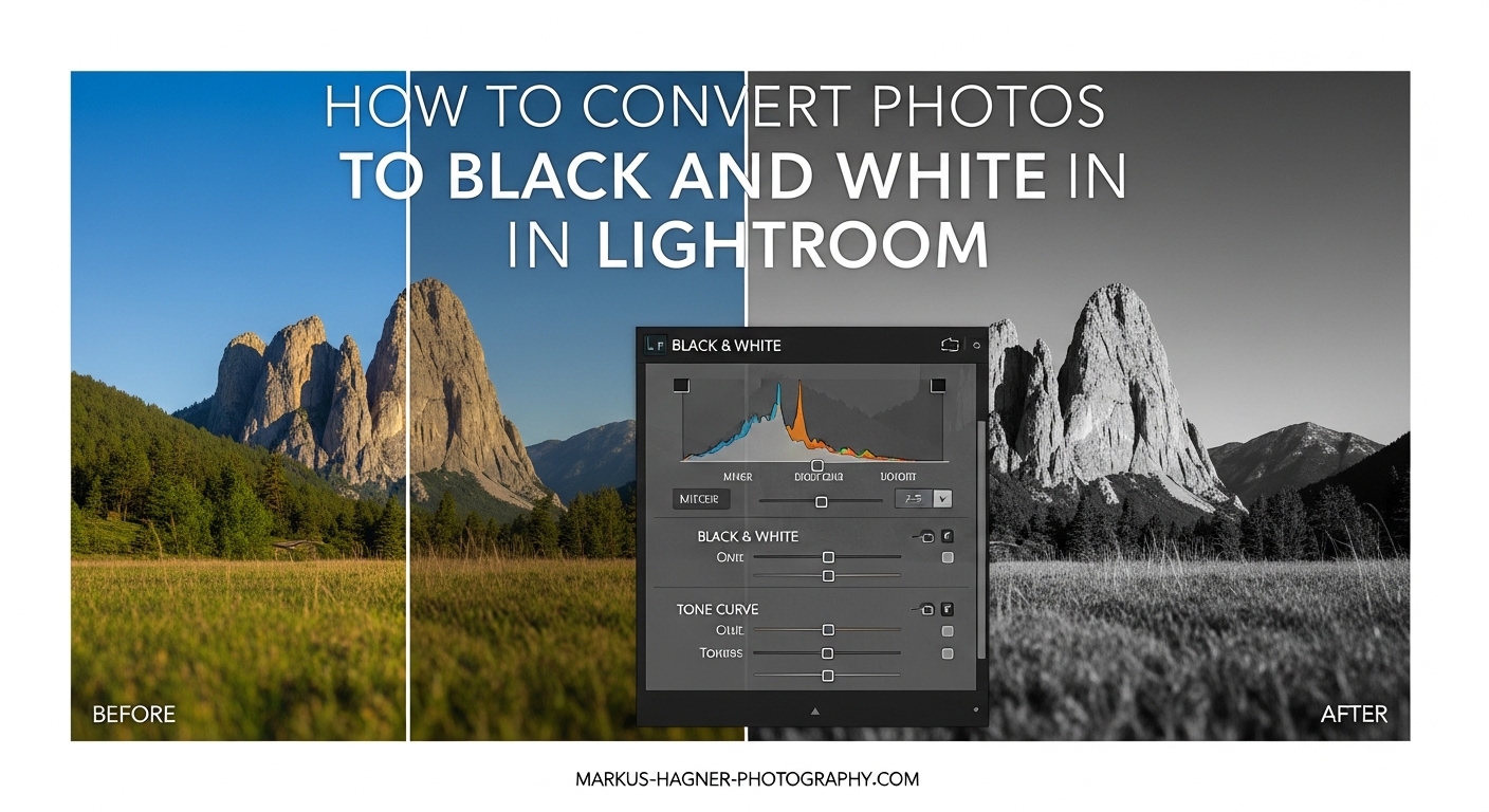
How to Convert Photos to Black and White in Lightroom: Method 1 – The B&W Mix Panel
The B&W Mix panel (also called the Color Mixer in newer Lightroom versions) is the most important tool for black and white conversion. It controls how each original color translates into a gray tone.
Accessing the B&W Mix
Open your image in the Develop module. In the Basic panel, click the dropdown that says “Color” and change it to “Black & White.” Alternatively, press “V” on your keyboard as a shortcut. This automatically opens the B&W Mix panel below.
Understanding Each Slider
The B&W Mix contains eight color sliders: Red, Orange, Yellow, Green, Aqua, Blue, Purple, and Magenta. Moving a slider to the right makes that color lighter in the black and white version. Moving it left makes that color darker.
Here are practical examples of how I use these sliders:
Blue skies: Drag the Blue slider left to darken skies and make clouds pop. This mimics using a red or orange filter on traditional B&W film. I typically use values between -30 and -70 for dramatic skies.
Skin tones: Orange and Red control skin tones. Increasing Orange slightly (+10 to +20) brightens skin, while decreasing it creates a moodier look. Be careful with the Red slider on portraits – small adjustments go a long way.
Foliage and vegetation: The Green and Yellow sliders control grass, trees, and leaves. Increasing Green (+15 to +30) brightens foliage, while decreasing creates darker, more dramatic vegetation.
Targeted Adjustment Tool: Click the circle icon in the top left of the B&W Mix panel, then click and drag directly on your image. Lightroom automatically adjusts the slider for the color under your cursor. Drag up to lighten, down to darken.
Method 2 – Setting Black and White Points
Full tonal control requires establishing a true black point and white point in your image. Without this, black and white photos often appear muddy with gray blacks and dull whites.
Using the Histogram and Clipping Indicators
Look at the histogram in the top right of the Develop module. A well-exposed black and white image should have data spanning from the left edge (shadows) to the right edge (highlights). Gaps at either end indicate unused tonal range.
Press “J” to toggle clipping indicators. When active, areas that are pure black show as blue, and areas that are pure white show as red on your image.
The Blacks Slider Technique
Hold the Alt (Option on Mac) key while dragging the Blacks slider. This shows you exactly where clipping begins. Slowly drag left until you see the first few pixels appear – these are your true blacks. Back off slightly to preserve some shadow detail if needed.
I typically use Blacks values between -20 and -50 for black and white images, but this depends entirely on the photo.
The Whites Slider Technique
Same approach for the Whites slider. Hold Alt and drag right until you see the first red pixels appear. These are your pure whites. For high-key images, you might want more clipping. For low-key moody shots, keep whites restrained.
Method 3 – Tone Curve for Advanced Tonal Control
The Tone Curve gives you precise control over specific tonal ranges. While the Basic panel adjusts broad categories, the curve lets you target exact brightness values.
Point Curve vs Parametric Curve
Click the curve icon in the Tone Curve panel to switch between point curve and parametric mode. Point curve lets you click directly on the curve to add control points. Parametric uses sliders for Highlights, Lights, Darks, and Shadows.
Creating an S-Curve for Contrast
A classic S-curve adds contrast to black and white images. Click to add a point near the top right of the curve and drag slightly up. Add another point near the bottom left and drag down. This steepens the midsection of the curve, increasing contrast where it matters most.
Be careful not to overdo it. Subtle curves usually look more natural and print better than extreme adjustments.
Targeted Tonal Adjustments
For precise control, click the target icon in the top left of the Tone Curve panel. Then click on a specific area of your image and drag up or down. This adjusts the curve at exactly the brightness level of that area.
Method 4 – Presence Adjustments: Texture, Clarity, and Dehaze
The Presence sliders in the Basic panel add depth and dimension to black and white images. Each one affects different types of detail.
Texture for Fine Details
Texture affects medium-sized details without touching edges or large tonal areas. For landscapes, I often increase Texture (+15 to +30) to bring out foliage detail and rock textures. For portraits, I decrease Texture (-10 to -20) to smooth skin while maintaining structure.
Clarity for Midtone Contrast
Clarity increases local contrast in the midtones. It makes images look “crisper” but can create an over-processed look if pushed too far. For black and white, I typically use Clarity values between +10 and +40.
Portraits generally need less Clarity (or even negative values), while architecture and street photography can handle more.
Dehaze for Atmospheric Depth
Dehaze was designed to cut through haze, but it also adds contrast and saturation – which converts to tonal depth in black and white. Small positive values (+5 to +15) can add drama. Negative Dehaze creates a softer, more ethereal look.
Method 5 – Gradient Mask Approach (Advanced Technique)
This technique from photographer Cemal Ekin offers unique control by converting to black and white through masking rather than the B&W treatment option.
Step 1: Create a Global Gradient Mask
Click the Masking icon (or press M) and select Linear Gradient. Draw a gradient that covers your entire image from edge to edge. This creates a mask affecting the whole photo.
Step 2: Eliminate Saturation
In the mask adjustment panel, drag Saturation to -100. Your image is now black and white, but here’s the advantage: you still have access to all the color controls.
Step 3: Use Temp and Tint for Tonal Shifts
With saturation at zero, the Temp and Tint sliders now shift tonal values rather than color. Dragging Temp toward blue makes certain tones darker, while yellow makes them lighter. This gives you another way to control how different colors render as gray values.
This method is particularly useful when you want to fine-tune tonal relationships without committing to the B&W treatment, which locks you out of certain color adjustments.
Complete Step-by-Step Workflow
Here is the complete workflow I use for converting photos to black and white in Lightroom:
Step 1: Open your image in the Develop module and assess the color photo. Make any basic exposure corrections first.
Step 2: Convert to black and white by pressing V or selecting “Black & White” from the Treatment dropdown in the Basic panel.
Step 3: Adjust the B&W Mix sliders to control how colors translate to gray tones. Focus on the dominant colors in your image.
Step 4: Set black and white points using the Blacks and Whites sliders with Alt-held clipping preview.
Step 5: Add Presence adjustments (Texture, Clarity, Dehaze) appropriate to your subject.
Step 6: Fine-tune with the Tone Curve for additional contrast and tonal shaping.
Step 7: Use masking for selective dodging and burning if needed.
Step 8: Apply split toning or color grading if you want a toned look (sepia, platinum, etc.).
Step 9: Check your histogram for full tonal range and make final adjustments.
Common Mistakes to Avoid
Through teaching this technique to many photographers, I see the same mistakes repeatedly:
Over-processing with Clarity: Too much Clarity creates an artificial, “crunchy” look. Start with +10 and increase only if needed.
Crushed blacks: Aggressive black point adjustments destroy shadow detail. Use clipping preview and back off when detail disappears.
Ignoring the B&W Mix: Simple desaturation never looks as good as intentional B&W Mix adjustments.
Not checking the histogram: Always verify you have data across the full tonal range.
FAQ
How do you convert photos to black and white in Lightroom?
How to apply auto tone to all photos in Lightroom?
How to make a picture fully black and white?
How do I turn multiple photos black and white in Lightroom?
Conclusion
Learning how to convert photos to black and white in Lightroom with full tonal control transforms your monochrome photography from flat snapshots to compelling fine art images. The key is understanding that B&W conversion is not just desaturation – it is about intentionally controlling how colors translate to gray tones.
Start with the B&W Mix panel for your primary tonal adjustments. Set proper black and white points for full tonal range. Add Presence adjustments for texture and impact. Use the Tone Curve for fine-tuning. And for advanced control, experiment with the gradient mask approach.
The best way to develop your eye for black and white is practice. Convert the same image using different approaches and compare the results. Over time, you will develop an intuitive sense for which techniques work best for different subjects and styles.