I remember the first time I printed one of my landscape photos at home. The image on my screen showed rich, saturated greens in the forest canopy and deep, detailed shadows in the tree line. But when that print came out of my printer, the greens looked flat and muddy, and the shadow detail had vanished into solid black blocks.
The problem was not my printer or my paper choice. It was my rendering intent setting in the color management workflow. Understanding rendering intents transformed my printing results, and in this guide, I will explain exactly how to choose between Perceptual and Relative Colorimetric rendering intents for your prints in 2026.
Rendering intents determine how your color management system handles colors when converting between different color spaces. When your source image contains colors that your printer cannot reproduce (called out-of-gamut colors), the rendering intent tells the software how to map those colors to colors the printer can actually produce. Choose the wrong one, and you lose color accuracy or detail. Choose the right one, and your print matches your vision.
What Are Rendering Intents in Color Management?
Rendering intent is a setting in your color management system that controls how colors are mapped when converting between different color spaces. Think of it as a translation rule that tells your software what to do when a color in your image cannot be exactly reproduced by your output device.
The need for rendering intents arises from a fundamental problem in digital imaging: different devices have different color gamuts. Your monitor might display a vibrant cyan that your printer simply cannot reproduce with its CMYK inks. When this happens, you have out-of-gamut colors that need special handling.
The ICC (International Color Consortium) defined four standard rendering intents, and every color-managed application uses these same four options:
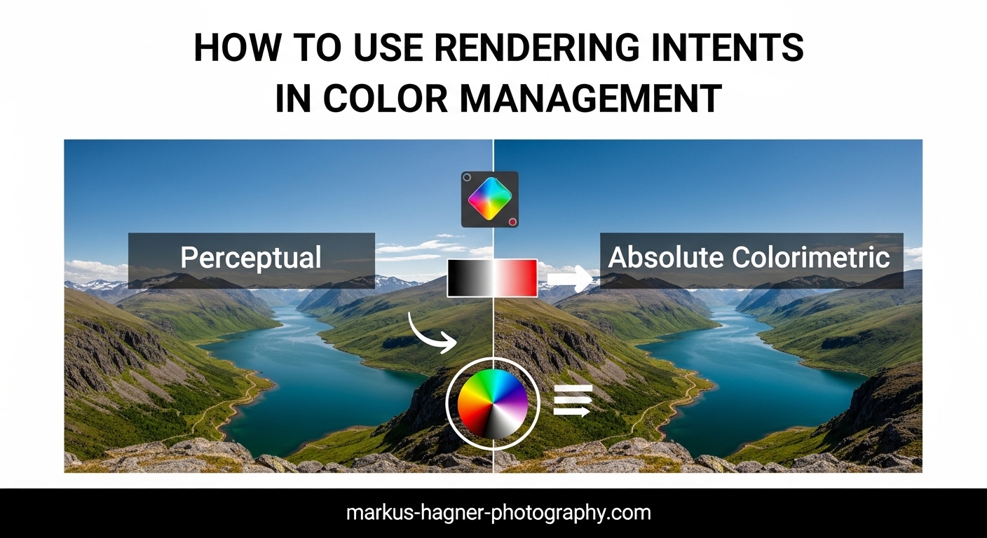
- Perceptual – Compresses all colors to fit within the destination gamut
- Relative Colorimetric – Clips out-of-gamut colors to the nearest reproducible color
- Absolute Colorimetric – Same as Relative but preserves the white point
- Saturation – Prioritizes vivid colors over accuracy
For photographic printing, the two intents that matter most are Perceptual and Relative Colorimetric. These are the ones you will toggle between when preparing images for print, and understanding the difference between them is essential for getting accurate results.
Understanding Color Gamut and Out-of-Gamut Colors
A color gamut is the complete range of colors that a device can capture, display, or print. Your camera might capture colors in the ProPhoto RGB color space, which has a massive gamut. Your monitor probably displays colors in sRGB or Adobe RGB. Your printer produces colors in a CMYK gamut that is much smaller than what you see on screen.
Out-of-gamut colors are colors that exist in your source image but fall outside what your destination device can reproduce. A bright fluorescent green that looks stunning on your calibrated monitor might be completely unprintable on matte paper. The rendering intent you choose determines what happens to those impossible colors.
Perceptual Rendering Intent Explained
Perceptual rendering intent works by compressing the entire color range of your source image to fit within the destination gamut. Instead of clipping individual colors that cannot be reproduced, it proportionally adjusts all colors to maintain the visual relationships between them.
Here is how I think about it: imagine your image has 100 different shades of color, but your printer can only reproduce 80 of them. Perceptual rendering squeezes all 100 shades down into those 80 available slots, keeping the relative differences between colors intact. Every color shifts slightly, but the overall look and feel of the image stays consistent.
This approach prioritizes preserving the visual appearance of the entire image over maintaining absolute color accuracy for any single color. Your bright blues might become slightly less saturated, but the transition from light blue to dark blue remains smooth and natural.
When to Use Perceptual Rendering Intent
Perceptual rendering intent works best when your image contains many out-of-gamut colors. I use it for:
- Highly saturated images – Vibrant sunsets, tropical landscapes, and colorful flowers often push beyond what printers can reproduce
- Images with smooth gradients – Perceptual maintains gradient smoothness by avoiding hard clipping
- Wide-gamut source files – Images shot in ProPhoto RGB or Adobe RGB often need compression to fit printer gamuts
- Printing on matte paper – Matte papers have smaller gamuts than glossy, so more compression is typically needed
The tradeoff with Perceptual is that even colors your printer could reproduce accurately get shifted slightly. If you have an image where most colors are already in-gamut and only a few are problematic, Perceptual might reduce saturation unnecessarily across the entire image.
Pros and Cons of Perceptual Rendering
Pros:
- Maintains visual relationships between colors
- Prevents banding in gradients
- Never produces jarring color shifts
- Safer choice for images with unknown gamut characteristics
Cons:
- Reduces overall saturation even for in-gamut colors
- Colors may not match what you see on screen
- Can make images look slightly flat
- Less color accuracy for critical color matching
Relative Colorimetric Rendering Intent Explained
Relative Colorimetric rendering intent takes a different approach. It maps all in-gamut colors exactly as they are, maintaining perfect accuracy for colors your printer can reproduce. Out-of-gamut colors get clipped to the nearest reproducible color at the edge of the destination gamut.
Using the same analogy: if your image has 100 shades and your printer can reproduce 80, Relative Colorimetric keeps those 80 colors exactly as they are. The 20 impossible colors get hard-mapped to the closest available color, which might mean several different source colors all become the same output color.
This approach prioritizes color accuracy for the colors that can be reproduced. If you are printing a product photo where brand colors must match exactly, Relative Colorimetric preserves those critical colors at the expense of the ones that cannot be printed anyway.
When to Use Relative Colorimetric Rendering Intent
Relative Colorimetric works best when most of your image colors fall within the destination gamut. I use it for:
- Images with subtle color variations – Portraits, muted landscapes, and natural scenes often stay within gamut
- Black and white photography – B&W images have no saturated colors to worry about
- Product and commercial photography – When specific colors must match accurately
- Printing on glossy or luster paper – These papers have wider gamuts and can reproduce more colors
- sRGB source images – Images already in sRGB typically fit well within printer gamuts
The risk with Relative Colorimetric appears when you have many out-of-gamut colors. Multiple distinct colors can collapse into the same output color, causing posterization or loss of detail in highly saturated areas.
Pros and Cons of Relative Colorimetric
Pros:
- Perfect accuracy for in-gamut colors
- Colors that can be printed match what you see on screen
- Better saturation for images that fit the gamut
- Industry standard for proofing and production work
Cons:
- Can cause banding where out-of-gamut colors clip
- Loss of detail in highly saturated areas
- May produce jarring transitions at gamut boundaries
- Not ideal for wide-gamut source images
Perceptual vs Relative Colorimetric: Key Differences
The core difference between these two rendering intents comes down to one choice: do you want all colors slightly adjusted to maintain smooth transitions, or do you want accurate colors for everything your printer can reproduce while accepting hard clipping for the rest?
I have tested both intents extensively, and here is my practical comparison:
| Aspect | Perceptual | Relative Colorimetric |
|---|---|---|
| Color handling | Compresses all colors proportionally | Clips out-of-gamut, keeps in-gamut exact |
| Gradient smoothness | Excellent – no banding | Can show banding at gamut boundaries |
| Overall saturation | Reduced slightly across image | Maintained for in-gamut colors |
| Color accuracy | Approximate for all colors | Exact for reproducible colors |
| Best for | Saturated images, matte paper | In-gamut images, glossy paper |
| Risk | Flat-looking prints | Banding and posterization |
When to Use Each Rendering Intent by Image Type
Here is my quick reference guide based on the type of image you are printing:
- Vibrant landscapes with saturated foliage: Start with Perceptual – the greens and cyans often push beyond printer gamuts
- Portraits with natural skin tones: Use Relative Colorimetric – skin tones typically stay in-gamut and benefit from accuracy
- Black and white photographs: Relative Colorimetric is almost always better – no saturated colors to worry about
- Product photos with brand colors: Relative Colorimetric ensures critical colors match
- Underwater photography: Perceptual usually works better – the intense blues and cyans often exceed gamut limits
- Architectural photography: Relative Colorimetric for neutral tones and accurate grays
Paper Type Considerations
Your choice of paper significantly affects which rendering intent works best. Glossy and luster papers have wider color gamuts than matte and fine art papers, which means fewer out-of-gamut colors to worry about.
For glossy or luster papers, I usually start with Relative Colorimetric. The wider gamut means most colors fit, and you get better overall saturation. For matte papers, especially cotton rag and other fine art papers, Perceptual often produces better results because the smaller gamut requires more compression.
What Is Black Point Compensation?
Black Point Compensation (BPC) is a setting that works alongside your rendering intent choice. When enabled, it maps the black point of your source color space to the black point of your destination space, preventing crushed shadows.
Without Black Point Compensation, the darkest shadows in your image might all map to the same solid black, losing all shadow detail. With BPC enabled, the full tonal range gets scaled to fit the destination, preserving separation in the shadows.
My recommendation: always enable Black Point Compensation for photographic printing. It works with both Perceptual and Relative Colorimetric intents and almost always improves shadow detail. The only exception would be specific proofing workflows where you need to simulate the exact black behavior of a press.
Practical Workflow: How to Test and Choose the Right Rendering Intent
After years of printing, I have developed a simple testing methodology that takes the guesswork out of choosing rendering intents. Here is my step-by-step process:
Step 1: Enable Soft Proofing
Both Lightroom and Photoshop offer soft proofing, which simulates how your image will look when printed using a specific printer and paper ICC profile.
In Lightroom, go to View > Soft Proofing or press S. In Photoshop, go to View > Proof Setup and select your printer profile. This shows you which colors are out of gamut and lets you preview how each rendering intent affects your image.
Step 2: Toggle Between Rendering Intents
With soft proofing enabled, switch between Perceptual and Relative Colorimetric while watching your image. Pay attention to:
- Saturated areas – Do colors clip or compress smoothly?
- Gradients – Is there any banding with Relative Colorimetric?
- Overall saturation – Does Perceptual make the image look flat?
- Shadow detail – Are blacks crushed in either version?
Step 3: Check the Gamut Warning
Both programs can show out-of-gamut colors. In Lightroom, click the gamut warning icon (the little icon showing out-of-gamut colors) in the soft proof panel. Out-of-gamut areas appear highlighted. If you see a lot of highlighted areas, Perceptual is probably your safer choice.
Step 4: Make Your Decision
If the two rendering intents look nearly identical, use Relative Colorimetric – you get the benefit of color accuracy without any downside. If you see significant differences, choose based on which looks better to your eye.
One forum user shared this approach: “If the first one looks good I stop, if it looks bad, I try the other one.” This simple method works surprisingly well.
Step 5: Print Test Strips
For critical prints, I recommend printing small test sections using both rendering intents. Screen previews are helpful, but the actual printed result is the only way to know for certain. Many printers can produce 4×6 test prints inexpensively.
Other Rendering Intents: Absolute Colorimetric and Saturation
While Perceptual and Relative Colorimetric handle most photographic printing needs, you should know about the other two rendering intents defined by the ICC.
Absolute Colorimetric
Absolute Colorimetric works exactly like Relative Colorimetric, with one key difference: it does not adapt the white point. The white in your source image maps to the actual white of the destination medium, not the white point adjusted for viewing conditions.
This intent is primarily used for proofing – when you want to simulate exactly how a print will look on a specific paper, including the paper color. For regular printing, Relative Colorimetric produces more natural results because it accounts for how our eyes adapt to different white points.
Saturation Rendering Intent
Saturation rendering intent prioritizes vivid, saturated colors over accuracy. It maps saturated colors to saturated colors, even if the hue shifts slightly. This intent is designed for business graphics, charts, and presentations where impact matters more than color fidelity.
For photographic printing, avoid Saturation rendering intent. It can produce unnatural color shifts that look wrong in photographs. Stick with Perceptual or Relative Colorimetric for all your photo printing needs.
FAQ: Common Questions About Rendering Intents
Which rendering intent is best for printing photographs?
There is no single best rendering intent for all photographs. Relative Colorimetric is the best starting point for most images because it preserves color accuracy for in-gamut colors. However, images with many saturated colors (like vibrant landscapes or underwater photos) often benefit from Perceptual rendering. Always test both using soft proofing before your final print.
Why do I see no difference between Perceptual and Relative Colorimetric?
If you see no difference between the two rendering intents, your image likely has few or no out-of-gamut colors. This is common with images in sRGB color space, images with muted colors, or when printing on wide-gamut glossy papers. When this happens, use Relative Colorimetric as your default since it provides better color accuracy.
Should Black Point Compensation be on or off?
For photographic printing, always keep Black Point Compensation enabled. It maps the black point of your source to the black point of your printer, preserving shadow detail and preventing crushed blacks. The only reason to disable it would be for specific proofing workflows where you need to simulate exact press behavior.
Does rendering intent matter if I stay in the same color space?
Rendering intent matters most when converting between color spaces with different gamuts. If you convert from Adobe RGB to the same Adobe RGB profile, you would see minimal change regardless of intent. However, even staying in the same color space, the printer profile conversion still applies the rendering intent when mapping to the printer’s gamut.
What is the difference between Absolute and Relative Colorimetric?
Both intents clip out-of-gamut colors to the nearest reproducible color. The difference is in white point handling. Relative Colorimetric maps the source white to the destination white (accounting for viewing conditions), while Absolute Colorimetric preserves the actual white point. Use Relative for normal printing and Absolute for proofing simulations.
Conclusion
Understanding how to use rendering intents in color management gives you control over the final look of your prints. Perceptual rendering compresses all colors to maintain smooth transitions and visual relationships, making it ideal for highly saturated images and matte papers. Relative Colorimetric preserves exact colors for everything your printer can reproduce, making it the better choice for images that mostly fit within the destination gamut.
The practical approach I recommend is simple: start with Relative Colorimetric as your default, enable Black Point Compensation, and use soft proofing to check for out-of-gamut colors. If you see banding or harsh transitions, switch to Perceptual. For critical work, print small test strips with both settings.
After years of printing, I can tell you that there is no substitute for testing. The rendering intent that works best depends on your specific image, your printer, your paper, and your personal preferences. But understanding the fundamental difference between Perceptual vs Relative Colorimetric puts you in control of the process rather than guessing and hoping for good results.