You spent hours curating your best shots. Your portfolio looks stunning. The galleries flow beautifully from one session to the next. But here’s the hard truth I learned after working with dozens of photographers: a beautiful portfolio alone doesn’t book clients.
I’ve seen photographers get 120+ visitors to their websites without a single booking. The problem isn’t their work. The problem is their website doesn’t tell visitors what to do next. That’s where photography website CTAs come in.
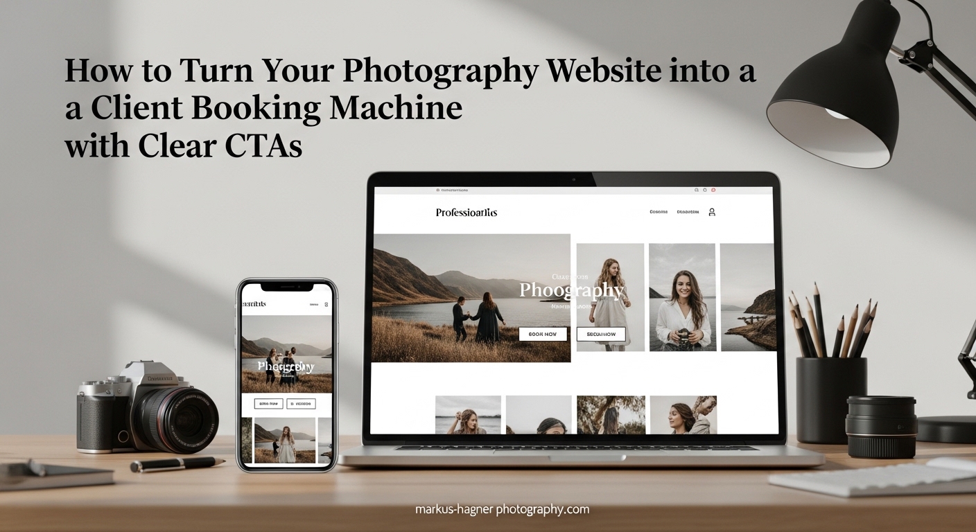
In this guide, I’ll show you exactly how to turn your portfolio website into a booking machine using strategic call-to-action buttons, system integration, and placement strategies that actually convert visitors into paying clients.
Why Beautiful Portfolios Don’t Book Clients
Here’s a scenario I hear constantly in photography forums: “I have great traffic, but nobody books.” One photographer shared that after 120+ visitors, they had zero bookings. Another mentioned they’ve only had one real client despite putting serious work into their online presence.
The disconnect happens because your website visitors don’t know how to work with you. They love your photos, but they can’t figure out the next step. Do they email you? Fill out a form? Call? The longer they think about it, the more likely they are to close the tab and move on.
This creates decision fatigue. When visitors face too many choices or unclear paths, they choose nothing. Your gorgeous gallery becomes a dead end instead of a doorway to new business.
The fix isn’t a website redesign. You don’t need to start over. You need clear, strategic call-to-action buttons that guide visitors toward booking. Let me show you how.
What Photography Website CTAs Are and Why They Matter
A call-to-action (CTA) on a photography website is a button or link that instructs visitors to take a specific action, such as booking a session, scheduling a consultation, or viewing pricing. Effective CTAs use action verbs like “Book Now” or “Reserve Your Date” and link directly to booking forms to convert website visitors into paying clients.
Think of CTAs as signposts on a path. Without them, visitors wander aimlessly through your galleries, admiring your work but never taking action. With them, you create a clear journey from discovery to booking.
The Psychology Behind Effective CTAs
CTAs work because they reduce cognitive load. When someone lands on your site, they’re evaluating whether you’re the right photographer for them. That evaluation takes mental energy. A clear CTA removes the guesswork.
Good CTAs also create urgency without being pushy. Phrases like “Check My Availability” or “Reserve Your Date” imply that your calendar fills up. This subtle urgency motivates action.
Finally, CTAs tap into the psychology of commitment. When someone clicks a button that says “Start My Inquiry,” they’ve taken a small step toward working with you. That micro-commitment makes them more likely to complete the full booking process.
Primary vs Secondary CTAs
Your primary CTA is the main action you want visitors to take. For most photographers, this is booking or inquiring. Buttons like “Book Your Session” or “Inquire Now” serve as primary CTAs.
A secondary CTA offers an alternative path for visitors who aren’t ready to book. Examples include “View Pricing,” “See My Process,” or “Browse Galleries.” These keep visitors engaged even if they’re still in research mode.
Strategic CTA Placement: Where to Put Your Book Now Buttons
Placement matters as much as wording. You need CTAs in locations where visitors naturally look when they’re ready to act. Here are the key placement areas every photography website needs:
Above the Fold on Your Homepage
“Above the fold” means the portion of your page visible without scrolling. This is prime real estate. Every visitor sees it. Your primary CTA belongs here.
I recommend placing your main booking button in your homepage hero section or navigation bar. Make it impossible to miss. A “Book Now” or “Inquire” button in your top navigation ensures visitors can act from any page.
After Each Service Section
When someone reads about your wedding photography services, they’re interested in that specific offering. Place a CTA immediately after describing each service type.
This contextual placement works because the visitor’s interest is peaked. They’ve just learned about your approach and seen relevant samples. The CTA captures that momentum.
In Image Galleries
Your galleries are where visitors fall in love with your work. Don’t let that emotional connection fade without offering a next step. Add CTAs at the end of galleries or as floating buttons that remain visible as visitors browse.
Some photographers worry this feels pushy. It doesn’t. Clients appreciate knowing how to book. A subtle “Ready to Create Similar Photos? Inquire Now” button feels helpful, not salesy.
In the Footer on Every Page
Your footer appears on every page of your website. It’s the perfect spot for a secondary CTA location. Visitors who scroll to the bottom are engaged. Give them a way to connect.
Include your contact form, email link, and a simple “Let’s Work Together” button. This catches visitors who read through your content and decide they want to learn more.
Embedded Contact Forms
Contact forms are CTAs in themselves. Embedding a form directly on your homepage eliminates friction. Visitors don’t need to click through to a separate page.
Keep these forms simple. Name, email, event type, and message are enough. Long forms create abandonment. You can gather more details after the initial inquiry.
Exit-Intent Popups (Use Strategically)
Exit-intent popups detect when visitors are about to leave your site and display a final offer. These can be effective, but use them carefully.
Offer something valuable: a free pricing guide, a consultation discount, or a mini-session announcement. Don’t just ask them to subscribe to a generic newsletter. Make the offer specific to photography clients.
How Many CTAs Should You Have?
Aim for at least two CTAs per page: one near the top and one near the bottom. More is fine if they serve different purposes. Your homepage might have a primary booking CTA, a secondary “View Pricing” link, and an embedded contact form. That’s three, but each serves a visitor at a different stage of readiness.
The key is avoiding CTA overload. Don’t present five identical “Book Now” buttons in a row. Variety and strategic placement work better than repetition.
CTA Examples That Actually Convert
The words on your CTA buttons matter. Generic phrases like “Submit” or “Click Here” perform poorly. Specific, action-oriented language converts better.
Good vs Bad CTA Wording
Bad: “Submit” – This feels like paperwork, not an exciting step toward beautiful photos.
Good: “Start My Inquiry” – This feels like the beginning of a relationship.
Bad: “Click Here for More Info” – Vague and passive.
Good: “See My Investment Guide” – Specific and speaks to what photographers actually want to know.
Bad: “Contact Us” – Generic and corporate.
Good: “Let’s Chat About Your Session” – Warm and personal.
CTA Examples by Photography Niche
Different photography niches benefit from tailored CTA language:
Wedding Photographers: “Check My Wedding Date Availability” or “Start Planning My Wedding Photos”
Portrait Photographers: “Book My Portrait Session” or “Reserve My Photo Shoot”
Family Photographers: “Schedule Our Family Session” or “Capture Our Family Moments”
Commercial/Brand Photographers: “Discuss My Project” or “Request a Custom Quote”
Real Estate Photographers: “Book My Property Shoot” or “Get My Listing Photos”
Headshot Photographers: “Book My Professional Headshots” or “Upgrade My Professional Image”
Action Verbs That Drive Clicks
Start your CTAs with strong action verbs. These create momentum and clarity:
Book, Reserve, Schedule, Start, Check, View, Discover, Get, Claim, Secure, Begin, Explore, Request.
Avoid weak verbs like “Learn More” or “Find Out.” They don’t create urgency or imply action.
System Integration: Connect Your CTAs to Your Booking Workflow
Here’s where most CTA advice stops, but where the real conversion magic happens. Your CTAs shouldn’t just link to a contact form. They should connect to a complete system that captures leads, nurtures them, and guides them toward booking.
CRM Integration Basics
A Customer Relationship Management (CRM) system stores client information and tracks where each lead is in your booking process. When someone clicks your CTA and fills out a form, that information flows into your CRM automatically.
Popular photography CRMs include HoneyBook, Studio Ninja, Pixieset, and Dubsado. These platforms connect with your website forms, creating a seamless data flow.
When your CTA submissions go straight to your CRM, you can automate follow-ups, track inquiry sources, and never lose a lead to a cluttered inbox.
Email Workflow Integration
Every CTA click should trigger an automated email sequence. When someone inquires, they immediately receive a confirmation email. A few days later, they get a follow-up with more information. If they don’t book within a week, another email reminds them of your availability.
These automated workflows do the nurturing work while you focus on photography. Your website becomes a 24/7 booking assistant.
Make sure your emails link back to specific pages on your website. A “View My Pricing” email should link to your investment page. A “Book Your Date” reminder should link directly to your booking form. This creates a loop between your emails and your site.
Hidden Pages Strategy
This is a strategy most photographers overlook. Hidden pages are pages on your website that don’t appear in your navigation menu but are accessible via direct links. Use these for client resources.
Create a hidden “Client Prep Guide” page. Link to it from your booking confirmation emails. This page could include what to wear, how to prepare for a session, and what to expect. It adds value and keeps clients engaged with your website.
You can also create hidden pricing pages that you share only with qualified leads. This allows you to control who sees your rates while still making them accessible to serious inquiries.
Mobile Optimization for CTAs
Over half of website traffic comes from mobile devices. Your CTAs must work flawlessly on phones and tablets.
Make buttons large enough to tap easily. Ensure there’s enough spacing between clickable elements. Test your forms on mobile devices to confirm they’re easy to fill out.
Mobile visitors behave differently. They scroll faster and have less patience for complex navigation. Simplify your mobile CTA strategy to focus on one primary action per page.
Common CTA Mistakes Photographers Make
Even with great intentions, photographers often make these CTA errors:
Using generic button text. “Submit” and “Contact” feel cold and impersonal. Use specific, warm language instead.
Hiding CTAs below the fold. If visitors need to scroll to find your booking button, many won’t.
Creating too many CTAs with competing goals. Don’t ask visitors to “Book Now,” “Subscribe,” “Follow on Instagram,” and “Download Free Guide” all on the same page. Pick one primary action.
Linking CTAs to broken or confusing pages. Test every button. Ensure it goes somewhere logical and functional.
Ignoring mobile users. Tiny buttons and cramped forms kill mobile conversions.
Not tracking CTA performance. You can’t improve what you don’t measure. Use analytics to see which buttons get clicked and which don’t.
Implementation Checklist: Audit Your Website Today
Ready to transform your photography website into a booking machine? Run through this self-audit:
[ ] Do you have a CTA visible above the fold on your homepage?
[ ] Is there a booking or inquiry button in your main navigation?
[ ] Does each service page end with a relevant CTA?
[ ] Do your galleries include next-step buttons?
[ ] Is there a contact option in your footer?
[ ] Are your CTAs using action-oriented, specific language?
[ ] Do your forms connect to a CRM or email system?
[ ] Have you tested your CTAs on mobile devices?
[ ] Are you tracking clicks on your CTA buttons?
[ ] Do you have an automated follow-up sequence for inquiries?
Work through this list one item at a time. Each fix moves your website closer to becoming a true booking machine.
Frequently Asked Questions
What is a booking CTA?
A booking CTA (call-to-action) is a button or link on your photography website that prompts visitors to schedule a session or inquire about your services. Examples include ‘Book Now,’ ‘Check Availability,’ or ‘Start My Inquiry.’ These CTAs connect directly to your booking system or contact form, making it easy for potential clients to take the next step.
What is the secondary CTA for website visitors?
A secondary CTA offers visitors an alternative action when they’re not ready for your primary booking CTA. Examples include ‘View Pricing,’ ‘See My Process,’ or ‘Browse Galleries.’ Secondary CTAs keep visitors engaged with your site even if they’re still in the research phase, increasing the chances they’ll return to book later.
How many CTAs should a website have?
Most photography websites should have at least two CTAs per page: one primary CTA (like ‘Book Now’) near the top and one near the bottom. Your homepage might include additional CTAs like embedded contact forms or secondary options. The key is strategic placement rather than quantity. Avoid overwhelming visitors with too many competing buttons.
What is an example of a CTA aimed at conversion?
Effective conversion-focused CTAs use specific, action-oriented language. Examples include: ‘Check My Availability’ (creates urgency), ‘Reserve Your Wedding Date’ (specific and committed), ‘Start My Inquiry’ (feels like beginning a relationship), and ‘Get My Investment Guide’ (offers value). These CTAs work because they tell visitors exactly what happens next and create momentum toward booking.
Conclusion
Turning your photography website into a client booking machine isn’t about redesigning everything. It’s about adding clear signposts that guide visitors toward working with you. Strategic photography website CTAs, placed in the right locations with the right wording, transform passive browsers into active inquiries.
Start with the basics: a visible CTA above the fold, buttons after each service section, and a contact option in your footer. Then level up by connecting those CTAs to a CRM system and automated email workflows. Add hidden pages to deliver extra value to serious leads.
Your photos already sell your artistic ability. Your CTAs sell the next step. Give your visitors a clear path, and watch your bookings grow in 2026.