After spending hours perfecting a photo in Lightroom, nothing is more frustrating than receiving a print that looks nothing like what you saw on screen. I learned this lesson the hard way when I ordered a 16×20 canvas print for a client, only to have it arrive looking dark and muddy. The problem was not my editing. The problem was my export settings.
Getting your Lightroom export settings for high-quality photo prints right is the final step between a beautiful edit and a stunning physical print. The wrong settings can result in pixelated images, inaccurate colors, or files that print labs reject entirely. This guide walks you through every setting you need to know, plus the advanced techniques most photographers overlook.
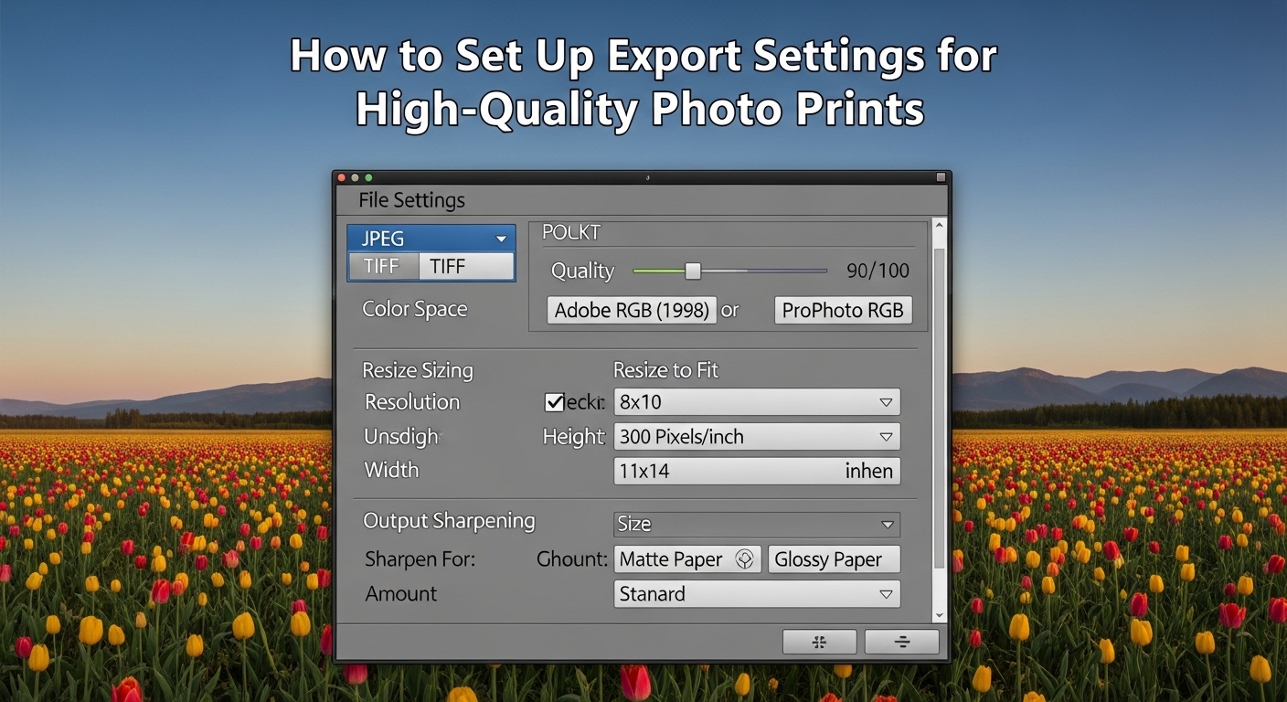
Quick Reference: Best Lightroom Export Settings for Print
Here are the exact settings I use for professional-quality prints. These work for most print labs and home printers:
- File Format: JPEG (TIFF for large format or professional labs)
- Color Space: sRGB (safest for most labs) or Adobe RGB (if your lab supports it)
- Quality: 100 (or 85-100 for smaller file sizes without visible quality loss)
- Resolution: 300 PPI for standard prints, 240 PPI acceptable for large format
- Image Sizing: Leave unchecked (export full resolution) OR check Resize to Fit and set Long Edge to your print dimension in pixels
- Output Sharpening: Sharpen for Screen (Standard) if you sharpened during editing, or Sharpen for Glossy/Matte Paper (Standard) if you did not
- Metadata: Include copyright and contact info, exclude camera settings if sharing
Understanding the Basics: What Makes a Great Print
Before diving into specific settings, understanding why each choice matters helps you make informed decisions for different printing scenarios.
PPI vs DPI: What You Actually Need
PPI (pixels per inch) and DPI (dots per inch) are often used interchangeably, but they measure different things. PPI refers to the pixel density of your digital image. DPI refers to how many dots of ink a printer lays down per inch.
For export settings, focus on PPI. A resolution of 300 PPI means your image contains 300 pixels for every inch of printed output. This density produces sharp, detailed prints at normal viewing distances.
Why 300 PPI? Most printers can produce excellent results with 240-300 PPI. Going higher rarely improves visible quality because printers have physical limitations. Going lower risks visible pixelation, especially in detailed areas like faces or text.
For large format prints viewed from further away, 240 PPI or even 150 PPI often works perfectly. A 40×60 canvas print does not need the same pixel density as an 8×10 portrait.
Color Space: sRGB vs Adobe RGB
Your color space determines the range of colors your file can contain. This choice significantly impacts print quality.
sRGB is the safest choice for most photographers. Nearly all print labs expect sRGB files, and most consumer printers handle it well. If you are unsure what your lab requires, use sRGB.
Adobe RGB contains a wider range of colors, particularly in greens and cyans. This wider gamut can produce more vibrant prints, but only if your entire workflow supports it. Your monitor must display Adobe RGB, your printer must handle it, and your print lab must expect it.
Using Adobe RGB when your lab expects sRGB often produces dull, washed-out prints. I have seen this mistake ruin countless orders.
ProPhoto RGB offers the widest gamut but is rarely used for final print files. Reserve this for your editing workflow and convert to sRGB or Adobe RGB during export.
JPEG vs TIFF: Does File Format Matter?
JPEG at quality 100 produces excellent prints for virtually all purposes. The compression is visually lossless at this setting, and files remain manageable in size.
TIFF offers uncompressed or lossless compressed options, making it technically superior. However, the quality difference is rarely visible in prints. Use TIFF when your print lab specifically requests it or for large format printing where every bit of data helps.
For most photographers, JPEG at quality 100 is the practical choice.
How to Set Up Lightroom Export Settings for High-Quality Photo Prints
Now let’s walk through each section of the Export dialog in Lightroom Classic. These same principles apply to Lightroom CC with slight interface differences.
Step 1: Open the Export Dialog
Select the photos you want to export, then go to File > Export > Export (or press Ctrl+Shift+E on Windows, Cmd+Shift+E on Mac). This opens the Export dialog with all your configuration options.
Step 2: Choose Export Location
The top section determines where your files end up.
Export To: Choose Hard Drive for local files. The Email option compresses files too much for print quality.
Location: Select a dedicated folder for print exports. I create a folder called “Print Exports” with subfolders organized by client or project.
Put in Subfolder: Check this and name your subfolder descriptively. Something like “Smith Wedding 8×10 Prints” keeps you organized.
Existing Files: Choose “Ask what to do” to avoid accidentally overwriting previous exports.
Step 3: Configure File Settings
This section controls format, quality, and color space.
Image Format: Choose JPEG for most prints. Select TIFF if your lab requires it or for large format work.
Quality: Set to 100 for maximum quality. If file size is a concern, 85-95 produces nearly identical results with smaller files. Never go below 80 for prints.
Color Space: Select sRGB for most print labs. Choose Adobe RGB only if your lab specifically requests it. The “Display” option uses your monitor profile, which is wrong for print.
Limit File Size To: Leave unchecked for print exports. File size limits can force compression that degrades quality.
Step 4: Set Image Sizing
This section confuses more photographers than any other. Here is how to handle it correctly.
Resize to Fit: For most prints, leave this unchecked to export your full-resolution file. Let your print lab resize to the exact print dimensions.
If you want to control dimensions yourself, check “Resize to Fit” and select “Long Edge” from the dropdown. Enter your print dimension in pixels:
- 8×10 print at 300 PPI: Long Edge = 3000 pixels (10 inches x 300 PPI)
- 11×14 print at 300 PPI: Long Edge = 4200 pixels (14 inches x 300 PPI)
- 16×20 print at 300 PPI: Long Edge = 6000 pixels (20 inches x 300 PPI)
- 20×30 print at 240 PPI: Long Edge = 7200 pixels (30 inches x 240 PPI)
Resolution: Set to 300 pixels per inch for standard prints. For large format prints viewed from a distance, 240 or even 180 works well.
Do Not Enlarge: Check this box to prevent Lightroom from upsampling your image. Upsampling creates artificial pixels and can reduce quality.
Step 5: Configure Output Sharpening
Output sharpening compensates for the slight softening that occurs during printing. This is different from the sharpening you apply during editing.
Sharpen For: Choose “Screen” if you applied significant sharpening during editing. Choose “Glossy Paper” or “Matte Paper” based on your print surface if you did minimal sharpening while editing.
Not sure about your paper type? Glossy includes any shiny surface. Matte includes matte, luster, satin, and canvas. When in doubt, use Screen sharpening.
Amount: “Standard” works for most images. Choose “Low” for images you heavily sharpened during editing. Choose “High” for soft subjects or low-resolution source files.
Output sharpening is applied during export and cannot be undone. If unsure, export without sharpening and apply it in a second pass.
Step 6: Metadata and Watermarking
Metadata: Include copyright information and your contact details. This protects your work and helps clients find you.
For prints going to clients, consider excluding camera settings and edit information. Some clients prefer clean metadata.
Watermarking: Generally, do not watermark files destined for print. Watermarks distract from the image and look unprofessional on physical prints.
Step 7: Save Your Export Preset
Once you have configured all settings, save them as a preset. Click the “Add” button in the Presets panel on the left, name your preset (I use “8×10 Print 300 PPI sRGB”), and save.
Create separate presets for common scenarios: 4×6 prints, 8×10 prints, large format, and anything else you do regularly.
Advanced Techniques for Professional Prints
The settings above produce excellent prints for most situations. These advanced techniques help when you need consistent, predictable results or when troubleshooting print quality issues.
Soft Proofing: See What You Will Get
Soft proofing simulates how your image will look when printed on specific paper with specific ink. This feature catches problems before you spend money on prints.
To use soft proofing in Lightroom:
- Open your image in the Develop module
- Go to View > Soft Proofing (or press S)
- The background turns white, and you see a new panel showing your proof preview
- If you have an ICC profile from your print lab, select it from the Profile dropdown
- Check “Simulate Paper and Ink” to see how the paper color affects your image
The soft proof often looks flatter and less vibrant than your edit. This is normal. Make adjustments to compensate, then export with your standard settings.
Some colors may show warnings (the little icons in the histogram). These indicate colors that cannot be reproduced accurately in print. Adjust those areas or accept the color shift.
Monitor Calibration: The Foundation of Accurate Prints
Every forum thread about print quality eventually mentions monitor calibration. There is a reason for that. If your monitor displays colors incorrectly, no amount of perfect export settings will fix your prints.
Professional photographers use hardware calibration devices like the X-Rite i1Display or Datacolor Spyder. These tools measure your monitor’s output and create a profile that corrects color and brightness.
Without hardware calibration, you can take these steps to improve accuracy:
- Lower your monitor brightness to 100-120 cd/m² (about half of typical factory settings)
- Use your monitor’s built-in calibration if available
- Avoid editing in rooms with colored walls or changing light
- Give your monitor 30 minutes to warm up before critical editing
Even basic calibration dramatically improves print consistency.
Why Prints Look Darker Than Your Screen
This is the most common complaint I hear. You edit a photo that looks perfect on screen, but the print arrives looking dark and muddy.
The culprit is usually monitor brightness. Monitors emit light, while prints reflect ambient light. A monitor set to factory brightness (often 250-300 cd/m²) displays images much brighter than any print can match.
To fix this issue:
- Calibrate your monitor to 100-120 cd/m² brightness
- Edit in a dimly lit room without direct light on your screen
- Use soft proofing to preview how prints will look
- Intentionally brighten images slightly before printing
- Order test prints before committing to large orders
Many photographers find that lowering monitor brightness by 20-30% produces prints that match their edits.
Print Lab vs Home Printing: Different Considerations
Your export settings may need adjustment depending on where you print.
Professional Print Labs:
- Always check your lab’s specific requirements
- Most expect sRGB, JPEG, 300 PPI
- Let the lab resize to exact print dimensions
- Request ICC profiles and use soft proofing
- Ask about their recommendations for sharpening
Home Printing:
- Use Adobe RGB if your printer supports it
- Install the correct ICC profile for your paper
- Enable printer color management, not Lightroom color management
- Test different sharpening amounts
- Print at native resolution (do not resize unnecessarily)
Home printers give you more control but require more knowledge to use well.
Large Format and Canvas Printing
Large prints require different thinking. A 40×60 canvas viewed from 6 feet away does not need the same resolution as an 8×10 held at arm’s length.
For large format:
- 240 PPI is usually sufficient, 150-180 PPI works for very large prints
- Export at full resolution rather than upsampling
- TIFF format may preserve more detail for extreme enlargements
- Apply more aggressive output sharpening (High setting)
- Request a small proof before ordering the full size
Canvas prints specifically require even less resolution because the texture obscures fine detail. Most canvas labs recommend 150-200 PPI minimum.
Troubleshooting Common Print Quality Issues
Even with perfect settings, prints sometimes disappoint. Here is how to diagnose and fix the most common problems.
Problem: Prints Are Too Dark
Cause: Your monitor is too bright, causing you to edit images darker than intended.
Fix: Lower monitor brightness to 100-120 cd/m². Brighten your images by 0.2-0.3 stops before exporting. Use soft proofing to preview darker output.
Problem: Colors Do Not Match Screen
Cause: Color space mismatch or uncalibrated monitor.
Fix: Verify you exported in the color space your lab expects. Calibrate your monitor. Request ICC profiles from your lab and use soft proofing.
Problem: Prints Look Pixelated or Soft
Cause: Resolution too low or excessive compression.
Fix: Check that resolution is at least 300 PPI for small prints, 240 PPI for larger prints. Ensure JPEG quality is 85 or higher. Export full resolution files.
Problem: Print Lab Rejected My File
Cause: File does not meet lab requirements for size, format, or color space.
Fix: Read your lab’s specifications carefully. Most rejections happen because files are the wrong dimensions, use the wrong color space, or exceed file size limits.
Problem: Banding in Gradients
Cause: Bit depth issues or heavy compression.
Fix: Export as 16-bit TIFF if your lab accepts it. Add subtle noise to gradients before exporting. Avoid over-processing images with heavy adjustments to smooth areas like skies.
Frequently Asked Questions
What export settings should I use for printing photos?
Use JPEG format at quality 100, sRGB color space (or Adobe RGB if your lab supports it), 300 PPI resolution, and output sharpening set to Standard for your paper type. Export at full resolution and let your print lab handle final sizing.
What is the best resolution for printing in Lightroom?
300 PPI is the standard for high-quality prints up to 16×20 inches. For larger prints viewed from greater distances, 240 PPI works well. Very large prints like canvases can use 150-200 PPI without visible quality loss.
Should I use JPEG or TIFF for printing?
JPEG at quality 100 produces excellent results for nearly all prints and is accepted by all print labs. Use TIFF only when your lab specifically requires it or for large format fine art printing where maximum quality is essential.
Why do my prints look darker than my screen in Lightroom?
Monitors emit light while prints reflect light, making monitors appear much brighter. Lower your monitor brightness to 100-120 cd/m² (about half of factory settings), use soft proofing, and consider brightening images 0.2-0.3 stops before exporting.
Should I sharpen photos for print in Lightroom?
Yes, output sharpening compensates for the slight softening during printing. Choose Sharpen for Screen (Standard) if you already sharpened during editing, or Sharpen for Glossy/Matte Paper (Standard) if you did minimal editing sharpening.
Conclusion
Getting your Lightroom export settings for high-quality photo prints right transforms frustrating, inconsistent results into predictable, professional-quality prints. Start with JPEG at quality 100, sRGB color space, 300 PPI resolution, and appropriate output sharpening. Save these settings as presets for different print scenarios.
The biggest improvements come from outside the Export dialog: calibrating your monitor, using soft proofing, and understanding why prints look different from screens. Invest time in these areas, and your prints will finally match your vision.
Before ordering large prints, always order test prints with a few images. This small investment saves money and frustration while helping you dial in your personal workflow for consistent results every time.