Nothing compares to standing under a dancing aurora borealis display. But when you open those RAW files in Lightroom, the magic you witnessed often looks flat, dull, and disappointingly muted. Learning how to edit and process northern lights photos in Lightroom transforms those underwhelming files into the vibrant images that match your memory of that incredible night.
I have spent countless nights photographing the northern lights across Iceland, Norway, and Alaska. Through hundreds of editing sessions, I have developed a workflow that brings out the natural beauty of aurora photos without crossing into unnatural territory. This guide walks you through every step of my process, from import to export.
The key to great aurora editing lies in restraint. Your camera captured far more color and detail than your eyes could see in the dark. The goal is revealing that hidden beauty, not inventing colors that never existed. Follow this workflow, and you will create images that honestly represent the aurora display while still making viewers say “wow.”
Preparing Your Aurora Photos for Editing
Before diving into creative adjustments, proper preparation sets the foundation for successful aurora editing. This stage ensures your RAW files are optimized and organized for an efficient workflow.
Import Settings for Aurora RAW Files
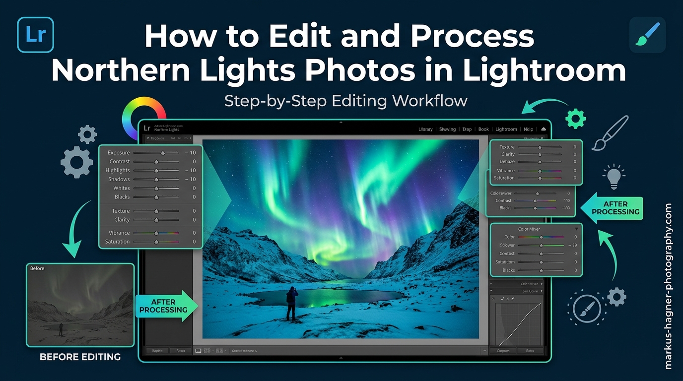
Start by importing your RAW files into Lightroom Classic or Lightroom CC. I recommend shooting RAW exclusively for northern lights photography. RAW files contain 12-14 stops of dynamic range compared to 8 stops in JPEG, giving you significantly more flexibility when recovering shadow detail and adjusting white balance.
During import, apply these default settings to save time. Set your metadata preset to include your copyright information. Choose “Minimal” for initial previews to speed up the import process. Create a collection for each aurora shoot to keep your images organized and easily accessible.
Enable Lens Corrections First
Navigate to the Develop module and open the Lens Corrections panel. Check “Enable Profile Corrections” to automatically correct vignetting and distortion based on your specific lens. Wide-angle lenses commonly used for aurora photography often introduce significant vignetting that darkens corners where aurora detail matters most.
Also enable “Remove Chromatic Aberration” to eliminate color fringing that frequently appears around bright stars against dark backgrounds. This fringing becomes more pronounced with wider apertures and can create unnatural colored edges in your final image.
Organizing Your Aurora Photo Session
Aurora shoots often produce hundreds of images from the same location. Use Lightroom’s survey view (press N) to quickly compare similar shots and identify the best candidates for editing. Look for images with interesting foreground elements, strong aurora structure, and sharp focus.
Create virtual copies of promising images before making major edits. This allows you to experiment with different editing approaches without duplicating the original file. Right-click your selected image and choose “Create Virtual Copy” to start exploring various creative directions.
How to Edit Northern Lights Photos in Lightroom: Basic Panel Adjustments
The Basic panel provides the foundation for your aurora edit. These adjustments establish the overall exposure, contrast, and color temperature before moving to more specialized tools. Getting these fundamentals right makes subsequent steps more effective.
Setting White Balance for Natural Aurora Colors
White balance dramatically affects how your aurora colors appear. Many photographers make the mistake of warming their images too much, which suppresses the natural green tones and creates an unrealistic yellow or orange cast. For authentic aurora colors, start with a cooler white balance setting.
I typically set my temperature between 3800K and 4500K for aurora photos. The Tungsten preset (around 3200K) often works surprisingly well as a starting point. Your goal is finding a balance where the greens look vibrant but natural, not sickly or overly blue.
Use the White Balance Selector tool (press W) to click on a neutral area of your image. Avoid clicking on the aurora itself, as this will neutralize the colors you want to enhance. Look for gray rocks, snow, or neutral clouds as reference points for accurate white balance.
Adjusting Exposure for Night Sky Photography
Aurora photos shot at high ISO settings often appear darker than optimal in the initial RAW file. Increase exposure gradually, typically between +0.3 and +1.5 stops depending on your original exposure. The goal is brightening the aurora structure without washing out the dark sky or blowing out the brightest parts of the display.
Watch your histogram while adjusting exposure. The right side should show data without a large spike at the edge, which indicates clipped highlights. The brightest portions of an intense aurora can easily overexpose, especially with long exposures during strong displays.
Controlling Highlights and Shadows
Highlights and Shadows sliders provide precise control over tonal range in your aurora images. Lower the Highlights slider (typically -20 to -50) to recover detail in the brightest portions of the aurora. This prevents the core of the display from becoming a featureless blob of light.
Raise the Shadows slider (+20 to +50) to bring out foreground detail without affecting the sky. This reveals landscape elements that provide context and scale for your aurora image. Be careful not to push shadows too far, as this introduces noise in dark areas.
Setting Whites and Blacks for Contrast
The Whites and Blacks sliders establish the endpoints of your tonal range. For aurora photos, I typically reduce Whites slightly (-5 to -15) to maintain detail in bright stars and aurora cores. Increase Blacks slightly (+5 to +20) to open up the deep sky without making it look gray.
Hold the Alt/Option key while adjusting Whites or Blacks to see exactly which pixels are clipping. This visual feedback helps you find the perfect balance between contrast and detail retention.
Adding Contrast and Presence
After setting your tonal endpoints, adjust Contrast to taste. Aurora images typically benefit from moderate contrast (+10 to +25) to separate the aurora from the night sky. Too much contrast creates harsh transitions and loses subtle color variations in the display.
The Texture and Clarity sliders add local contrast and definition. Use these sparingly for aurora photos. Texture (+5 to +15) enhances the structural detail within the aurora without adding artifacts. Avoid high Clarity values, which create unnatural halos around the aurora edges and emphasize noise in the sky.
How to Enhance Aurora Colors with the HSL Panel
The HSL (Hue, Saturation, Luminance) panel is where aurora magic happens. This tool allows you to target specific color ranges independently, giving you precise control over the green, purple, and red tones that make northern lights images so captivating.
Understanding the HSL Panel for Aurora Editing
The HSL panel divides colors into eight ranges: Red, Orange, Yellow, Green, Aqua, Blue, Purple, and Magenta. For aurora photos, you will primarily work with Green, Aqua, and Purple sliders. Each color has three controls: Hue shifts the actual color, Saturation controls intensity, and Luminance controls brightness.
Start with the Luminance tab before moving to Saturation. Brightening specific colors often achieves more natural results than saturating them. This approach reveals color that already exists in your RAW file rather than artificially creating it.
Enhancing Green Aurora Tones
Green dominates most aurora displays, resulting from oxygen atoms at altitudes around 60-150 miles. In the Luminance tab, increase Green Luminance (+10 to +30) to brighten the aurora structure without affecting other colors. This brings out the curtain-like formations and vertical rays that make aurora images compelling.
For Saturation, increase Green moderately (+5 to +20). Avoid pushing this slider too far, as over-saturated greens quickly look artificial and posterized. If your greens appear yellowish, shift Green Hue slightly toward cyan (negative values) for a more natural appearance.
Bringing Out Purple and Red Aurora
Purple and red aurora colors appear during stronger geomagnetic activity and at higher altitudes. These colors often exist subtly in your RAW file and need careful enhancement to become visible without looking fake.
Increase Purple Luminance (+10 to +25) and Saturation (+5 to +15) to reveal these tones. For reds at the tops of aurora columns, raise Red Luminance (+5 to +15) and Saturation (+5 to +10). The key is subtlety. These colors should complement the greens, not compete with them.
Watch for color banding when pushing HSL sliders to extremes. If you see posterization or distinct bands of color instead of smooth gradients, back off your adjustments. This artifact becomes more visible in print and on high-quality displays.
Vibrance vs. Saturation for Aurora
The Vibrance slider provides intelligent saturation that protects already-saturated colors and skin tones. For aurora photos, Vibrance often produces more natural results than global Saturation. Increase Vibrance (+10 to +30) to boost muted colors while preventing already-vibrant aurora from becoming garish.
Use the Saturation slider sparingly, if at all. Global saturation affects every color equally, including the night sky, which should remain relatively dark and neutral. If you use Saturation, keep it low (+5 to +10) and rely on targeted HSL adjustments for color enhancement.
Avoiding the Over-Saturated Look
The most common mistake in aurora editing is over-saturation. Nuclear green aurora might catch attention on social media, but experienced photographers immediately recognize the unnatural processing. Your goal is revealing the colors your camera captured, not creating colors that never existed.
A good test is comparing your edited image to your memory of the scene. If the colors look significantly more intense than what you witnessed, reduce your saturation adjustments. Another approach is walking away from your edit for 30 minutes, then returning with fresh eyes to assess whether the colors still look natural.
Noise Reduction and Sharpening for Night Sky Images
Aurora photography requires high ISO settings, typically ranging from 1600 to 6400 or higher. These settings introduce noise that must be addressed during editing. The challenge lies in reducing noise without smearing away the delicate detail in stars and aurora structure.
Understanding Noise in Aurora Photos
Two types of noise affect night sky images: luminance noise (grainy texture) and color noise (random colored specks). Luminance noise is often acceptable in moderate amounts and can even add a film-like quality to images. Color noise, however, always looks artificial and should be addressed first.
Lightroom’s Detail panel provides separate controls for both noise types. The order matters: always address color noise before luminance noise. Color noise reduction is essentially free in terms of detail loss, while luminance reduction requires a trade-off between smoothness and detail.
Color Noise Reduction Settings
Start with Color Noise Reduction set to its default value of 25. Zoom into 100% view (press 1) on an area of dark sky to assess color noise. If you still see random colored pixels, increase the slider gradually until they disappear. Most aurora images need Color Noise Reduction between 25 and 40.
The Color Smoothness slider (available in newer Lightroom versions) controls how aggressively color noise reduction blends adjacent pixels. Lower values preserve more detail but may leave some color artifacts. Higher values produce smoother results but can create muddy color transitions.
Luminance Noise Reduction for Aurora
Luminance noise reduction requires more careful application than color noise reduction. The Luminance slider smooths grain but also softens detail. For aurora photos, I typically use values between 15 and 35, depending on the ISO used and the amount of noise present.
Preview your adjustments at 100% magnification, alternating between the sky and aurora areas. You want to reduce obvious grain without losing the fine structure within the aurora or turning pinpoint stars into soft blobs. When in doubt, err on the side of less noise reduction.
The Luminance Detail slider controls the threshold for what Lightroom considers noise versus detail. Lower values apply stronger smoothing. Higher values preserve more texture but leave more visible grain. For aurora images, values between 50 and 70 typically work well.
Sharpening with Masking for Stars
Sharpening enhances edge contrast and brings out detail in your aurora photos. However, global sharpening also emphasizes noise in smooth sky areas. The solution is using Lightroom’s masking feature to restrict sharpening to edges only.
Set Amount between 40 and 60 for most aurora images. Radius should stay at its default of 1.0 or slightly higher (1.2-1.5) for higher resolution sensors. Detail controls how much fine texture is enhanced; values between 25 and 40 work well for night sky images.
The key is the Masking slider. Hold Alt/Option while dragging this slider to see the sharpening mask as a white-on-black preview. White areas receive sharpening; black areas do not. Adjust until only the edges of the aurora and stars appear white, leaving the smooth sky areas protected.
Maintaining Star Detail During Processing
Stars present a unique challenge in aurora editing. You want them sharp and pinpoint, but noise reduction tends to soften them. The masking technique described above helps, but also consider your overall processing intensity.
Avoid extreme adjustments in any single slider. Heavy noise reduction combined with aggressive clarity and contrast creates a synthetic look where stars appear painted rather than photographed. Subtle, cumulative adjustments across multiple panels produce more natural results than dramatic moves in any one area.
Local Adjustments for Selective Aurora Enhancement
Global adjustments affect your entire image equally. Local adjustments let you target specific areas, brightening the aurora without affecting the foreground, or enhancing the landscape without washing out the sky. These tools separate snapshot edits from polished, professional results.
Using Radial Gradients for Aurora
The Radial Gradient tool is perfect for selectively enhancing the aurora itself. Select the tool (press Shift+M repeatedly until the radial gradient appears), then draw an oval around the aurora display. Position the gradient so the aurora falls within the center or inner portion.
With the gradient active, increase Exposure (+0.2 to +0.5) and possibly Contrast (+10 to +20) to make the aurora pop. You might also increase Clarity slightly (+5 to +10) within the gradient to enhance structural detail. Check the “Invert” checkbox if your adjustments are affecting the wrong area.
Use Feather to control how gradually the adjustment blends into surrounding areas. For aurora work, moderate feathering (50-75) produces natural transitions. Too little feathering creates visible edges; too much makes the adjustment affect areas you intended to leave unchanged.
Linear Gradients for Sky Enhancement
Linear gradients work well for darkening the sky near the horizon or brightening foreground elements. Select the Linear Gradient tool (press Shift+M to cycle through gradient types) and drag from the edge of your image toward the center.
For darkening an overly bright horizon caused by light pollution, create a gradient from the bottom of the image upward. Reduce Exposure (-0.3 to -0.7) within this gradient. The gradual transition mimics natural light falloff and maintains a realistic appearance.
You can stack multiple gradients for complex adjustments. One gradient might darken the horizon while another brightens the aurora higher in the frame. Each gradient operates independently, giving you precise control over different image regions.
Adjustment Brush for Fine Details
The Adjustment Brush provides the most precise local control, letting you paint adjustments directly onto specific areas. Use this tool to enhance small aurora features, brighten foreground subjects, or darken specific bright spots.
For enhancing the brightest portions of the aurora, select a soft brush with moderate Flow and Density (around 50-70). Paint over the aurora cores while increasing Exposure slightly (+0.2 to +0.4). The “Auto Mask” feature helps keep your adjustments within the aurora boundaries.
The Adjustment Brush also helps address hot pixels, those bright individual specks caused by long exposures. Create a brush with negative Exposure (-0.5 to -1.0) and paint over hot pixels individually. For extensive hot pixel issues, consider addressing these in Photoshop with the Spot Healing tool.
Brightening Foreground Elements
Aurora images often feature silhouetted foreground landscapes that add context and depth. Sometimes you want to reveal more foreground detail while keeping the sky dark and the aurora vibrant. Local adjustments make this possible.
Create a gradient or brush selection over your foreground area. Increase Exposure (+0.3 to +1.0) and Shadows (+20 to +40) within this selection. Add a small amount of Clarity (+10 to +20) to enhance landscape texture. Be careful not to brighten the foreground so much that it competes with the aurora for attention.
For the most natural results, keep your foreground slightly darker than you might initially prefer. The viewer’s eye should be drawn to the aurora first, with the landscape providing context rather than becoming a competing focal point.
Advanced Techniques for Aurora Enhancement
Once you master the fundamental workflow, several advanced tools and techniques can further refine your aurora images. These methods require more skill but offer additional creative control for specific situations.
Using the Dehaze Slider Effectively
The Dehaze slider removes atmospheric haze and adds contrast. For aurora photos, small amounts of Dehaze (+5 to +15) can enhance contrast between the aurora and the night sky. However, this tool easily overcorrects, creating dark, brooding images that look unnatural.
Use Dehaze as a finishing touch rather than a primary adjustment. Apply it after your basic adjustments and HSL work are complete. If Dehaze creates unwanted color shifts, counteract them with slight adjustments to white balance or HSL saturation.
Negative Dehaze values create a softer, more ethereal look that works for some aurora images. Try values between -5 and -15 if your image feels too harsh or contrast-heavy. This approach particularly suits images with subtle, diffuse aurora rather than intense, structured displays.
Clarity and Texture for Aurora Structure
Clarity adds midtone contrast and creates a more dramatic appearance. For aurora images, moderate Clarity (+5 to +15) enhances the structural detail within the aurora display. Higher values create halos around high-contrast edges and emphasize noise, so restraint is essential.
Texture provides more subtle local contrast enhancement without the halo artifacts of Clarity. Increase Texture (+10 to +20) to bring out the curtain-like folds and vertical rays within the aurora. This slider affects smaller details than Clarity, making it ideal for enhancing aurora structure.
Creating and Saving Aurora Presets
After developing an aurora editing style you like, save it as a preset for future use. In the Develop module, click the Plus icon in the Presets panel and choose “Create Preset.” Select which settings to include, give your preset a descriptive name, and choose a folder for organization.
Create different presets for various aurora conditions. A preset for faint, diffuse aurora differs significantly from one designed for intense, structured displays. You might also create presets for different white balance approaches or noise reduction levels based on ISO settings.
Remember that presets provide starting points, not finished edits. Every aurora image requires individual attention based on the specific conditions when it was captured. Use presets to accelerate your workflow, then fine-tune adjustments for each unique image.
Batch Editing Multiple Aurora Photos
Aurora shoots often produce dozens or hundreds of similar images. Batch editing applies consistent adjustments across multiple files, dramatically speeding up your workflow. Select multiple images in the Library module, then switch to Develop to edit one while syncing changes to others.
Enable “Auto Sync” by clicking the switch at the bottom of the Presets panel. With Auto Sync active, any adjustments you make apply to all selected images simultaneously. This works best for images shot under identical conditions with the same camera settings.
For more control, use the “Sync Settings” button after editing your best image. Select which specific adjustments to copy to other images. This approach lets you apply exposure and white balance corrections while leaving noise reduction and local adjustments for individual attention.
Export Settings for Aurora Photography
Your export settings determine how your edited aurora images appear on different devices and platforms. Proper export preserves the quality you worked to achieve while creating files optimized for their intended use.
Export Resolution and Quality
For web sharing, export at the resolution required by your platform. Social media typically works best with images around 2000 pixels on the long edge. For your website or portfolio, larger files (3000-4000 pixels) maintain detail when viewed on high-resolution displays.
When exporting as JPEG, use quality settings between 80 and 90 for the best balance between file size and image quality. Higher settings create larger files with minimal visible improvement. Lower settings introduce compression artifacts that become visible in smooth gradient areas like the night sky.
Color Space and Bit Depth
Export in sRGB color space for web use. This ensures consistent appearance across different browsers and devices. For print or archival purposes, export in Adobe RGB or ProPhoto RGB to preserve the wider color gamut your camera captured.
For maximum quality, export as TIFF with 16-bit depth when creating files for print or further editing. This preserves all the tonal information in your image without JPEG compression artifacts. The larger file size is worthwhile for images destined for gallery prints or publications.
Output Sharpening for Different Media
Lightroom offers output sharpening during export, optimized for different display methods. Choose “Screen” for web images, “Matte Paper” or “Glossy Paper” for prints. Select Standard sharpening amount for most uses; increase to High for images that will be printed small or viewed on low-resolution displays.
Output sharpening applies in addition to the sharpening you added during editing. If you applied aggressive sharpening in the Develop module, reduce output sharpening to avoid an over-sharpened appearance with visible halos around edges.
Troubleshooting Common Aurora Editing Problems
Even with careful technique, specific issues commonly arise when editing northern lights photos. Here are solutions to the most frequent problems photographers encounter.
Fixing Grainy or Noisy Aurora Images
If your aurora photos appear excessively grainy despite noise reduction, you likely shot at very high ISO or underexposed significantly. Return to the Detail panel and increase Luminance noise reduction. Consider applying noise reduction as a local adjustment only to the worst-affected areas.
For severely noisy images, try reducing overall contrast slightly. High contrast emphasizes noise, while lower contrast helps smooth the appearance. You might also try DxO PureRAW or Topaz Denoise as external noise reduction tools that can outperform Lightroom’s built-in capabilities.
Addressing Color Banding in Aurora
Color banding appears as visible stripes or posterization in smooth gradient areas like the night sky or aurora. This artifact results from pushing HSL or saturation adjustments too far. Reduce your HSL saturation values and use luminance adjustments instead.
Adding subtle noise can hide banding in finished images. In the Effects panel, increase Grain Amount slightly (5-10) with low Size and low Roughness. This adds texture that breaks up visible bands. Export in higher bit depth (16-bit TIFF) when possible to minimize banding in the final output.
Recovering Over-Exposed Aurora
Intense aurora displays can overexpose, especially with longer exposures. If the brightest parts of your aurora lack detail, reduce Highlights significantly (-50 to -80) and lower Exposure slightly (-0.3 to -0.5). These adjustments may recover some texture in blown-out areas.
For severely clipped highlights, no amount of editing can recover detail that was never captured. This underscores the importance of checking your histogram during shooting and using shorter exposures during intense displays. Bracket exposures when possible to ensure at least one frame with proper aurora exposure.
Enhancing Faint Aurora Displays
Weak aurora displays that barely registered in your RAW file require careful processing. Increase Exposure more aggressively (+1.0 to +2.0) and push Shadows higher (+40 to +70). Use targeted HSL luminance adjustments to brighten specifically the green and purple color ranges.
Local adjustments become essential for faint aurora. Create radial gradients over the area where aurora should appear and increase Exposure and Contrast within these selections. The key is enhancing what exists without creating artificial structure or color that your camera never captured.
Frequently Asked Questions
How do I edit raw photos of northern lights in Lightroom?
To edit raw northern lights photos in Lightroom, start by enabling lens corrections and removing chromatic aberration. Set white balance between 3800K-4500K for natural colors, adjust exposure to brighten the scene, use the HSL panel to enhance green and purple aurora tones, apply noise reduction for high ISO grain, and use radial gradients to selectively brighten the aurora while maintaining dark skies.
What white balance setting works best for aurora photos?
A cooler white balance between 3800K and 4500K typically produces the most natural aurora colors. The Tungsten preset around 3200K often works well as a starting point. Avoid warming the image too much, which suppresses natural green tones and creates unrealistic yellow or orange casts in the aurora display.
How do I reduce noise in northern lights photos without losing detail?
Start with Color Noise Reduction at 25-40 to eliminate colored specks. Then apply Luminance Noise Reduction between 15-35, checking results at 100% magnification. Use the Masking feature in the Detail panel (hold Alt/Option while adjusting) to restrict sharpening to edges only, protecting smooth sky areas from sharpening noise.
Should I use saturation or vibrance for aurora editing?
Vibrance typically produces more natural results for aurora photos because it protects already-saturated colors and prevents over-processing. Use Vibrance (+10 to +30) for initial color enhancement, then rely on targeted HSL adjustments for specific colors rather than global Saturation, which affects the entire image including areas that should remain neutral.
How do I brighten the foreground in aurora photos without washing out the sky?
Use local adjustment tools like linear gradients or the adjustment brush to selectively target only the foreground area. Increase Exposure (+0.3 to +1.0) and Shadows (+20 to +40) within this selection. Keep the foreground slightly darker than you might initially prefer so the aurora remains the primary focal point.
How do I avoid over-saturated aurora photos?
Compare your edited image to your memory of the actual scene. If colors look significantly more intense than what you witnessed, reduce saturation adjustments. Focus on revealing colors your camera captured using HSL luminance adjustments rather than creating artificial intensity through saturation. Walk away from your edit for 30 minutes, then return with fresh eyes to assess whether colors still look natural.
Conclusion: Mastering Aurora Photo Editing in Lightroom
Learning how to edit and process northern lights photos in Lightroom transforms disappointing RAW files into stunning images that capture the magic of the aurora borealis. The workflow outlined in this guide gives you a systematic approach to revealing colors, reducing noise, and enhancing detail while maintaining the natural appearance that separates professional aurora images from over-processed snapshots.
Remember that great aurora editing starts with great capture. Well-exposed RAW files shot with proper technique require less aggressive processing and produce superior final results. But when conditions or settings were less than ideal, the techniques covered here help you rescue and enhance images that might otherwise end up in the delete folder.
The most important lesson is restraint. Your camera captured far more color and detail than your eyes could perceive in the darkness. The goal of editing is revealing that hidden beauty, not inventing an aurora display that never existed. When you find yourself pushing sliders to extremes, step back and ask whether you are enhancing reality or creating fantasy.
Practice this workflow on your own aurora images, adjusting the specific values based on your shooting conditions and personal style. Create presets that match your vision while remaining flexible enough for the unique characteristics of each aurora display you photograph. With time and practice, editing northern lights photos becomes second nature, allowing you to focus on the creative joy of sharing these incredible natural phenomena with the world.