Learning how to master curves in Photoshop transformed my photo editing workflow completely. When I first opened the Curves adjustment layer years ago, the diagonal line and grid looked like something from a math textbook. But once I understood what that graph actually represents, I gained control over exposure and color that no other tool could match. In this guide, I will walk you through everything you need to know about Curves, from the basics of reading the graph to advanced color grading techniques that professional photographers use daily.
The Curves tool is widely considered the most powerful adjustment in Photoshop. Unlike simple brightness or contrast sliders, Curves gives you precise control over every tonal range in your image. You can brighten shadows without affecting highlights, add contrast to midtones, or correct color casts with surgical precision. By the end of this tutorial, you will understand why photographers who master Curves rarely reach for simpler tools.
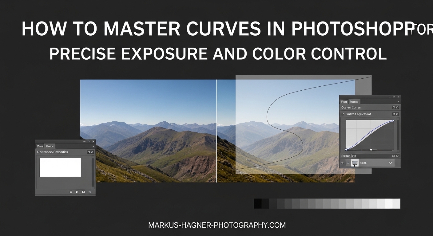
What Is the Curves Adjustment in Photoshop?
The Curves adjustment in Photoshop is a tonal editing tool that maps input brightness values to output values on a graph. The horizontal axis represents the original tonal values in your image (input), ranging from black on the left to white on the right. The vertical axis shows the adjusted values (output), with black at the bottom and white at the top. The diagonal line that runs from the bottom-left corner to the top-right corner represents the current tonal relationship.
Think of it this way: every point along that diagonal line corresponds to a specific brightness level in your photo. When you click on the line and drag it upward, you are telling Photoshop to make that brightness level lighter. Drag it down, and you make it darker. The beauty of Curves is that you can add multiple points and adjust different tonal ranges completely independently.
The graph also displays a histogram in the background, which shows the distribution of tones in your actual image. This histogram is crucial for understanding where your image data lives. A landscape photo with lots of sky might show a spike on the right side (highlights), while a low-key portrait might cluster on the left (shadows). Reading this histogram helps you decide which tonal ranges need adjustment.
What makes Curves superior to simpler tools is the ability to create custom curves that affect specific tonal ranges in precise amounts. While Levels only lets you set three points (black, white, and midtone), Curves lets you add up to 14 control points along the curve. This flexibility is why professional retouchers consider Curves the foundation of serious color work.
How to Access and Use Curves in Photoshop
There are three main ways to open the Curves adjustment in Photoshop, and I recommend learning all three. The most common method is through the Adjustments panel: click the Curves icon (which looks like a diagonal line curving upward) in the Adjustments panel. If you do not see this panel, go to Window > Adjustments to open it.
The second method uses the menu bar. Go to Image > Adjustments > Curves. This applies the adjustment directly to your layer, which destroys original pixel data. I strongly recommend avoiding this method for professional work because it is not reversible after you save and close the file.
The third and fastest method is the keyboard shortcut. Press Ctrl+M on Windows or Cmd+M on Mac to open the Curves dialog. This shortcut is one you will use constantly once Curves becomes part of your regular workflow.
For non-destructive editing, always use adjustment layers. Go to Layer > New Adjustment Layer > Curves, or click the half-filled circle icon at the bottom of the Layers panel and select Curves. This creates a separate Curves layer that you can edit, hide, or delete at any time without affecting your original image. Non-destructive editing is essential for professional photography workflows.
Understanding the Curves Dialog Box
When you open a Curves adjustment layer, you will see several important elements. The main graph dominates the center, showing your curve line against the histogram background. Along the top, you will find presets dropdown that offers pre-made curve shapes like “Medium Contrast” or “Negative.” On the left side, three eyedropper tools let you set black, gray, and white points directly in your image.
The channel dropdown at the top defaults to RGB, which adjusts all three color channels simultaneously. Clicking this dropdown reveals the individual Red, Green, and Blue channels for color-specific adjustments. The hand icon near the top-left activates the Targeted Adjustment Tool, which I will explain in detail later.
Beneath the graph, you will see Input and Output values that change as you move your cursor over the curve. These numbers range from 0 (black) to 255 (white). When you click to add a point, these values tell you exactly what tonal level you are affecting and how much you are adjusting it.
Essential Keyboard Shortcuts for Curves
Efficient Curves work depends on keyboard shortcuts. Here are the most important ones I use daily:
Ctrl+M (Windows) or Cmd+M (Mac) opens the Curves dialog. M by itself selects the Curves adjustment layer tool when you have an adjustment layer selected. Holding Alt (Windows) or Option (Mac) while clicking on the grid toggles between a 10×10 grid and a finer 4×4 grid for more precise control.
To add a point at a specific location, Ctrl-click (Windows) or Cmd-click (Mac) directly on your image. This places a control point on the curve at exactly the brightness level of the pixel you clicked. This technique is invaluable for targeting specific areas without guessing.
Arrow keys move selected points up, down, left, or right for fine adjustments. Hold Shift while pressing arrow keys for larger movements. Delete removes the selected point. Ctrl+D (Windows) or Cmd+D (Mac) deselects all points.
Using Curves for Precise Exposure Control
Exposure correction is where Curves truly shines. While simple exposure sliders affect the entire image equally, Curves lets you target specific tonal ranges with precision. Let me walk you through the techniques I use for every image I edit.
Setting Black and White Points
Properly setting black and white points gives your image a full tonal range from deep shadows to bright highlights. Start by locating the black eyedropper tool in the Curves panel (the leftmost eyedropper). Click it, then find the darkest point in your image that should be pure black. Clicking here sets the black point.
Next, use the white eyedropper (rightmost) to set your white point. Find the brightest area that should be pure white, like a specular highlight or bright cloud. Click to set this as your white point. Your image immediately gains contrast because Photoshop stretches the tonal range to fill the full 0-255 spectrum.
If your image lacks obvious black or white points, use the clipping preview. Hold Alt (Windows) or Option (Mac) while dragging the black or white point sliders at the bottom of the Curves panel. The image turns white or black, and colored pixels appear where clipping occurs. Stop just before you see significant clipping.
Creating the Classic S-Curve for Contrast
The S-curve is the most common Curves adjustment for adding contrast. Here is how I create one every time I want to add punch to an image:
Start with three points on the curve. Click near the bottom quarter of the diagonal line to create a shadows control point. Click near the middle for midtones. Click near the top quarter for highlights.
Pull the shadows point slightly downward to deepen the dark areas. Pull the highlights point slightly upward to brighten the light areas. The middle point stays roughly in place to anchor the midtones. The resulting curve shape resembles an S, hence the name.
The steepness of the S determines contrast intensity. A gentle S adds subtle contrast, while a more aggressive S creates dramatic impact. I typically start with small adjustments and increase gradually until the image looks right on my calibrated monitor.
Be careful not to overdo the S-curve. Pushing contrast too far clips shadows to pure black and highlights to pure white, destroying detail in those areas. Watch the histogram while adjusting, and use the clipping preview (Alt/Option while dragging) to monitor for lost data.
Adjusting Shadows, Midtones, and Highlights Independently
One of Curves’ greatest strengths is independent control over different tonal ranges. If your shadows look muddy but your highlights are perfect, you can adjust only the lower portion of the curve without affecting the upper portion.
For shadow adjustments, work with the lower third of the curve. Raising this area brightens shadows without changing midtones or highlights. This technique, called “lifting shadows,” is useful for recovering detail in underexposed areas.
Midtone adjustments affect the middle of the curve. Raising the midtone point brightens the overall image while maintaining contrast. Lowering it darkens the overall image. Because midtones contain most of the visible detail in typical photographs, small adjustments here have significant impact.
Highlight adjustments happen in the upper third of the curve. Lowering this area recovers blown highlights or reduces excessive brightness. Raising it increases highlight brightness. Always watch for clipping when adjusting highlights.
The Luminosity Blend Mode Technique
Here is a professional technique that many tutorials skip. When you adjust the RGB curve to change contrast or exposure, you might notice colors shifting. Shadows become more saturated, highlights lose saturation, and skin tones look unnatural. The luminosity blend mode solves this problem.
After creating your Curves adjustment layer, change its blend mode from Normal to Luminosity. You will find this dropdown at the top of the Layers panel. Luminosity mode applies only the tonal changes from your curve while ignoring any color shifts.
This technique is especially valuable for portrait photographers. Skin tones remain natural even when you add aggressive contrast. Landscape photographers also benefit because green foliage and blue skies maintain their original hue while gaining the contrast boost.
Mastering Color Control with Curves
Color correction and grading with Curves opens creative possibilities that transform ordinary photos into compelling images. By working with individual RGB channels, you can fix color casts, enhance mood, and create cinematic looks.
Understanding Individual RGB Channels
Click the channel dropdown at the top of the Curves panel to access individual color channels. Red controls red and cyan colors. Raising the red curve adds red to the image, while lowering it adds cyan. Green controls green and magenta. Blue controls blue and yellow.
The opposite colors are important to understand. When you lower the red curve, you are not just reducing red; you are actively adding cyan. This complementary relationship exists for all three channels. Red’s opposite is cyan, green’s opposite is magenta, and blue’s opposite is yellow.
Each channel operates on the same curve principles as the RGB composite. You can add multiple control points and create S-curves within individual channels. The difference is that adjustments now affect color rather than just tonality.
Color Correction Workflow
When correcting color problems, I follow a systematic workflow. First, I identify the color cast by looking at neutral areas like white walls, gray pavement, or shadows. If whites look yellow, I need to add blue (lower the blue curve or raise the yellow end). If shadows look magenta, I need to add green.
Start with the RGB composite curve to set overall exposure and contrast. Then switch to individual channels for color work. Often, a slight adjustment to one channel is all you need to neutralize a color cast.
The gray eyedropper tool (middle eyedropper) can automatically correct color casts. Click it on any area that should be neutral gray in your image. Photoshop adjusts all three channels to make that point neutral. This works well for images with obvious neutral reference points.
Color Grading Techniques
Color grading goes beyond correction into creative enhancement. This is where you develop a signature look or match the mood of your subject. The key is understanding how channel curves interact to create different effects.
For a warm, golden-hour look, raise the red curve in the highlights and lower the blue curve slightly. This adds warmth to bright areas while keeping shadows relatively cool. The color contrast creates visual interest.
For a moody, cinematic look, try the teal-and-orange effect popular in film. Lower the blue curve in the shadows (adding yellow) and raise it in the highlights (adding blue). This creates cool highlights and warm shadows, which looks especially striking in portraits and urban landscapes.
Vintage or faded looks often involve lifting the black point. Instead of letting shadows go to pure black, raise the bottom-left point of the RGB curve slightly. This creates milky shadows characteristic of film photography and gives digital images a softer, more nostalgic feel.
Skin Tone Considerations
Skin tones require special care when using Curves for color adjustments. Even small changes to the red or yellow channels can make skin look unnatural. I recommend making skin tone adjustments on separate layers with masks that isolate the skin areas.
When correcting skin, focus on the midtone portion of your color curves. Skin typically falls in the upper-midtone range. Avoid aggressive adjustments in this area. If skin looks too red, a very slight lowering of the red curve midtones usually suffices.
For warming skin tones, raise the red curve slightly in the midtones while lowering blue just a touch. The adjustment should be subtle enough that you barely notice it happening. Review your work at different zoom levels to ensure skin looks natural throughout.
Advanced Curves Techniques for Professional Results
Beyond basic adjustments, several advanced techniques can elevate your Curves workflow to professional levels. These methods address common challenges and improve efficiency.
The Targeted Adjustment Tool Explained
The Targeted Adjustment Tool (the hand icon in the Curves panel) lets you adjust the curve by clicking directly on your image. Activate this tool, then click and drag up or down on any part of your image. Photoshop automatically places a control point at the corresponding tonal level and adjusts it based on your drag direction.
This tool eliminates the guesswork of finding the right position on the curve. If you want to brighten a specific shadow area, click on that area and drag up. The tool places the point exactly where it needs to be on the curve to affect those pixels.
I use this tool constantly for localized adjustments. Combined with layer masks, it provides intuitive control over specific image areas without requiring precise curve point placement.
Creating and Saving Custom Curves Presets
When you develop a Curves adjustment you love, save it as a preset for future use. Click the presets dropdown at the top of the Curves panel, then click the save icon (looks like a floppy disk). Name your preset and save it.
Your saved presets appear in the presets dropdown alongside the default options. This is invaluable for maintaining consistent looks across multiple images or creating signature styles for different photography genres.
I have presets for common scenarios: portrait contrast, landscape drama, vintage fade, and several color grading looks. Loading these presets takes seconds compared to rebuilding curves from scratch each time.
Combining Multiple Curves Adjustment Layers
Professional retouchers often use multiple Curves layers for different purposes. One layer handles overall contrast, another handles color grading, and a third makes localized adjustments through masking. This modular approach provides maximum flexibility.
Start with a luminosity blend mode Curves layer for contrast. Add a second Curves layer in Normal blend mode for color grading. Use a third Curves layer with a layer mask to brighten or darken specific areas. Name each layer clearly so you remember its purpose.
This approach also makes revision easy. If a client wants more contrast but likes the color, you adjust only the contrast layer. If they want different color grading, you modify only that layer without affecting tonality.
Troubleshooting Common Curves Problems
Several issues commonly arise when using Curves. Knowing how to identify and fix them prevents frustration.
Posterization appears as banding in smooth gradients like skies. This happens when you push Curves adjustments too far, reducing the number of unique tonal values. The solution is gentler adjustments or working in 16-bit mode (Image > Mode > 16 Bits/Channel) which provides more tonal headroom.
Color shifts during tonal adjustments result from changing the RGB composite curve. Switch to Luminosity blend mode or make separate Curves layers for tonal and color adjustments.
Jagged curves create unnatural transitions. If your curve looks choppy with too many points close together, the image develops harsh tonal jumps. Use fewer control points and smooth transitions between them. The Smooth Curves option (pencil icon menu) can help fix rough curves.
Practical Examples: Curves in Action
Let me share specific workflows for common photography scenarios. These examples demonstrate how the techniques combine in real editing situations.
Portrait Photography Workflow
For portraits, I start with a luminosity blend mode Curves layer for overall contrast. A gentle S-curve adds dimension without affecting skin color accuracy. I keep the midtone point anchored and make subtle adjustments to shadows and highlights.
Next, I add a color grading layer in Normal blend mode. For most portraits, I add slight warmth by raising red highlights minimally. I check skin tones carefully and adjust if they look off.
Finally, I use a targeted Curves layer with a mask to brighten the face slightly. Feathering the mask ensures natural transitions. The result is a polished portrait with natural skin and pleasing contrast.
Landscape Enhancement Technique
Landscapes benefit from more aggressive contrast. I start with a stronger S-curve in luminosity mode to add drama. The steeper curve creates more impact without affecting color.
For color grading, I often add blue to highlights and warmth to shadows. This creates atmospheric depth and visual interest. The technique works especially well for skies and distant mountains.
If the foreground needs brightening while the sky stays dark, I use a Curves layer with a graduated mask. The mask protects the sky while the curve lifts shadow detail in the foreground.
Creative Color Grading Look
For a dramatic cinematic look, try this approach. Lower the RGB curve’s black point slightly to create lifted shadows. Add a strong S-curve for contrast. In the Blue channel, create an inverted S that adds blue to highlights and yellow to shadows. The result is a film-like aesthetic perfect for urban or editorial work.
Remember that creative looks work best when they serve the image’s mood. Not every photo needs dramatic color grading. Sometimes subtle adjustments create more impact than obvious effects.
Frequently Asked Questions
How to make perfect curves in Photoshop?
How do I turn on precise color management in Photoshop?
Which Photoshop tool is used to smooth curves or create paths?
How to adjust color curves in Photoshop?
Conclusion
Mastering curves in Photoshop opens doors to precise exposure control and creative color grading that no other tool can match. From understanding the input-output graph to creating cinematic color grades, the techniques in this guide form the foundation of professional photo editing. Remember that Curves rewards practice. Start with gentle S-curves and subtle color adjustments, then gradually experiment with more aggressive looks as your confidence grows. Save your favorite adjustments as presets, and always work non-destructively with adjustment layers. With consistent practice, Curves will become your go-to tool for transforming good photos into great ones.