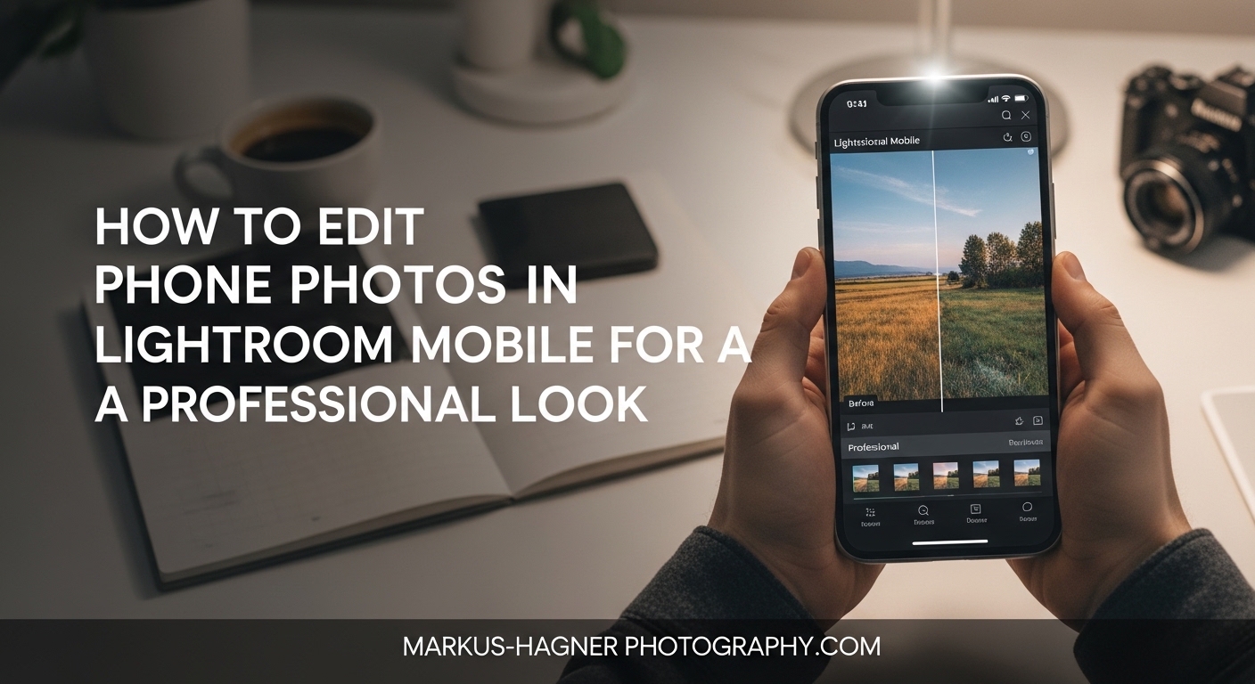
Your phone captures incredible images, but raw phone photos rarely look polished straight out of the camera. Learning how to edit phone photos in Lightroom Mobile for a professional look transforms ordinary snapshots into professional-quality images that stand out on social media, portfolios, or personal archives.
Lightroom Mobile brings desktop-grade editing power to your fingertips. In this guide, I will walk you through my complete mobile photo editing workflow, from basic adjustments to advanced techniques that give your images that polished, professional look. Whether you are shooting with an iPhone or Android device, these techniques work universally.
After editing thousands of phone photos over the years, I have developed a reliable workflow that consistently delivers professional results. Let me share exactly how I approach each edit, including the specific settings and order of operations that make the biggest difference.
Getting Started with Lightroom Mobile
Adobe Lightroom Mobile is free to download and offers impressive editing capabilities without any subscription. The app is available on both iOS (iPhone and iPad) and Android devices, providing the same core features across platforms.
Downloading and Setting Up the App
Download Lightroom Mobile from the App Store (iOS) or Google Play Store (Android). Once installed, you can sign in with an Adobe ID or use the app without logging in for basic editing features. The free version includes most essential tools, while premium features like selective edits, healing brush, and RAW editing require a Creative Cloud subscription.
Free vs Premium Features
The free version gives you access to basic light and color adjustments, cropping tools, and built-in presets. Premium unlocks advanced masking tools, the healing brush, geometry corrections, RAW editing, and cloud sync with desktop Lightroom. Most beginners can start with the free version and upgrade as their skills grow.
Navigating the Interface
The Lightroom Mobile interface is intuitive once you understand the layout. Your editing tools are organized into panels at the bottom of the screen: Light, Color, Effects, Detail, Optics, and Geometry. Tapping each panel reveals specific adjustment sliders. The top of the screen houses your undo/redo buttons and the export option.
Importing Your First Photo
Tap the blue plus icon to add photos from your camera roll. You can also shoot directly within the app using the camera icon, which gives you manual controls for exposure and focus. When importing existing photos, Lightroom creates a copy for editing, so your original remains untouched.
Understanding RAW vs JPEG for Mobile Photography
Before diving into editing, understanding file formats helps you make better capture decisions. Phone cameras typically shoot JPEG by default, which processes and compresses the image in-camera. While convenient, JPEG files limit your editing flexibility.
What RAW Files Offer
RAW files contain all the unprocessed data from your camera sensor. This means you can recover blown-out highlights, pull detail from shadows, and adjust white balance without degrading image quality. For serious mobile photography, shooting RAW provides dramatically more editing headroom.
How to Capture RAW on Mobile
On iPhone, use the Lightroom Mobile camera or enable Apple ProRAW in settings (iPhone 12 Pro and later). Many Android phones support RAW capture through their native camera apps or third-party apps like Lightroom Mobile camera. Look for the RAW or DNG option in your camera settings.
When JPEG Works Fine
JPEG files work perfectly for casual shots, social media posts, and situations where you want to edit quickly. If your exposure and white balance are correct in-camera, JPEG files can still produce professional results. The key is understanding when you need RAW flexibility versus JPEG convenience.
Basic Light Adjustments: The Foundation of Every Edit
Light adjustments form the foundation of every professional edit. I always start here because color and effects depend on proper tonal balance. The Light panel contains six essential sliders that work together to shape your image.
Exposure: Setting Overall Brightness
The Exposure slider controls the overall brightness of your image. Drag right to brighten, left to darken. For phone photos, I typically adjust exposure in small increments of 0.1 to 0.3 stops. Over-brightening creates washed-out highlights, while under-exposing loses shadow detail.
Start by finding the sweet spot where your subject is properly exposed. If the overall scene looks too dark, increase exposure gradually. Watch the histogram at the top of the screen to avoid clipping highlights (pushing data off the right edge) or crushing shadows (left edge).
Contrast: Adding Depth and Dimension
Contrast increases the difference between light and dark areas in your photo. Higher contrast creates a punchy, dramatic look, while lower contrast appears softer and flatter. For most phone photos, I increase contrast slightly (+10 to +25) to compensate for the slightly flat look of mobile cameras.
Highlights: Recovering Bright Areas
The Highlights slider specifically targets the brightest parts of your image. Phone cameras often blow out skies and bright backgrounds. Dragging highlights to the left (-20 to -50) recovers detail in these areas without affecting mid-tones or shadows.
This is particularly useful for outdoor shots where the sky appears too bright. Lowering highlights brings back cloud detail and creates a more balanced exposure across the entire frame.
Shadows: Opening Up Dark Regions
Shadows affect only the darkest areas of your photo. Increasing shadows (+20 to +40) reveals hidden detail in underexposed regions like foregrounds in backlit scenes or faces in shadow. Be careful not to overdo this adjustment, as lifting shadows too much introduces noise and an unnatural flatness.
Whites and Blacks: Setting Tonal Endpoints
Whites and Blacks fine-tune the extreme ends of your tonal range. Increasing Whites (+10 to +20) adds brightness to the lightest areas without affecting highlights. Decreasing Blacks (-10 to -20) deepens the darkest shadows, adding richness and preventing washed-out blacks.
I adjust Whites and Blacks after setting exposure, highlights, and shadows. These final tweaks polish the overall tonal balance and give images that professional contrast without harshness.
The Recommended Order of Light Adjustments
Follow this sequence for consistent results: Exposure first, then Contrast, followed by Highlights, Shadows, Whites, and finally Blacks. This order ensures each adjustment builds on a properly balanced foundation rather than fighting against previous changes.
Color Correction Essentials
After establishing proper light balance, color correction takes your photo from technically correct to visually compelling. The Color panel offers both global adjustments and targeted HSL controls for precise color work.
Temperature and Tint: Fixing White Balance
Temperature controls the warm-cool balance of your image. Drag right to warm up (add yellow/orange) or left to cool down (add blue). Phone cameras often produce slightly cool images, so warming by +5 to +15 typically looks more natural.
Tint handles the green-magenta axis. Most phone photos need minimal tint adjustment, but indoor lighting can introduce color casts that require correction. Look at neutral areas like white walls or gray surfaces to judge accurate white balance.
Vibrance vs Saturation: Understanding the Difference
Saturation increases color intensity equally across all colors, which can quickly lead to oversaturated, unnatural results. Vibrance is smarter: it boosts muted colors while protecting already-saturated areas and skin tones.
For professional results, I prefer Vibrance over Saturation. Increase Vibrance by +10 to +25 for most images. Use Saturation sparingly, if at all, as it tends to create that over-processed look common in amateur edits.
Using the HSL Panel for Targeted Color Work
The HSL (Hue, Saturation, Luminance) panel gives you surgical control over individual color ranges. This is where you fix specific color issues or create stylized looks.
Common HSL adjustments for phone photos include desaturating blues (-20 to -50) and increasing blue luminosity to prevent harsh blue skies from dominating landscapes. Decreasing orange saturation and increasing orange luminosity helps balance skin tones that appear too saturated from phone cameras.
Fixing Common Phone Photo Color Issues
Phone cameras often produce colors that look slightly artificial or overly saturated. To fix this, I recommend slightly reducing overall saturation (-5 to -10), using the HSL panel to target problem colors, and applying subtle color grading for a cohesive look. The goal is natural colors that enhance rather than overwhelm the image.
How to Edit Phone Photos in Lightroom Mobile Using Selective Edits and Masking?
Selective edits transform good photos into great ones by letting you adjust specific areas independently. This is where mobile editing truly matches desktop capabilities, giving you professional control over every element of your image.
Linear and Radial Gradients Explained
Linear gradients create adjustments that transition across the image in a straight line. Use them to darken skies, brighten foregrounds, or add directional light effects. Drag across the image to create the gradient, then adjust your settings.
Radial gradients apply adjustments in an elliptical shape, perfect for vignettes or highlighting subjects. The adjustment applies from the center outward (or inverted), creating natural-looking localized changes.
The Brush Tool for Precise Selections
The Brush tool lets you paint adjustments exactly where you want them. Use it to dodge (brighten) or burn (darken) specific areas, enhance subjects, or apply color corrections to isolated regions. The brush includes size, feather, and flow controls for precision work.
AI-Powered Masking Features
Premium subscribers gain access to AI masking tools that automatically detect and select subjects, skies, and backgrounds. These tools save tremendous time and create clean selections that would be difficult to achieve manually. The AI Select Subject feature works remarkably well for portraits and product photos.
When to Use Selective Edits
Use selective edits when global adjustments affect areas you want to preserve. Common scenarios include darkening bright skies without affecting the foreground, brightening faces in backlit portraits, or adding warmth to specific elements while keeping the rest neutral. Selective edits should enhance your image subtly, not look obvious or forced.
Removing Distractions: Healing and Generative Remove
Professional photos rarely include random objects, dust spots, or blemishes. Lightroom Mobile offers healing tools that clean up distractions efficiently, though some features require a premium subscription.
Using the Healing Brush
The Healing brush samples nearby pixels and blends them to remove small objects, spots, or blemishes. Tap the area you want to remove, and Lightroom automatically finds a suitable source area. For best results, work on small areas at a time and zoom in for precision.
Heal vs Clone Modes
Heal mode blends the sampled area with surrounding pixels for seamless integration. Clone mode copies pixels exactly without blending. Use Heal for most situations and Clone when you need to match specific textures or patterns exactly.
Generative Remove for Complex Distractions
Premium subscribers can use Generative Remove, an AI-powered tool that removes larger objects and reconstructs the background convincingly. This works well for photobombers, power lines, or any distraction that covers significant portions of your image. The AI fills in removed areas with contextually appropriate content.
Tips for Natural-Looking Results
Always work at 100% zoom or higher when healing to ensure clean edges. Make multiple small passes rather than one large brush stroke. Check your results by toggling the before/after view to confirm the edit looks natural and seamless.
Cropping, Geometry, and Composition Tools
Composition adjustments refine how your image is framed and perceived. These tools correct technical issues and improve visual impact through careful cropping and perspective correction.
The Crop Tool and Aspect Ratios
The Crop tool removes unwanted edges and recomposes your image. Lightroom Mobile includes preset aspect ratios (1:1 for Instagram square, 16:9 for video, 4:5 for Instagram portrait) or you can crop freely. Tap the lock icon to constrain proportions or unlock for free-form cropping.
Straightening Horizons
Crooked horizons immediately make photos look amateur. The straighten tool (accessed within the Crop panel) lets you rotate your image to level horizons. Drag the slider or use the auto-straighten feature for quick corrections. A perfectly straight horizon adds polish to landscape and architectural photos.
Geometry Tools for Perspective Correction
The Geometry panel (premium feature) corrects perspective distortion common in architectural and interior photography. Use Vertical to fix converging lines when shooting up at buildings, or Horizontal for side-angle distortions. The Auto option often works well, or manually adjust with the sliders.
When to Use Auto Upright
Auto Upright analyzes your image and applies perspective corrections automatically. It works best for photos with clear vertical and horizontal lines like buildings, doorways, or room interiors. For more control, use the Guided Upright tool to draw lines that should be vertical or horizontal.
Using Presets and Creating Your Own
Presets provide one-click starting points for your edits. While presets cannot replace proper editing technique, they accelerate your workflow and help achieve consistent looks across multiple photos.
Built-in Presets Overview
Lightroom Mobile includes several preset categories: Color, Creative, B&W, Vintage, and more. Each preset applies a specific combination of adjustments designed for particular looks. Browse through them to find styles that match your vision, then fine-tune individual settings as needed.
How to Apply Presets Effectively
Treat presets as starting points, not final solutions. Apply your chosen preset, then adjust exposure, white balance, and other settings to match your specific image. A preset designed for sunny landscapes will look wrong on an indoor portrait without adjustment.
Creating Custom Presets for Consistent Style
Once you develop an editing style you like, save it as a custom preset. Edit a photo to your satisfaction, tap the three dots menu, and select Create Preset. Name it descriptively and choose which settings to include. Custom presets ensure consistency across your portfolio and save time on future edits.
Advanced Techniques for a Professional Look
These advanced techniques separate casual edits from professional results. Each requires careful application and an understanding of when to use (and not overuse) these powerful tools.
Color Grading for Mood and Style
Color grading adds colored tints to shadows, midtones, and highlights to create mood and cohesion. Unlike basic color correction, color grading is a creative choice that defines your visual style.
For a cinematic look, add slight blue to shadows and warm orange to highlights. For a vintage feel, add muted green to shadows and warm tones to midtones. Keep adjustments subtle (saturation under 20) for natural results. Color grading works best when applied consistently across a series of photos.
Clarity and Texture for Detail Enhancement
Texture enhances fine details without affecting overall contrast. Clarity increases mid-tone contrast for a punchier look. For phone photos, I often decrease Clarity slightly (-5 to -15) to reduce the digital sharpness typical of mobile cameras. Increase Texture (+10 to +20) for landscapes and architectural shots where detail matters.
Removing the iPhone Look from Phone Photos
Phone cameras produce a distinctive processed look: oversaturated colors, excessive local contrast, and harsh sharpening. To counteract this, try these adjustments: decrease Clarity by 5-10 points, desaturate blues in the HSL panel (-20 to -50), increase blue luminosity, and reduce overall Vibrance slightly.
These changes soften the artificial crispness that signals phone photography, giving your images a more natural, professional appearance.
Lens Blur for Depth of Field Effects
Premium subscribers can add artificial depth of field using the Lens Blur tool. This simulates the shallow focus of professional lenses, blurring backgrounds while keeping subjects sharp. The AI-powered version automatically detects subjects, or you can manually refine the focus area. Use this sparingly, as obvious blur effects look artificial.
Exporting and Saving Your Edited Photos
Your edit is only useful once exported and shared. Lightroom Mobile offers several export options with different quality settings for various purposes.
Export Quality Settings
For maximum quality, export at 100% quality with full resolution. This creates larger files but preserves all detail. For social media, 85% quality with long edge set to 2048 pixels balances quality with file size. Always export as JPEG for sharing, unless you need to preserve transparency (use PNG).
File Format Recommendations
JPEG works for virtually all sharing scenarios. If you plan to edit further on desktop, export as DNG (available with premium) to preserve editing flexibility. For web use, JPEG at 80-85% quality provides the best quality-to-size ratio.
Sharing to Social Media
Lightroom Mobile includes direct sharing to Instagram, Facebook, and other platforms. However, I recommend exporting to your camera roll first, then uploading through the native app. This gives you more control over captions, hashtags, and scheduling while preserving image quality.
Cloud Sync with Lightroom Desktop
Premium subscribers can sync edits across devices through Adobe Creative Cloud. Photos edited on mobile appear in your desktop Lightroom catalog, and vice versa. This seamless integration lets you start edits on your phone and finish on a larger screen when convenient.
Common Editing Mistakes to Avoid (2026)
Even experienced editors make these mistakes. Awareness helps you avoid them and maintain professional quality in your work.
Over-Sharpening
Excessive sharpening creates halos around edges and an artificial, crunchy appearance. Apply sharpening as one of your final steps, and zoom to 100% to check results. For most phone photos, minimal or no additional sharpening is needed.
Excessive Saturation
Oversaturated images look amateur and dated. If colors seem weak, check your white balance first before reaching for saturation. Remember that Vibrance provides more natural results than raw Saturation increases.
Ignoring White Balance
Incorrect white balance makes colors look wrong regardless of other adjustments. Always check temperature and tint early in your workflow. A properly white-balanced image needs less color correction overall.
Inconsistent Editing Across Photos
When editing a series of photos, use similar settings or presets to maintain visual consistency. Jarring differences between images in a portfolio or social feed look unprofessional. Create custom presets for your common scenarios to ensure consistency.
Frequently Asked Questions
How to edit photos in mobile like a professional?
To edit photos like a professional on mobile, start with proper exposure and white balance adjustments, then move to color correction using temperature and tint sliders. Use selective edits to enhance specific areas, apply subtle sharpening, and finish with consistent color grading. The key is making subtle, intentional adjustments rather than drastic changes. Always work in a logical order: exposure first, then contrast, highlights, shadows, and finally color adjustments.
Can Lightroom mobile enhance photo quality?
Yes, Lightroom Mobile can significantly enhance photo quality through professional-grade adjustment tools. It allows you to correct exposure, fix color casts, recover detail in highlights and shadows, remove unwanted objects, and apply professional color grading all from your phone. For best results, shoot in RAW format when possible, as this gives you maximum editing flexibility to recover details and adjust white balance without quality loss.
How to make photos taken on a phone look professional?
To make phone photos look professional: 1) Start with proper exposure using the exposure slider, 2) Adjust white balance for natural colors, 3) Recover highlights and open shadows carefully, 4) Use selective edits to enhance the subject, 5) Apply subtle sharpening at the end of your workflow, 6) Use color grading for consistent mood, 7) Avoid over-editing with heavy filters or excessive clarity. The most professional edits are often the most subtle ones.
How to make photos sharper on Lightroom phone?
To make photos sharper in Lightroom Mobile, use the Sharpening slider in the Detail panel, available with a premium subscription. Start with Amount around 40-50 and Radius around 1.0. Hold down on the photo to see the before and after comparison. For best results, zoom in to 100% to check sharpness. Apply sharpening at the end of your editing workflow, and remember that phone photos often need minimal additional sharpening.
Conclusion
Learning how to edit phone photos in Lightroom Mobile for a professional look photography from the device you carry every day. The workflow is straightforward once you understand the order of operations: start with light adjustments, move to color correction, apply selective edits where needed, and finish with composition and export.
The techniques covered here form the foundation of professional mobile editing. As you practice, you will develop an intuitive sense for which adjustments each image needs and how far to push each slider. Remember that the best edits enhance your vision without calling attention to the editing itself. Keep practicing, experiment with different styles, and most importantly, have fun transforming your phone photos into professional-quality images.