After printing thousands of photographs over the past 15 years, I’ve learned that the choice between matte and glossy finishes can make or break how your fine art work is perceived. This matte vs glossy prints fine art photography decision goes far beyond personal preference. It affects everything from how collectors view your work to whether your images will hold up in gallery settings.
The print finish you choose determines how light interacts with your image, how colors appear to viewers, and even how your work ages over time. For fine art photographers specifically, this choice carries professional weight. Your print finish signals quality, intention, and artistic vision to everyone who sees your work.
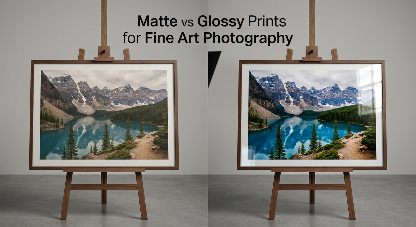
Here’s my quick verdict after years of testing both finishes: matte wins for most fine art applications, especially gallery exhibitions, framed prints, and limited edition sales. However, glossy has its place, particularly for vibrant color work and images viewed up close without glass.
Let me walk you through everything you need to know to make the right choice for your specific situation.
What is Matte Finish?
A matte finish features a non-reflective surface that scatters light rather than reflecting it directly back at the viewer. This happens because matte papers have a textured surface coating that diffuses light in multiple directions. The result is a soft, understated appearance that many photographers describe as more artistic and professional.
When I first started printing my work, I gravitated toward glossy because it seemed to make colors “pop.” But after seeing my matte prints displayed alongside other photographers’ glossy work at a group exhibition, I understood the difference immediately. While glossy prints created glare under the gallery spotlights, my matte prints remained viewable from any angle without the viewer needing to dodge reflections.
The technical reason matte appears softer involves ink absorption. With uncoated or lightly coated matte papers, ink sinks into the paper surface rather than sitting on top. This creates what photographers call “gentle gradations” where tonal transitions appear smooth rather than abrupt. For fine art work, this subtle quality often enhances the viewing experience.
Matte papers come in various textures, from completely smooth to heavily textured watercolor-style surfaces. Each texture affects how your image appears. Smooth matte papers maintain detail sharpness while reducing glare. Textured matte papers add an organic, painterly quality that works beautifully for certain subjects.
Pros of Matte Finish
Glare-free viewing: You can view matte prints from any angle without fighting reflections. This matters enormously in galleries, homes with bright windows, and any space with overhead lighting.
Fingerprint resistance: Matte surfaces hide fingerprints and smudges far better than glossy. If you handle prints frequently or sell them at art fairs, this practical benefit becomes significant.
Professional perception: The fine art market overwhelmingly associates matte finishes with premium quality. Collectors and gallery curators often expect matte prints for limited edition work.
Better for framing: When you place a print behind glass, adding another reflective surface creates double glare issues. Matte prints paired with glass create far fewer viewing problems.
Black and white excellence: Matte papers render subtle tonal gradations beautifully, making them ideal for black and white photography where tonal range defines image quality.
Archival advantages: Many archival-quality papers come in matte finishes, designed for longevity without the plastic-like coating found on some glossy papers.
Cons of Matte Finish
Reduced color vibrancy: Colors appear less saturated on matte surfaces. If your image relies on punchy, vibrant colors, you may find the results disappointing compared to glossy.
Perceived sharpness reduction: The light-scattering effect that eliminates glare can also make fine details appear slightly softer. This effect varies greatly depending on paper quality.
Limited dynamic range: Matte papers typically can’t reproduce the deepest blacks or brightest highlights as effectively as glossy papers, potentially reducing overall contrast.
Higher cost: Premium matte fine art papers cost more than consumer glossy options, though this investment pays off for serious work.
What is Glossy Finish?
A glossy finish features a smooth, highly reflective surface that bounces light directly back toward the viewer. This creates that characteristic shine most people associate with traditional photo prints. The coating on glossy papers keeps ink sitting on the surface rather than absorbing into the paper fibers.
I remember printing a series of vibrant sunset images on glossy paper for a client who specifically requested maximum color impact. The results were stunning. Colors appeared saturated and rich, with deep blacks that matte simply couldn’t match. Viewed under controlled lighting, those glossy prints drew people in immediately.
The technical advantage of glossy comes from how it handles light and ink. Because the coating prevents ink absorption, colors remain vivid and details stay sharp. The smooth surface also creates what’s called “specular highlights” that can enhance the perception of dimensionality in an image.
Glossy papers range from consumer-grade options at drugstore photo labs to professional gallery-quality papers. High-quality glossy papers designed for fine art printing differ significantly from cheap glossy options. Professional glossy papers maintain color accuracy while providing that characteristic sheen.
Pros of Glossy Finish
Maximum color vibrancy: Glossy papers deliver the most saturated, punchy colors possible. For images with intense color palettes, glossy makes those colors sing.
Sharp detail reproduction: The smooth surface preserves fine details with exceptional clarity. Texture and fine patterns render beautifully on quality glossy paper.
Wide dynamic range: Glossy papers typically produce deeper blacks and brighter highlights, creating greater overall contrast and impact.
Traditional photo appearance: Many viewers associate glossy with “real photographs,” which can influence perception positively for certain audiences.
Lower cost: Consumer glossy papers and prints cost less than premium matte options, making them budget-friendly for high-volume printing.
Cons of Glossy Finish
Glare and reflections: The shiny surface reflects light sources directly, creating viewing problems in many environments. This becomes especially problematic in galleries with spot lighting.
Fingerprint magnet: Every touch leaves visible marks on glossy surfaces. Handling glossy prints requires extreme care, especially when selling at art fairs or exhibitions.
Poor glass pairing: Framing glossy prints behind glass compounds reflection problems. You’ll often see yourself reflected in the frame rather than the image.
Less professional perception: In fine art circles, glossy sometimes signals “consumer quality” rather than professional work, though this perception varies.
Viewing angle limitations: You must stand directly in front of glossy prints for optimal viewing. Move to either side and reflections interfere with the image.
Matte vs Glossy: Side-by-Side Comparison
Understanding the differences between these finishes helps you make informed decisions. Here’s how matte and glossy compare across the factors that matter most for fine art photography.
| Feature | Matte Finish | Glossy Finish | Winner |
|---|---|---|---|
| Reflectivity | Non-reflective, diffuses light | Highly reflective, direct light bounce | Matte for galleries |
| Color Vibrancy | Muted, natural appearance | Maximum saturation and punch | Glossy for vibrant work |
| Contrast Range | Moderate contrast | Deep blacks, bright highlights | Glossy |
| Fingerprint Resistance | Excellent, hides marks well | Poor, shows every touch | Matte |
| Detail Sharpness | Good, slightly softer | Excellent, crisp details | Glossy |
| Gallery Suitability | Excellent, professional standard | Challenging due to glare | Matte |
| Behind Glass | Works well with glass | Double reflection problems | Matte |
| Black and White | Beautiful tonal gradations | High contrast impact | Depends on image |
| Handling Durability | Better resists marks | Requires careful handling | Matte |
| Professional Perception | Premium, artistic | Consumer-oriented | Matte (fine art context) |
| Cost | Higher for archival quality | Lower for consumer options | Glossy (budget) |
The right choice depends entirely on your specific situation. A vibrant travel photograph destined for a photo album might benefit from glossy, while the same image printed for a gallery exhibition would likely work better on matte.
Fine Art Photography Considerations
Fine art photography demands different considerations than casual printing. Your choice affects how curators, collectors, and fellow artists perceive your work. After years of exhibiting and selling prints, I’ve learned that the fine art market has specific expectations around print finishes.
Gallery and Exhibition Standards
Most galleries prefer or require matte prints for exhibitions. The practical reason is simple: gallery lighting typically involves spotlights aimed at artwork. Glossy prints under spotlights become nearly unviewable due to glare. During one exhibition, I watched visitors struggle to see a photographer’s glossy prints while easily viewing matte work from various angles.
Many galleries explicitly state their preference for matte finishes in submission guidelines. Some won’t accept glossy prints at all. Before submitting work to exhibitions, always check the specific requirements.
Limited Edition Print Market
Collectors purchasing limited edition prints expect archival quality and professional presentation. Matte papers dominate this market because they signal serious fine art rather than consumer snapshots. When you sell prints for hundreds or thousands of dollars, the finish choice affects perceived value.
For limited editions, I recommend premium cotton rag matte papers with archival certifications. These papers cost more but justify higher sale prices and provide collectors with confidence in longevity.
Black and White Photography
Black and white photography deserves special consideration. The genre relies entirely on tonal range rather than color. Matte papers excel at rendering the subtle gradations between tones that define quality black and white work.
That said, some photographers prefer glossy for high-contrast black and white images where deep blacks and bright whites create dramatic impact. Ansel Adams famously printed on glossy papers for maximum tonal range. The key is matching your paper choice to your image style.
For most contemporary fine art black and white work, matte papers provide the sophisticated tonal rendering that collectors expect.
Collector Preferences
Based on my experience and conversations with collectors, the fine art market strongly favors matte finishes. Collectors associate matte with museum-quality work and archival permanence. This perception influences purchasing decisions and the prices collectors are willing to pay.
One collector told me explicitly that glossy prints feel “like drugstore photos” regardless of the image quality. While this view isn’t universal, it reflects a common bias in the fine art market.
Museum Conservation Standards
Museums prioritize longevity and conservation when acquiring photographs. Archival matte papers with acid-free composition and stable coatings meet these requirements. Many museum-quality papers are specifically designed for long-term preservation.
Glossy papers can also be archival, but the coating composition varies widely. Some glossy coatings yellow or degrade over time. For work intended to last generations, choose papers with proven archival certifications regardless of finish.
Professional Photographer Perspective
From conversations with professional photographers who print their own work, matte dominates for exhibitions and client presentations. Most own both matte and glossy papers but use them strategically.
One colleague explained his approach: “I use matte for everything that gets framed or displayed. Glossy only for portfolio books and prints that stay in sleeves.” This practical division makes sense for many working photographers.
Another photographer working with highly saturated color images prefers glossy for that specific body of work. “My travel photography needs that color punch,” she explained. “But my documentary work goes on matte because it feels more appropriate to the subject.”
When to Choose Matte
Based on years of printing experience, here are the situations where matte finish delivers the best results for fine art photography.
Gallery Exhibitions
Any work destined for gallery display should use matte finish unless the gallery specifically requests otherwise. The glare-free viewing experience matters more in exhibition settings than anywhere else. You want viewers focused on your image, not fighting reflections.
Framed Prints
When you plan to frame work behind glass, matte prints work far better. The combination of glossy print plus glass creates double reflections that make viewing difficult. Matte prints behind glass remain viewable from various angles and under different lighting conditions.
Brightly Lit Spaces
Homes and offices with large windows or bright overhead lighting benefit from matte prints. You won’t need to reposition the print or dim lights to see the image clearly. This practical consideration matters for client satisfaction.
Black and White Work
For most black and white fine art photography, matte papers render the subtle tonal gradations that define quality work. The soft, non-reflective surface complements the contemplative nature of monochrome imagery.
Limited Edition Sales
When selling limited edition prints to collectors, matte finishes signal professional quality and archival intent. The market expects matte for premium priced work.
Handling Intensive Situations
Art fairs, portfolio reviews, and any situation where prints get handled frequently benefit from matte’s fingerprint resistance. You can show work without constant worry about marks and smudges.
Subtle, Contemplative Images
Images with soft light, gentle transitions, and quiet moods often work better on matte. The paper’s character complements rather than competes with the image content.
When to Choose Glossy
Glossy has legitimate applications in fine art photography. Here’s when glossy makes sense.
Vibrant Color Photography
Images with intense, saturated colors benefit from glossy’s color-popping ability. Travel photography, vivid landscapes, and work where color is the primary subject can shine on glossy paper.
Photo Albums and Books
Prints in albums or books viewed close-up without glass work beautifully on glossy. The traditional photo appearance feels appropriate for personal collections and portfolio books.
Close Viewing Distances
Small prints meant to be held and examined closely work well on glossy. When viewers can control the viewing angle and distance, glare becomes less problematic.
Maximum Detail Work
Images where fine detail matters most, such as intricate textures or patterns, benefit from glossy’s sharp reproduction. Architectural photography and macro work can take advantage of this quality.
High Contrast Images
Work that relies on dramatic contrast between deep blacks and bright highlights gains impact from glossy’s wider dynamic range. High-key or low-key imagery may benefit from this characteristic.
Controlled Lighting Environments
If you control the display environment with careful lighting placement, glossy becomes more viable. Museums with sophisticated lighting design sometimes display glossy prints successfully.
Framing Behind Glass: Special Considerations
Framing presents unique challenges for print finish choice. The combination of print surface and glass creates interaction effects that significantly impact viewing experience.
Glossy prints behind glass create double reflections. The print surface reflects light, and the glass reflects additional light. This compound effect often makes glossy prints nearly impossible to view comfortably. You see yourself, the room, and light sources reflected in the frame rather than the photograph.
Matte prints behind glass work well. The non-reflective print surface eliminates one reflection source. Only the glass creates reflections, which can be minimized with proper placement and non-reflective glass options.
Museum glass and anti-reflective options help both finishes. These specialty glass types reduce reflections significantly but add substantial cost. With museum glass, even glossy prints become more viewable behind glass.
Alternative: Print on metal or acrylic. Some fine art photographers skip paper entirely and print directly on metal or acrylic substrates. These options provide their own surface characteristics without requiring additional glass.
Alternative Finish Options
Matte and glossy represent endpoints on a spectrum. Several middle-ground options exist that combine characteristics of both.
Lustre and Satin Finishes
Lustre and satin finishes offer moderate reflectivity between matte and glossy. These papers provide some color vibrancy enhancement while maintaining reasonable glare resistance. Many professional photographers consider lustre the best compromise for client work.
I’ve used lustre papers for client proofs where I wanted better color accuracy than matte provided without committing to glossy’s glare problems. The results satisfied clients who wanted to see colors accurately without the extreme characteristics of either endpoint.
Silk Finish
Silk papers feature a subtle texture that reduces glare while maintaining color vibrancy. The texture adds a tactile quality that some photographers find appealing for certain subjects.
Pearl and Semi-Gloss
These finishes provide slight sheen without full glossy reflection. They work well for images that need more color pop than matte provides but shouldn’t have glossy’s extreme reflectivity.
Alternative Substrates
Beyond paper, consider these substrate options for fine art printing:
Canvas: Canvas prints naturally have a matte or semi-matte appearance. The texture adds character and works well for large format prints destined for wall display without glass.
Metal prints: Aluminum prints can have glossy, satin, or matte coatings. Metal provides exceptional durability and a contemporary aesthetic that suits certain work.
Acrylic face mounts: Printing on paper and face-mounting to acrylic creates a glossy, glass-like appearance with exceptional depth and vibrancy. This premium option works for high-end gallery displays.
Testing Before Committing
Before ordering large prints or committing to a paper for an entire project, always test with small samples. This advice comes from experience: I once printed an entire exhibition’s worth of work on a paper I hadn’t tested, only to discover the surface texture overwhelmed the subtle images.
Order sample packs from paper manufacturers. Most companies offer small sample sheets or sample books at reasonable prices. Print the same image on multiple papers and compare them under different lighting conditions.
View samples at different times of day and under various light sources. A print that looks perfect under your studio lights might appear completely different in gallery spotlights or home lighting.
Test the same image on both matte and glossy versions before committing. Some images clearly favor one finish over the other, and you won’t know until you see them side by side.
FAQ
Should fine art prints be matte or glossy?
Most fine art photographers prefer matte prints for gallery exhibitions and collector sales. Matte finishes provide glare-free viewing, professional appearance, and better compatibility with framing. However, the choice depends on your specific image, display environment, and target audience. Vibrant color work may benefit from glossy, while contemplative black and white images typically excel on matte.
Do professional photographers use matte or glossy?
Professional photographers use both finishes strategically. For gallery exhibitions, client presentations, and framed work, most professionals choose matte. For portfolio books, album prints, and images requiring maximum color vibrancy, many professionals select glossy or lustre. The decision depends on the specific application rather than a universal preference.
Are photos better in matte or glossy?
Neither finish is universally better. Matte excels for framed prints, bright spaces, gallery displays, and black and white photography. Glossy excels for vibrant color work, close viewing, photo albums, and controlled lighting environments. The best choice depends on your specific image, how it will be displayed, and who will view it.
Is gloss or matte better for photo prints?
The answer depends on your use case. Choose matte for: gallery exhibitions, framed prints behind glass, brightly lit spaces, black and white work, and limited edition sales. Choose glossy for: vibrant color images, photo albums, close-up viewing, maximum detail reproduction, and high-contrast work. Consider lustre or satin as middle-ground options.
Final Verdict
For most fine art photography applications in 2026, matte finish represents the safer and more professional choice. The glare-free viewing experience, fingerprint resistance, and market perception favor matte for gallery exhibitions, framed prints, and limited edition sales.
However, glossy deserves consideration for specific applications. Vibrant color work, portfolio books, and images destined for close viewing without glass can benefit from glossy’s color vibrancy and sharp detail reproduction.
The best approach involves testing both finishes with your specific images before committing to any project. Order sample prints, view them in your intended display environment, and make informed decisions based on actual results rather than assumptions.
Remember that print finish is just one element of fine art printing. Paper quality, color management, printer calibration, and print lab selection all contribute to the final result. A mediocre paper choice with excellent color management often produces better results than perfect paper with poor color handling.
Whatever you choose, make the decision intentionally. Your print finish communicates something about your work and your standards as an artist. Choose the finish that best serves your vision and your audience.