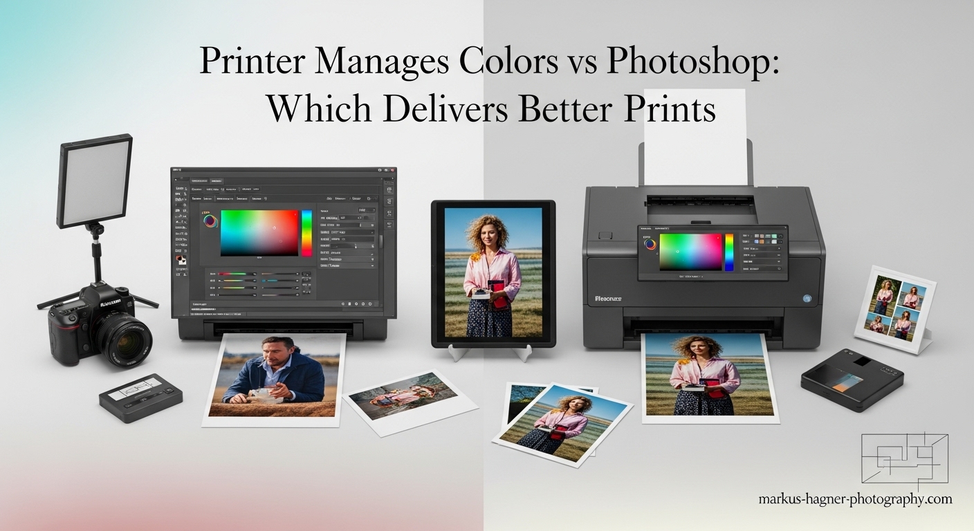
I’ve spent countless hours wrestling with color management issues, and I know firsthand how frustrating it can be when your prints don’t match what you see on screen. If you’re anything like me, you’ve probably stared at disappointing prints wondering where all the vibrant colors went. Today, I’m going to settle this debate once and for all: should you let your printer manage colors or should Photoshop take control?
Understanding the Great Color Management Debate
When I first started printing my photos, I had no idea there was even a choice to make. I’d hit print and hope for the best, often ending up with prints that looked dull and lifeless compared to my beautifully edited images on screen. Sound familiar?
The truth is, the choice between printer-managed colors and Photoshop-managed colors can make or break your final prints. I’ve tested both methods extensively with various printers, papers, and inks, and I’m here to share what I’ve discovered.
What Exactly Is Color Management?
Before we dive into the comparison, let me explain what color management actually means in simple terms. Color management is the process of ensuring that the colors you see on your monitor match as closely as possible to the colors that come out of your printer.
Think of it like this: your monitor speaks one color language (RGB), while your printer speaks another (CMYK plus additional inks). Color management is the translator that makes sure they understand each other perfectly.
Printer Manages Colors: The Simple Approach
When you choose “Printer Manages Colors,” you’re essentially telling Photoshop: “Hey, you’ve done your job editing this image. Now let the printer handle the color translation.”
How It Works?
I discovered that when you let the printer manage colors, the printer driver takes your RGB image and converts it to the printer’s color space using its built-in profiles. The printer manufacturer has already created profiles for their own inks and papers, so in theory, this should work perfectly.
My Experience with Printer-Managed Colors
I’ll be honest – when I use my Epson printer with Epson papers and Epson inks, letting the printer manage colors often gives me excellent results right out of the box. The colors are vibrant, the skin tones look natural, and I don’t have to think too much about technical settings.
Here’s what I found works best with printer-managed colors:
The Good:
- It’s incredibly simple – just select your paper type and hit print
- Works beautifully with OEM (Original Equipment Manufacturer) inks and papers
- Less technical knowledge required
- Great for beginners or those who want quick, reliable results
The Not-So-Good:
- Limited control over the final color output
- Can struggle with third-party papers or inks
- Fewer options for fine-tuning color reproduction
- May not achieve the absolute best possible color accuracy
When Printer Management Shines?
Through my testing, I’ve found that printer-managed colors work best when:
- You’re using the same brand of ink and paper as your printer
- You want quick, hassle-free printing
- You’re printing casual photos where absolute color accuracy isn’t critical
- You’re just starting out with photo printing
I remember printing a family photo on my Canon printer using Canon paper and ink. With printer management, the colors popped perfectly, and everyone looked natural and healthy. I didn’t have to adjust a single setting.
Photoshop Manages Colors: The Professional’s Choice In 2025?
Now, let’s talk about the other side of the coin – letting Photoshop manage colors. This is where things get technical, but also where you can achieve truly professional results.
How It Works?
When you choose “Photoshop Manages Colors,” you’re taking complete control of the color management process. Photoshop uses its sophisticated color engine (called the Adobe Color Engine or CMM) to convert your image from its working color space to the printer’s color space using a specific ICC profile.
My Journey with Photoshop Color Management
I’ll admit it – when I first tried Photoshop-managed colors, I was completely overwhelmed. There were so many settings: rendering intents, black point compensation, ICC profiles… I felt like I needed a degree in color science just to print a photo!
But after months of experimentation and countless test prints, I’ve discovered that this method, when done correctly, produces the most accurate and consistent results.
Here’s what I’ve learned:
The Good:
- Complete control over color reproduction
- Ability to use custom profiles for any paper/ink combination
- Access to superior rendering intents
- Better results with third-party materials
- More consistent color across different print runs
The Not-So-Good:
- Much more complex to set up correctly
- Requires understanding of color management concepts
- Easy to make mistakes that lead to poor prints
- More time-consuming initially
Critical Settings for Photoshop Management
Through trial and error (and many wasted prints), I’ve identified the key settings that matter most:
Rendering Intents:
- Relative Colorimetric: I’ve found this works best for most of my images, especially ones with vibrant colors. It preserves color relationships well and maintains the “punch” in my photos.
- Perceptual: I switch to this for landscapes and portraits where I want a more natural, pleasing look. It compresses the color gamut more smoothly throughout the image.
Black Point Compensation: This should ALWAYS be on. I learned this the hard way after several prints with blocked-up shadows. BPC maps the black point of your image to the printer’s black point, preventing dark areas from filling in.
ICC Profile Selection: This is crucial. You must select the correct profile for your specific printer and paper combination. I’ve made the mistake of selecting Adobe RGB or sRGB here – don’t do that! Those are working spaces, not printer profiles.
The Ultimate Comparison: Real-World Testing
I decided to put both methods to the test with a variety of images and printing scenarios. Here’s what I discovered:
Test 1: OEM Supplies (Epson Printer, Epson Paper, Epson Ink)
- Printer Manages Colors: Excellent results right out of the box. Colors were vibrant, skin tones looked natural, and the print matched my monitor well.
- Photoshop Manages Colors: Slightly more accurate color reproduction, especially in the shadow areas. The difference was noticeable but not dramatic.
- Winner: Printer management for simplicity, Photoshop management for absolute accuracy.
Test 2: Third-Party Paper (Epson Printer, Moab Paper)
- Printer Manages Colors: Disappointing results. Colors looked dull and slightly off. The printer had no idea how to handle this premium third-party paper.
- Photoshop Manages Colors: Outstanding results! Using a custom profile for the Moab paper, the colors were accurate, vibrant, and exactly what I expected.
- Winner: Photoshop management by a huge margin.
Test 3: Mixed Media (Various Papers and Images)
I tested both methods with different types of images and papers:
- Vibrant landscapes: Photoshop management with Relative Colorimetric produced the most stunning results
- Portraits: Both methods worked well, but Photoshop management gave me more natural skin tones
- Black and white: Photoshop management with proper black point compensation created richer, deeper blacks
The Technical Deep Dive: What’s Really Happening?
After all my testing, I wanted to understand why these differences exist. I dug deep into the technical aspects, and here’s what I discovered:
Color Engines and Quality
Photoshop uses the Adobe Color Engine (ACE), which is significantly more sophisticated than most printer drivers. ACE offers better rendering intents, more precise color calculations, and better handling of out-of-gamut colors.
Most printer drivers use basic color management systems designed for speed and simplicity, not absolute accuracy. They’re optimized for the manufacturer’s own products and don’t handle third-party materials well.
Profile Quality and Availability
When you use printer management, you’re limited to the profiles that came with your printer driver. These are typically “canned” profiles that work reasonably well with OEM supplies but aren’t optimized for specific conditions.
With Photoshop management, you can use custom profiles created specifically for your printer, ink, and paper combination. These profiles account for the unique characteristics of your specific setup.
Control Over Color Conversion
Printer management gives you little to no control over how colors are converted from RGB to the printer’s color space. Photoshop management gives you complete control, including:
- Choice of rendering intent
- Black point compensation
- Precise profile selection
- Soft-proofing capabilities
2025 Common Mistakes and How to Avoid Them
Through my journey, I’ve made plenty of mistakes. Let me share the most common ones and how to avoid them:
Mistake 1: Double Color Management
This is the biggest mistake I see people make. They select “Photoshop Manages Colors” but forget to turn off color management in the printer driver. This results in “double” color management, which produces terrible prints.
How to avoid: When using Photoshop management, always go into your printer settings and make sure color management is turned off. On Windows, look for “ICM” settings and disable them. On Mac, they should be grayed out automatically.
Mistake 2: Wrong Profile Selection
I can’t tell you how many times I’ve accidentally selected Adobe RGB or sRGB as my printer profile. These are working spaces, not printer profiles!
How to avoid: Look for profiles that include your printer model and paper type. They should be named something like “EPSON_3880_PremiumLuster.icc” or similar.
Mistake 3: Ignoring Rendering Intents
For months, I just used the default rendering intent without understanding what it did. This was a huge mistake!
How to avoid: Test both Relative Colorimetric and Perceptual with your images. Relative works best for vibrant colors, while Perceptual is better for natural subjects.
Mistake 4: Not Calibrating Your Monitor
All the color management in the world won’t help if your monitor isn’t calibrated. I learned this after wondering why my prints never matched my screen.
How to avoid: Invest in a good monitor calibration tool like the ColorMunki or Spyder. Calibrate regularly and always soft-proof before printing.
Making Your Choice: Which Method Is Right for You?
After all my research and testing, I’ve developed a simple guide to help you choose:
Choose Printer Management If:
- You primarily use OEM inks and papers
- You want simple, hassle-free printing
- You’re just starting with photo printing
- You print mostly casual photos where perfect color isn’t critical
- You don’t want to deal with technical settings
Choose Photoshop Management If:
- You use third-party papers or inks
- You demand the highest possible color accuracy
- You print professionally or for clients
- You enjoy technical control and fine-tuning
- You have custom profiles for your materials
My Personal Workflow
I’ve settled on a hybrid approach that works perfectly for me:
- For quick prints and proofs: I use printer management with OEM supplies. It’s fast and reliable.
- For final prints and client work: I always use Photoshop management with custom profiles. The extra effort is worth it for the superior results.
- For third-party materials: Photoshop management is non-negotiable. It’s the only way to get good results.
2025 Advanced Tips for Perfect Prints
I want to share some advanced techniques I’ve discovered that take color management to the next level:
Custom Profiling
If you’re serious about printing, invest in custom profiles. You can either:
- Buy a profiling system (like the ColorMunki Photo) for around $500
- Use a profiling service for about $50 per profile
I use a profiling service and the difference is night and day. You print a target, send it to them, and they email you a custom profile. It’s amazing how much better the results are.
Soft-Proofing
Before I print anything, I always soft-proof in Photoshop. This gives me a preview of how the print will look. I go to View > Proof Setup > Custom and select my printer profile. It saves so much paper and ink!
Print Ramping
For critical prints, I make a series of test prints at different brightness levels. I call this “print ramping.” I’ll print the same image at -5, 0, and +5 brightness to see which looks best. It’s tedious but worth it for important work.
The Future of Color Management
I’ve been watching the industry closely, and I’m excited about where color management is heading:
- AI-powered color matching: Some companies are developing AI that can automatically match colors across different devices
- Improved printer profiles: Newer printers come with much better built-in profiles
- Cloud-based color management: Services that store your color profiles and settings in the cloud
Despite these advances, I believe the fundamental choice between printer and Photoshop management will remain. The technical principles don’t change, even as the tools improve.
Final Thoughts
After years of experimentation and countless prints, I’ve come to a clear conclusion: there’s no single “best” method for everyone.
The choice between printer-managed colors and Photoshop-managed colors depends entirely on your specific needs, equipment, and goals. For casual printing with OEM supplies, printer management is simple and effective. For professional results or when using third-party materials, Photoshop management is superior.
What matters most is understanding the trade-offs and making an informed choice. Don’t be afraid to experiment with both methods – that’s how I learned what works best for my specific setup.
Remember, the goal is to create prints that make you proud. Whether you achieve that through printer management or Photoshop management doesn’t matter as much as the final result.
FAQ: Printer Manages Colors vs Photoshop
Which method is better for beginners?
I recommend starting with printer-managed colors. It’s much simpler and less intimidating. As you get more comfortable with printing, you can gradually experiment with Photoshop management.
Do I need to calibrate my monitor for both methods?
Yes! Monitor calibration is essential regardless of which color management method you use. If your monitor isn’t calibrated, you won’t know what “correct” color looks like.
Can I switch between methods for different prints?
Absolutely! I do this all the time. I use printer management for quick proofs and casual prints, then switch to Photoshop management for final prints and professional work.
Why do my prints look different than my screen?
This is usually due to one of three issues: 1) Your monitor isn’t calibrated, 2) You’re using the wrong color management method, or 3) You have double color management enabled.
Is it worth investing in custom profiles?
If you’re serious about printing, yes! Custom profiles made a huge difference in my print quality, especially when using third-party papers.
What’s the biggest mistake people make with color management?
Double color management is by far the biggest mistake. People select “Photoshop Manages Colors” but forget to turn off color management in the printer driver, resulting in terrible prints.
How often should I recalibrate my monitor?
I recalibrate my monitor every two weeks. If you’re doing professional work, you might want to do it weekly. Environmental changes can affect monitor color over time.
Can I use Photoshop management with any printer?
Yes, you can use Photoshop management with any printer that allows you to disable color management in the driver settings. Most modern printers support this.
Pro Photography Tips
Before I wrap up, here are some quick tips I’ve learned that will help you get better prints immediately:
- Always let prints dry completely before judging color – they can shift as they dry
- Print in a room with consistent lighting – color looks different under different lights
- Keep your printer clean – clogged nozzles can ruin color accuracy
- Use high-quality paper – cheap paper will never give you good results, no matter how good your color management is
- Make small adjustments – color management is about precision, not big changes