You spend hours editing a photo. The colors are perfect on your screen. Then the canvas arrives and the sky looks gray, the greens are muted, and the whole image feels flat. This is the color shift problem that frustrates photographers, digital artists, and anyone ordering canvas prints. I have seen this happen dozens of times, and I have helped people fix it consistently. In this guide, I will walk you through exactly how to prepare images for canvas printing and avoid color shifts, step by step, using techniques that professional print labs rely on. By the end, you will know what causes color shifts, how to prevent them, and what settings to use in Photoshop and Lightroom so your final canvas matches what you see on screen.
The key to avoiding color shifts is understanding that your screen and a canvas print speak different color languages. Your monitor uses RGB light to create colors, while a canvas printer uses CMYK inks. That mismatch is where problems start. But with the right preparation workflow, you can close that gap significantly and get results that honor your original vision.
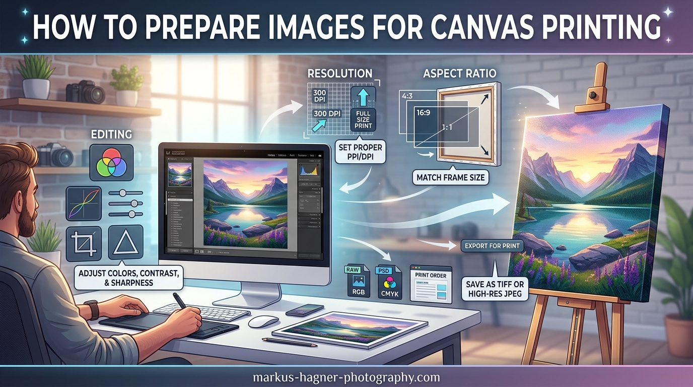
Quick Summary: How to Prepare Images for Canvas Printing in 8 Steps
If you need the core steps right away, here is the condensed workflow. Each step gets a full explanation further down.
Step 1: Check your image resolution. Aim for at least 200 pixels per inch at the final canvas size. For a 16 by 20 inch canvas, that means a minimum of 3200 by 4000 pixels.
Step 2: Set your working color space to Adobe RGB if your printer supports it, or sRGB for broader compatibility. Do not leave your file in an unmanaged color space like Display P3 unless you know your printer handles it.
Step 3: Calibrate your monitor with a hardware calibrator. This is non-negotiable if you want reliable color.
Step 4: Use soft proofing in your editing software to preview how the image will look on canvas before you export.
Step 5: Crop your image to the correct aspect ratio for your chosen canvas size to avoid stretching or distortion.
Step 6: Export as TIFF with an embedded ICC profile. JPEG can work for smaller files, but TIFF preserves more quality.
Step 7: Add a canvas wrap border if you are ordering a gallery-wrapped canvas, using the wrap style your printer offers.
Step 8: Apply print-specific sharpening before exporting, since canvas softens detail compared to a screen.
What Causes Color Shifts in Canvas Printing
Understanding why colors shift between your screen and a finished canvas is the most important part of this entire process. Without that understanding, you will be guessing at settings instead of making informed decisions.
Color shift happens for four main reasons. The first is color gamut mismatch. Your monitor displays colors in the RGB color space, which can represent millions of colors using red, green, and blue light. Canvas printers use CMYK inks, which have a significantly narrower gamut. Colors that look vibrant on your screen, especially deep cyans, bright oranges, and neon greens, may simply not exist in the printer’s ink set. The printer has to approximate those colors, and the approximation often looks muted or shifted.
The second cause is uncalibrated monitors. Every screen displays color differently out of the box. A monitor set to a warm color temperature will make images look warmer than they really are. A screen running at high brightness will make prints come out darker than expected. One user on Reddit r/DigitalArt shared that the pink-ish tones in their artwork looked completely different on both a MacBook and an iPad screen, which is a classic sign of working in an unmanaged color space like Display P3 without proper conversion.
The third cause is the physical nature of canvas itself. Unlike glossy photo paper that reflects light sharply, canvas fabric absorbs and scatters light. This makes printed colors appear less saturated and sometimes lighter than they do on a backlit screen. A user on Reddit r/postprocessing noted that printing to canvas or vinyl does not produce true blacks, and that this is not a color management failure but a physical limitation of the ink and substrate combination.
The fourth cause is missing or incorrect ICC profiles. An ICC profile is a file that describes how your specific printer and paper combination reproduces color. Without it, the printer guesses, and the results are inconsistent. Many users skip this step entirely and then wonder why colors look wrong.
Finally, brightness and contrast settings play a role. Screens emit light, while canvas reflects it. An image that looks balanced at 300 nits on a monitor can appear flat when printed. Many print labs recommend bumping brightness slightly and adding a touch of contrast before sending files for canvas printing.
Step 1: Set the Right Resolution and DPI
Resolution is the foundation of every good canvas print. If your image does not have enough pixel data, no amount of color correction will fix the result. The image will look blurry, pixelated, or blocky once stretched across a large canvas.
DPI stands for dots per inch, and it measures how many pixels of information are packed into each inch of the printed output. For canvas prints, the industry standard is 200 DPI at the final output size. Some large-format printers accept 150 DPI for very large canvases viewed from a distance, but 200 DPI is the safe target for anything up to about 40 inches wide. Fine art reproductions and close-up displays benefit from 300 DPI.
Here is a quick-reference table for common canvas sizes and the pixel dimensions you need at 200 DPI.
| Canvas Size (inches) | Required Pixels at 200 DPI | Minimum File Dimensions |
|---|---|---|
| 8 x 10 | 1600 x 2000 | 3.2 MP |
| 11 x 14 | 2200 x 2800 | 6.2 MP |
| 16 x 20 | 3200 x 4000 | 12.8 MP |
| 20 x 30 | 4000 x 6000 | 24 MP |
| 24 x 36 | 4800 x 7200 | 34.6 MP |
| 30 x 40 | 6000 x 8000 | 48 MP |
If your image falls short of these numbers, you have two options. The first is to resize to a smaller canvas size that matches your available pixels. The second is to use an AI-based upscaler like Topaz Gigapixel or Adobe Super Resolution to increase pixel dimensions. Upscaling works reasonably well for photos, but it cannot create detail that was never captured. For line art and digital illustrations, upscaling tends to produce softer results.
Be careful not to rely on your editing software’s automatic DPI recalculation when exporting. Changing the DPI number in the export dialog does not add pixels to your image. It only changes the metadata tag. The actual image quality depends on the pixel dimensions, not the DPI number you set in the export dialog. A 2000-pixel-wide image exported at 300 DPI will still only be about 6.7 inches wide at that setting.
Step 2: Master Color Management (RGB vs CMYK)
Color management is the system that keeps colors consistent between your screen, your editing software, and your printer. It is the single most important factor in preventing color shifts on canvas.
Your monitor displays colors in RGB, which is an additive color model. Red, green, and blue light combine to create every color you see. Canvas printers use CMYK, which is a subtractive color model. Cyan, magenta, yellow, and black inks absorb light to create colors. The two systems overlap significantly, but they do not cover the same range of colors. RGB can display colors that CMYK inks simply cannot reproduce, especially in the bright cyan, green, and orange ranges.
When you edit an image in RGB and send it to a CMYK printer, colors outside the printer’s gamut get converted. The conversion method, called the rendering intent, determines how those out-of-gamut colors are handled. Perceptual rendering intent compresses the entire color range to fit inside the printer’s gamut, preserving the relative relationships between colors. This is the best choice for photographs. Relative colormetric rendering intent maps colors precisely within the gamut and clips anything outside it, which works well for graphic designs with flat colors but can cause harsh shifts in photos.
For your working color space, Adobe RGB is the best choice if your print lab supports it. Adobe RGB covers a wider range of colors than sRGB, especially in the green and cyan ranges, which means more of your edited colors will survive the transition to print. However, not all consumer printers and online services handle Adobe RGB well. If you are unsure, sRGB is the safe default. The critical rule is never to leave your file in an unmanaged color space like Display P3, which is the default on many modern Apple devices. Files in Display P3 will look wildly different when printed unless you explicitly convert them before export.
Here is how to set your color space in Photoshop. Go to Edit, then Color Settings. Under Working Spaces, set RGB to Adobe RGB (1998) or sRGB IEC61966-2.1 depending on your printer’s recommendation. Under Color Management Policies, set RGB to Convert to Working RGB. This ensures that any image you open gets converted to your chosen working space automatically. For CMYK, set it to the specific profile your print lab provides. Most labs offer downloadable ICC profiles for their specific printer and canvas material combinations.
In Lightroom, go to Edit, then Preferences, then the Color tab. Under RGB Profiles, select your working space. Lightroom uses a soft proofing feature that applies ICC profiles for preview, which I cover in the next section.
Step 3: Calibrate Your Monitor
Monitor calibration is the step that most people skip and then regret. If your monitor does not display accurate colors, nothing else in this workflow will matter. You could follow every other step perfectly and still get a shifted print because you were editing against an inaccurate reference.
Monitor calibration involves measuring your screen with a hardware colorimeter device such as a Calibrite Display or Datacolor SpyderX. The device attaches to your screen and reads the colors your monitor produces. The accompanying software then creates a calibration profile that tells your computer to adjust the output so colors display accurately. The process takes about five to ten minutes and needs to be repeated every one to two months, or whenever you change your screen’s brightness setting significantly.
Software-only calibration, where you adjust brightness, contrast, and gamma by eye using built-in display tools, is better than nothing. But it is nowhere near as accurate as hardware calibration. Your eyes adapt to color casts over time, which means you will not notice a warm or cool tint that a colorimeter will catch immediately.
During calibration, target a brightness of 80 to 120 nits for a print-editing environment. Most monitors ship at 200 to 300 nits, which is far too bright for accurate color work. A calibrated monitor at the right brightness level will show you colors closer to what the final print will actually look like.
Trust signals from the photography community consistently rank monitor calibration as the single most important step in print preparation. Users on Reddit and Adobe Community forums repeatedly cite uncalibrated monitors as the number one cause of unexpected color shifts. This is not an expensive fix. A basic colorimeter costs around 130 dollars and pays for itself by preventing just one bad print order.
Step 4: Use Soft Proofing to Preview Print Results
Soft proofing is a digital simulation of how your image will look when printed on a specific paper or canvas. It applies the printer’s ICC profile to your on-screen image so you can see potential color shifts before you spend money on a physical print. This step alone can save you from costly reprints.
In Photoshop, open your image and go to View, then Proof Setup, then Custom. In the dialog that appears, select the ICC profile provided by your print lab under Device to Simulate. Set the Rendering Intent to Perceptual for photographs. Check the Simulate Paper Color box to see how the white of the canvas will affect the image. The Black Point Compensation option helps preserve detail in shadow areas. Click OK to apply the proof.
Your image will now display as it will appear on the printed canvas. Areas that fall outside the printer’s color gamut will be highlighted if you enable Gamut Warning under the View menu. Out-of-gamut colors typically appear as neon pink or bright clippings in the warning view. When you see gamut warnings, you can adjust those areas by slightly reducing saturation or shifting hues toward colors the printer can reproduce.
In Lightroom, soft proofing is built into the Develop module. Go to the Develop module and click the Proofing checkbox below the main image. A new panel appears where you can select the printer profile and set the rendering intent. Lightroom also lets you create a proof copy of the image so your original edits remain untouched. Adjustments you make while proofing only affect the proof version, which is useful for comparing the original and proofed versions side by side.
Soft proofing is not perfect because your monitor cannot perfectly replicate the look of a reflective canvas surface. But it is remarkably accurate for identifying color shifts before they become costly problems. I recommend running every print through soft proofing before exporting, even images that look fine on screen.
Step 5: Crop and Set the Correct Aspect Ratio
Aspect ratio is the proportional relationship between the width and height of your image. If your original photo does not match the aspect ratio of your chosen canvas size, you will either have unwanted parts of the image cut off or the image will be stretched to fill the canvas. Neither result is ideal.
Common canvas aspect ratios include 4:3 for 8 by 10 and 16 by 20 inch canvases, 3:2 for 12 by 18 and 18 by 24 inch canvases, and 2:3 for portrait-oriented 12 by 18 and 18 by 24 inch canvases. Square canvases use a 1:1 ratio.
Before you crop, calculate the dimensions you need. For an 8 by 10 inch canvas at 200 DPI, you need an image that is 1600 by 2000 pixels. That is a 4:5 aspect ratio. If your original image is 4000 by 3000 pixels (4:3), you will need to crop 500 pixels from each side to reach the 1600 by 2000 target without stretching.
Always crop from the edges, not the center, unless the center is the only important part of the composition. Leave a little extra space around your subject when shooting or scanning so you have flexibility during cropping. Cropping too tight at the source leaves no room for adjustment later.
One user on Reddit r/AskPhotography asked what they should edit on their photo before printing it on canvas. Cropping to the correct aspect ratio was one of the top recommendations from experienced photographers in the thread. Getting the composition right before you worry about color will save you time and headaches.
Step 6: Choose the Right File Format
The file format you choose for export affects both the quality of your final canvas print and the file size you need to upload. Three formats dominate the canvas printing workflow: TIFF, JPEG, and PNG.
TIFF is the best choice for professional canvas printing. It uses lossless compression, meaning no image data is discarded during save. TIFF files support 16-bit color depth, which provides smoother gradients and more color information than 8-bit files. They also support embedded ICC profiles, which ensures the printer receives the correct color information. The trade-off is file size. A 24 by 36 inch TIFF at 200 DPI can be 100 megabytes or more.
JPEG is acceptable for canvas printing if file size is a concern. JPEG uses lossy compression, which discards some image data to reduce file size. At the highest quality setting, the loss is minimal and invisible on a printed canvas. However, repeatedly saving a JPEG at high compression will degrade quality over time. Use JPEG only as a final delivery format, not as an editing format. Always embed the ICC profile when saving JPEG for print.
PNG is a lossless format like TIFF but with wider compatibility and typically smaller file sizes for images with large areas of flat color. PNG supports 16-bit color in some applications, but not all print labs accept PNG files. Check with your printer before committing to PNG.
Bit depth matters more than many people realize. An 8-bit file stores 256 levels of brightness per color channel, which can result in visible banding in smooth gradients like skies. A 16-bit file stores 65,536 levels per channel, producing much smoother transitions. If your source file supports 16-bit editing, work in 16-bit mode and export in 16-bit TIFF. The difference is especially noticeable in large gradient areas on canvas prints.
Step 7: Create Your Canvas Wrap Border
Most gallery-wrapped canvas prints extend the image around the sides of the stretched canvas. This is called a canvas wrap. There are three main wrap styles, and choosing the right one affects both the appearance of your print and the preparation steps you need to take.
The first style is the image wrap, where the outer edges of the image are simply repeated around the sides. This is the simplest approach, but it can look odd if the edge of your photo does not have natural continuation. A 2 by 2 inch border around the entire image is a common starting point for calculating the wrap area.
The second style is the mirror wrap, where the edge pixels of the image are mirrored outward along the sides. This creates a reflection effect that works well for images with consistent edges. Mirror wrapping is easy to set up in Photoshop using the Canvas Size command with the anchor positioned to the center and the canvas extension set to the desired border width. After extending the canvas, select the new border area and use the Image Offset command with a mirror offset to flip the edge pixels.
The third style is the border wrap, where you fill the side areas with a solid color, usually white or black. This is the cleanest option for images that do not wrap naturally. A white border wrap works well for bright images. A black border wrap adds a professional frame effect. Some print labs offer a blurred border option where the edge pixels are blurred before extending, creating a soft fade around the image.
To calculate the border size you need, measure the depth of the stretcher bars your printer uses. Common depths are 0.75 inch, 1 inch, and 1.5 inches. You need at least that much extra image data on each side to account for the wrap. For a 0.75 inch deep stretcher bar, extend your canvas by 0.75 inch on each side before applying the wrap style. Add a small safety margin of 0.25 inch to account for trimming variations during the stretching process.
Here is a quick reference for border extensions based on stretcher bar depth.
| Stretcher Bar Depth | Minimum Border Extension | Recommended (with safety margin) |
|---|---|---|
| 0.75 inch | 0.75 inch per side | 1.0 inch per side |
| 1.0 inch | 1.0 inch per side | 1.25 inches per side |
| 1.5 inch | 1.5 inch per side | 1.75 inches per side |
Step 8: Sharpen for Print Output
Sharpening for print is different from sharpening for screen. On a monitor, pixels are backlit and viewed from arm’s length. On a canvas, the ink is absorbed into the fabric, which softens edges and reduces apparent sharpness. You need to apply more sharpening for canvas than you would for a JPEG destined for social media.
The most reliable method for print sharpening is Unsharp Mask in Photoshop. Start with an Amount of 80 to 120 percent, a Radius of 1.0 to 1.5 pixels, and a Threshold of 2 to 3 levels. These settings will vary depending on your image resolution and the canvas size. For very large canvases viewed from a distance, you can push the Amount higher, up to 150 percent, and the Radius up to 2 pixels.
Smart Sharpen is Photoshop’s more advanced sharpening tool. It gives you separate control over shadow and highlight sharpening, which helps prevent over-sharpening bright areas. Use the Remove dropdown set to Gaussian Blur or Motion Blur depending on your image type. The Amount starts at 80 percent, Radius at 1.0 pixel, and Reduce Noise at 15 to 20 percent to keep the sharpening from amplifying grain.
Always apply sharpening as the last step before export. Do not sharpen while editing at a small preview size. Sharpen at full image resolution or at 100 percent zoom so you can see exactly what the output will look like. If you are working in Lightroom, the Output Sharpening option in the Export dialog has a Print setting that applies appropriate sharpening automatically based on the output resolution and media type.
Be careful not to over-sharpen. Halos around edges, a gritty texture on smooth surfaces, and exaggerated noise are signs of too much sharpening. Since canvas absorbs ink and softens detail anyway, moderate sharpening with careful settings will always look better than aggressive sharpening that creates artifacts.
Troubleshooting Common Color Shift Problems
Even with careful preparation, color shifts can still happen. Here are the most common problems I have encountered and how to fix them.
My canvas print looks too dark
This is the single most common complaint in the canvas printing community. One user on Reddit r/CommercialPrinting reported that their printing company told them they had to lighten the image for it to not come back too dark. This happens because screens emit light while canvas reflects it. An image that looks balanced at 300 nits on a monitor will typically print darker. The fix is to increase the brightness of your image by 5 to 10 percent before exporting. Be subtle about it. Over-lightening makes prints look washed out. Soft proofing will show you whether your brightness adjustments are in the right range before you commit to the print.
My colors look desaturated or washed out
Canvas fabric absorbs light, which reduces the perceived saturation of printed colors. Colors that pop on a backlit screen can look flat on canvas. A slight boost in vibrance or saturation of 5 to 10 percent in your editing software can compensate for this. Use soft proofing to check whether your saturation adjustments look natural on the simulated canvas preview. Also verify that your ICC profile is correctly embedded. A missing or wrong profile will cause the printer to misinterpret color values, often resulting in desaturated output.
I have unexpected warm or pink color casts
A warm or pinkish cast on prints usually means your monitor is not calibrated or your file is in an unmanaged color space. A user on Reddit r/DigitalArt described exactly this problem: the pink-ish tones appeared on both a MacBook and an iPad, which pointed to a Display P3 color space issue. The fix is to convert your file from Display P3 to sRGB or Adobe RGB before export. In Photoshop, go to Edit, then Convert to Profile, and select your target working space. Re-calibrate your monitor if the cast persists across multiple images.
How do I check print quality before sending my file?
The ruler test is a simple technique that professional print labs use to verify image quality. Before you submit your final file, zoom in to 100 percent in your editing software and look for a ruler or straight edge in the image. If the ruler lines look crisp and straight on screen, they will print crisply on canvas. If they look soft or pixelated, your resolution is too low. You can also print a small test section on regular paper to check color and sharpness before committing to the full canvas.
For ongoing color accuracy, consider using a gray card during your photography or scanning workflow. A gray card provides a neutral reference point that helps you set correct white balance and exposure at the source, which reduces the amount of correction needed later and produces more accurate colors in the final print.
Frequently Asked Questions
How to prepare photos for canvas prints?
Start by ensuring your image has at least 200 pixels per inch at the final canvas size. Set your working color space to Adobe RGB or sRGB depending on your printer requirements. Calibrate your monitor, apply soft proofing to preview print colors, crop to the correct aspect ratio, export as TIFF with an embedded ICC profile, create a canvas wrap border if needed, and apply print-specific sharpening before sending your file to the printer.
Is it better to print from TIFF or JPEG?
TIFF is the better choice for canvas printing because it uses lossless compression and preserves maximum image quality. TIFF files also support embedded ICC profiles and 16-bit color depth, which JPEG does not. JPEG can work for final delivery if you must meet file size limits, but always save at the highest quality setting and embed the ICC profile.
Why are my photos so desaturated?
Canvas prints often appear desaturated because canvas fabric absorbs light rather than reflecting it like a backlit screen. Additional causes include working in a color space wider than your printer can reproduce, missing or incorrect ICC profiles, or using the wrong rendering intent. Try slightly increasing saturation by 5 to 10 percent in your editing software, use perceptual rendering intent, and always embed the correct ICC profile provided by your print lab.
What is the 2/3 rule for pictures?
The 2/3 rule, commonly called the rule of thirds, is a photography composition technique where you divide your frame into a 3 by 3 grid and place key elements along the grid lines or at their intersections. This creates more dynamic and visually balanced images. While useful for composing the original photograph, it is not directly related to preparing images for canvas printing.
Conclusion
Preparing images for canvas printing and avoiding color shifts is a process that combines technical knowledge with practical habits. The steps I have outlined here are the same ones professional print labs use internally. Monitor calibration sets the foundation. Color management keeps your colors consistent. Soft proofing catches problems before they become reprints. Resolution ensures your image has enough detail to look sharp on a large canvas. File format and sharpening decisions polish the final output.
Start with a calibrated monitor and a correctly sized image file. Those two steps alone will eliminate most color shift problems. From there, work through the remaining steps methodically. Use soft proofing every time. Embed your ICC profile every time. And when in doubt, run a small test print before ordering a large canvas.
The most important thing to remember about how to prepare images for canvas printing and avoid color shifts is that consistency beats perfection. A workflow you follow every time will produce better results than a perfect one-time effort. Build these steps into your regular editing process and your canvas prints will start matching what you see on screen with far greater accuracy.