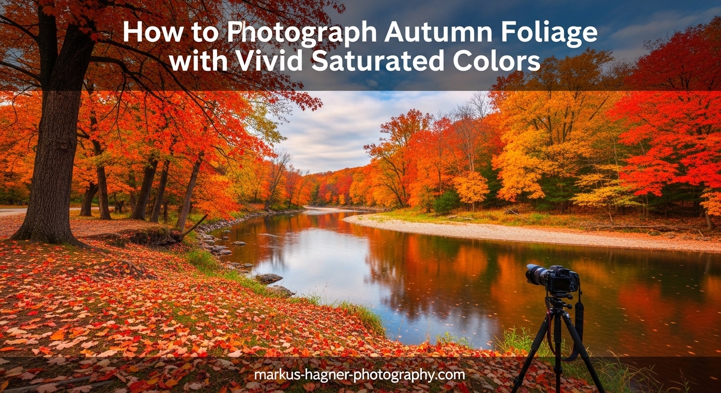
You stand there surrounded by brilliant reds, glowing oranges, and deep golden yellows. The autumn foliage takes your breath away. You raise your camera, compose the shot, and click the shutter. But when you review the image on your LCD, something feels wrong. The colors look flat, washed out, nothing like what you see with your own eyes.
This frustrating experience is one I have had countless times, and it is probably why you are here reading this guide on autumn foliage photography. The good news? Capturing vivid, saturated fall colors is absolutely learnable. In this comprehensive guide, I will walk you through the exact techniques I use to make autumn colors pop in my photographs.
We will cover everything from understanding why cameras struggle with fall colors to mastering backlighting, nailing your camera settings, and enhancing your images in post-processing without going overboard. By the end, you will have a complete toolkit for photographing autumn foliage with the vivid, saturated colors that match what you see in person.
Understanding Color Saturation in Autumn Photography
Before we dive into techniques, let’s talk about what saturation actually means and why autumn colors present such a unique challenge for photographers.
Color saturation refers to the intensity or purity of a color. A highly saturated red appears vivid and bold, while a desaturated red looks dull and washed out, almost grayish. When we photograph autumn foliage, we want to capture those intense reds, oranges, and yellows at their most saturated state.
Here is the problem: your camera does not see colors the same way your eyes do. Human vision automatically adjusts for lighting conditions and enhances color contrast in our brains. Cameras, even expensive ones, capture a more literal interpretation of light. When bright sunlight hits fall foliage, the leaves reflect a lot of light, which can wash out colors and reduce saturation.
Additionally, many leaves have a natural waxy coating that creates glare. This reflective surface scatters light in all directions, further reducing color intensity in your photos. This is why the same scene can look dramatically different depending on how you manage light, exposure, and equipment.
The goal is not to oversaturate your images to the point where they look unnatural. Oversaturated photos have that artificial, almost neon quality that screams “over-processed.” Instead, we want to capture rich, deep colors that feel authentic to the autumn experience while still making those colors sing.
Understanding the science behind color can help you make better decisions in the field. Autumn leaves change color because chlorophyll breaks down, revealing other pigments that were always present but hidden. Carotenoids produce yellows and oranges, while anthocyanins create reds and purples. These pigments interact with light differently, which is why shooting technique matters so much for capturing their true vibrancy.
Color saturation is also affected by the surrounding colors in your frame. A red leaf will appear more saturated when surrounded by complementary colors like green, while it might look less intense when surrounded by similar warm tones. This psychological effect, called simultaneous contrast, means your composition choices directly impact how saturated colors appear to viewers.
Light Techniques for Maximum Color Impact
Light is the single most important factor in capturing vivid autumn colors. Understanding how different lighting conditions affect your foliage shots will transform your results.
Backlighting: The Secret to Glowing Autumn Colors
If there is one technique that will revolutionize your autumn foliage photography, it is backlighting. I cannot stress this enough: backlighting is the secret weapon for vivid fall colors.
Backlighting occurs when the sun is positioned behind your subject, shining through the leaves toward your camera. When light passes through translucent autumn leaves, something magical happens. The leaves seem to glow from within, and colors become incredibly saturated and intense.
The reason backlighting works so well has to do with how light interacts with leaf pigments. When light passes through a leaf rather than reflecting off its surface, it illuminates the color-bearing pigments directly. This creates that characteristic glow that makes autumn photos so compelling. The effect is particularly strong with maples, aspens, and other trees with relatively thin leaves.
To use backlighting effectively, position yourself so the sun is behind the foliage you want to photograph. This often means shooting toward the sun, which requires some care with exposure. The best times for backlighting are during golden hour, shortly after sunrise or before sunset, when the sun is low in the sky and the light has a warm, golden quality.
One mistake I see often is photographers shooting at the wrong angle. You want the sun to be partially blocked by trees or branches to avoid lens flare overwhelming your image. Slightly changing your position can make a huge difference in how the backlighting renders. Sometimes moving just a few feet to one side transforms an ordinary shot into something spectacular.
Backlighting also creates beautiful rim lighting around leaves, separating them from darker backgrounds and adding depth to your images. This technique works especially well for individual leaves, small groups of trees, or sections of canopy where you can isolate the backlit elements. Try shooting at different angles to see how the rim lighting changes as you move.
For the most dramatic backlit effects, look for leaves that are slightly translucent. Freshly turned leaves often have more translucency than older ones, which is why timing your shoot during peak color can matter. Leaves that have started to dry out become more opaque and less effective for backlighting.
When shooting backlit scenes, pay careful attention to exposure. Your camera’s meter will often want to underexpose backlit subjects because of the bright light source. Use exposure compensation to brighten the image while still preserving the glowing effect. Sometimes slightly underexposing actually helps, as it prevents highlights from blowing out and makes colors appear richer.
Experiment with different angles relative to the sun. Shooting directly toward the sun creates the most dramatic backlighting but also presents the greatest exposure challenge. Positioning yourself at a slight angle to the sun can give you a nice balance of backlit glow while maintaining easier exposure control.
Weather Conditions and How They Affect Your Colors
Many photographers pack up their gear when clouds roll in, but overcast days can actually be better for color saturation than bright sunny ones.
Here is why: clouds act like a giant softbox, diffusing sunlight and eliminating harsh shadows and bright highlights. This soft, even light allows colors to appear more saturated because there is no glare bouncing off the waxy leaf surfaces. The diffuse light penetrates the leaves rather than reflecting off them.
I have captured some of my most vivid autumn foliage photos on completely overcast days. The colors seem deeper and richer without the competing brightness of direct sun. Overcast conditions are also perfect for forest interiors where dappled sunlight can create difficult exposure challenges. The soft light lets you capture the full range of colors from bright yellows to deep reds without losing detail in either end.
That said, sunny days have their place. The key is timing. Avoid midday sun when possible, as the harsh overhead light creates strong contrast and washes out colors. Instead, aim for the golden hours when the sun is low and the light has warmth that complements autumn’s natural color palette.
Rain can also create stunning opportunities. Wet leaves appear more saturated, and raindrops add sparkle and interest to your compositions. After a rain shower, look for reflections in puddles and streams, and take advantage of the saturated colors that moisture brings out. The combination of wet surfaces and soft post-rain light can produce some of the most vivid autumn images possible.
Fog and mist present unique opportunities for autumn foliage photography. While fog might seem to reduce color saturation, it actually creates beautiful atmospheric depth that can make the colors that do show through appear more intense by contrast. Look for situations where colorful trees emerge from fog, or where mist creates layers of receding color in a forest scene.
Wind is often considered the enemy of foliage photography, but it can work in your favor. A gentle breeze creates movement that you can either freeze with fast shutter speeds or embrace for creative blur effects. Long exposures of moving leaves create abstract washes of color that can be more artistic than literal representations.
Snow combined with autumn foliage creates rare and striking images. The contrast between white snow and colorful leaves is visually powerful. This combination typically occurs late in the season when some leaves still cling to branches after the first snowfall. Look for opportunities to capture red maple leaves against fresh snow for maximum impact.
Time of Day: When to Shoot for Best Results
The quality of light changes dramatically throughout the day, and timing your autumn foliage shoots can make or break your results.
Morning light tends to be cleaner and cooler, which can create beautiful contrast with warm autumn colors. Early morning also offers the possibility of mist or fog, which adds atmosphere and depth to forest scenes. Frost on leaves can add another layer of interest to your autumn foliage photography. The combination of golden leaves and white frost creates stunning color contrast.
Afternoon and evening light brings warmer tones that complement the reds, oranges, and yellows of fall foliage. The golden hour before sunset is particularly magical, as the warm light enhances the natural warmth of autumn colors. During this time, backlighting opportunities abound as the sun drops low in the sky.
Plan your shoots around these optimal times. Scout locations in advance so you know exactly where to be when the light is right. Some photographers even track the sun’s position using apps to predict exactly how light will fall on specific trees at specific times. This level of planning can help you be in the perfect position when conditions align.
Blue hour, the time just before sunrise or after sunset, offers unique opportunities for autumn photography. During blue hour, the sky takes on a deep blue color that creates stunning contrast with any remaining warm autumn tones. This works especially well for silhouette shots or scenes where you want to emphasize shape and form over color detail.
Mid-day shooting is not impossible, just more challenging. If you find yourself shooting at noon, look for shaded areas within the forest where the light is naturally diffused. Or seek out backlit opportunities where the overhead sun can still create that glowing effect through upper branches. Using a polarizing filter becomes even more important during mid-day to cut through harsh light.
Camera Settings for Capturing Vivid Autumn Colors
Now let’s get into the technical details. Your camera settings play a crucial role in how vivid and saturated your autumn colors appear.
Essential Exposure Settings
One of the most effective techniques for maximizing color saturation is slight underexposure. When you underexpose by about one-third to one-half stop, you darken the shadows and midtones, which makes colors appear richer and more saturated.
This technique works because overexposure washes out colors by pushing bright areas toward pure white. By deliberately keeping your exposure slightly darker, you preserve color information and create more saturated-looking results. You can always brighten shadows in post-processing, but recovering blown-out highlights is much harder and often impossible without quality loss.
For aperture, I typically shoot fall foliage between f/8 and f/11. This range provides good depth of field while maintaining sharpness across the frame. If I am shooting individual leaves with a telephoto lens and want shallow depth of field to isolate my subject, I will open up to f/2.8 or f/4. The shallow depth of field creates beautiful bokeh that can complement colorful foliage.
Keep your ISO as low as possible, ideally at your camera’s base ISO (usually 100 or 200). Higher ISOs introduce noise, which can make colors look muddy and less pure. Since autumn foliage photography often benefits from a tripod anyway, there is usually no need to crank up the ISO. The cleaner your file, the more flexibility you have in post-processing to enhance colors.
Shutter speed depends on your subject. For static scenes, use a tripod and shoot at whatever speed gives you proper exposure. If there is wind moving the leaves, you will need faster shutter speeds to freeze motion, or embrace the blur for a creative effect. A shutter speed of 1/250 or faster typically freezes gentle leaf movement, while speeds below 1/30 second create visible blur.
Using your histogram is essential for autumn foliage photography. The right side of the histogram represents bright areas where color information can be lost to overexposure. Watch for spikes at the right edge, which indicate blown highlights. In autumn scenes with bright yellow and orange leaves, highlight clipping is a real concern that can ruin an otherwise great shot.
Consider using exposure bracketing for difficult lighting situations. Taking multiple exposures at different settings gives you options later, whether you want to blend them for HDR or simply choose the best exposure. This is particularly useful for high-contrast scenes with bright sky and dark forest areas.
White Balance Techniques for Fall Colors
White balance significantly affects how autumn colors render in your images, and getting it right in-camera saves considerable time in post-processing.
Auto white balance often does a decent job, but it can sometimes neutralize the warm tones that make autumn scenes feel authentic. For more control, try using the Shade or Cloudy white balance presets. These settings add warmth to your image, enhancing the golden, amber tones of fall foliage.
Shade white balance typically adds the most warmth, around 7500K, which can transform cool-toned images into golden autumn scenes. Cloudy preset adds moderate warmth, around 6500K, providing a more subtle enhancement. Experiment with these presets to see which gives you the most pleasing results for your specific scene.
You can also fine-tune white balance manually using the Kelvin temperature scale if your camera allows it. For autumn foliage, try settings between 5600K and 7000K to enhance warmth without going overboard. Some cameras also allow fine-tuning along the amber-blue and green-magenta axes, giving you even more control.
If you shoot in RAW format, you have complete flexibility to adjust white balance in post-processing without quality loss. However, getting close in-camera helps you evaluate your exposures more accurately and reduces editing time. A warmer white balance setting also gives you a better preview of how your final image will look.
Consider creating a custom white balance for consistent results across a shoot. This is especially useful when shooting in mixed lighting conditions, such as when some areas are in sun and others in shade. A custom white balance ensures your colors remain consistent throughout your image set.
Be aware that different lighting conditions may require different white balance approaches within the same shoot. Sunny areas might need one setting while shaded forest interiors need another. Shooting in RAW gives you the flexibility to address these variations later.
In-Camera Saturation Settings by Brand
Most modern cameras offer in-camera picture styles or creative modes that can boost saturation directly in your JPEGs. While RAW shooters can ignore these settings, they are useful for JPEG photographers or for getting a better preview of your final result.
Canon users can access Picture Styles. The Landscape picture style boosts saturation and contrast, making it a good starting point for fall foliage. You can also customize the Standard style by increasing the saturation parameter by one or two notches. Canon’s Fine Detail style can also work well, providing saturation enhancement while preserving subtle color gradations. Canon allows you to save custom Picture Styles with your preferred saturation, contrast, and sharpness settings.
Nikon photographers have Picture Control options. The Landscape or Vivid picture controls increase saturation and contrast. The Vivid setting provides the most intense colors, though it can sometimes go too far, especially with already-saturated reds. Landscape offers a more balanced approach that enhances colors without pushing them to extremes. Nikon also allows you to create custom Picture Controls with specific saturation settings. The Flat picture control can be useful for maximum dynamic range when you plan to do significant post-processing.
Sony shooters can use Creative Styles. The Landscape style boosts saturation and contrast for vivid results. Sony also offers Fine-tuning options to adjust saturation, contrast, and sharpness to your taste. Sony’s Creative Look options on newer cameras provide even more control over color rendering. The Autumn Leaves creative style on some Sony models is specifically designed for fall foliage photography.
Fujifilm users have access to Film Simulations, which are particularly well-suited for autumn photography. Velvia simulation provides vivid, saturated colors that are perfect for fall foliage. Classic Chrome offers a more muted, film-like aesthetic that can create unique autumn images. Provia gives a balanced, natural look that works well for scenes you do not want to push too far. Experiment with different simulations to find your preferred look.
Pentax cameras offer Custom Image modes with options like Vibrant, which boosts saturation for punchy colors. The Landscape mode enhances greens and blues while maintaining good color balance across the spectrum.
Olympus users can utilize Picture Modes. The i-Enhance mode automatically analyzes the scene and boosts colors it identifies as dominant, which can work well for fall foliage. The Vivid mode provides consistent saturation boosts across all colors.
Remember that these settings primarily affect JPEG output and the preview on your LCD. If you shoot RAW, you can achieve similar or better results in post-processing with more control. However, setting a vivid picture style can help you visualize the final result while shooting and ensure you are capturing the colors you want.
Composition Techniques for Autumn Foliage Photography
Great autumn foliage photography is not just about technical settings. How you compose your image determines whether viewers connect emotionally with your photo.
Finding Order in Chaotic Forest Scenes
Forests in autumn can be visually overwhelming. Trees, branches, and leaves create complex, chaotic patterns that are hard to organize into coherent compositions. The key is isolating elements that tell a cleaner story.
One effective approach is using a telephoto lens to compress the scene and isolate specific groups of colorful trees or individual branches. The narrower field of view helps eliminate distracting elements and creates cleaner, more focused compositions. A 70-200mm or 100-400mm lens can transform a chaotic forest into a study in color and pattern.
Look for patterns and repetition. A row of similarly colored trees, a cluster of leaves against a darker background, or a single colorful branch can all serve as strong subjects. Abstract compositions that focus on color and texture rather than recognizable subjects can be surprisingly powerful. These images often have more staying power than obvious landscape shots.
Leading lines work beautifully in autumn scenes. A path winding through colorful trees, a stream reflecting fall colors, or a row of tree trunks can guide the viewer’s eye through your image. These lines create visual flow and help organize complex scenes into readable compositions.
The rule of thirds still applies, but do not be afraid to break it when the scene calls for symmetry. A perfectly centered reflection or a symmetrical alley of trees can create powerful images that defy conventional composition rules. Let the subject dictate the composition rather than forcing it into a predetermined framework.
Consider using negative space to give your colorful subjects breathing room. A single red leaf against a large area of blue sky can be more striking than filling the frame with color. Negative space creates emphasis and draws attention to your subject by surrounding it with emptiness.
Look for color harmony when composing. Analogous colors (adjacent on the color wheel) like reds, oranges, and yellows create peaceful, harmonious images. Complementary colors (opposite on the color wheel) like orange and blue create vibrant, energetic compositions. Understanding these relationships helps you create more visually pleasing images.
Perspectives That Make Colors Pop
Changing your physical perspective can dramatically transform how colors appear in your autumn foliage photographs.
Looking up at the canopy is one of my favorite techniques. When you point your camera upward at backlit leaves against a blue sky, colors become incredibly vivid. The contrast between warm foliage and cool sky creates visual tension that makes images pop. This perspective also creates natural frames with surrounding branches.
Getting low and photographing fallen leaves at ground level offers a completely different perspective. This angle works especially well with wide-angle lenses, which can make foreground leaves appear larger and more prominent. Dew or frost on fallen leaves adds another dimension of interest. The intimate perspective draws viewers into the scene.
Reflections provide opportunities to double the color impact. Lakes, ponds, streams, and even puddles can mirror autumn foliage, creating symmetrical compositions filled with color. Still water creates perfect reflections, while slightly rippled water produces impressionistic color washes. Early morning often provides the calmest water conditions for mirror-like reflections.
Shooting through foreground elements adds depth and layers to your autumn images. Position colorful leaves close to your lens and shoot through them toward the main subject. The out-of-focus foreground creates a natural frame and adds color without overwhelming the composition. This technique works particularly well with longer focal lengths.
Try intimate landscapes instead of always going wide. Sometimes a small section of forest, a single branch against the sky, or a cluster of leaves tells a more powerful story than a grand vista. These intimate compositions often resonate more deeply because they feel personal and discovered rather than obvious.
Telephoto compression can make colorful trees appear closer together, creating walls of color that fill the frame. This effect occurs when you use a long focal length from a distance, making background elements appear larger relative to foreground ones. The result can be striking bands of color that would not be visible to the naked eye.
Do not forget to look down as well as up and out. The forest floor in autumn is carpeted with fallen leaves, creating patterns and textures that make compelling subjects. A single maple leaf on a mossy log, a scattering of oak leaves along a path, or leaves trapped in eddies of a stream can all be beautiful subjects.
Subject Selection and Storytelling
Not every autumn photo needs to be a grand landscape. Some of the most compelling fall foliage images focus on intimate details and stories.
Choose a clear subject for your image, even in broad landscapes. A single colorful tree, a person enjoying the scene, or a distinctive rock formation can anchor the composition and give viewers something to focus on amid the color. Without a clear subject, even the most colorful scene can feel like just another pretty picture.
Think about color combinations and how they work together. Red leaves against green create strong contrast that immediately draws attention. Yellow and orange tones harmonize beautifully for a more peaceful feeling. Including some elements that complement or contrast with the dominant colors adds visual sophistication and keeps the image from feeling monotonous.
Do not forget to capture the feeling of autumn, not just the colors. A path covered in fallen leaves invites the viewer to walk into the scene. A child playing in a leaf pile adds joy and movement. A quiet moment in a golden forest creates a sense of peace and contemplation. These emotional elements make your images resonate on a deeper level.
Consider the story you want to tell. Is this about the grandeur of nature? The fleeting beauty of a season? The intimate details most people walk past? Your composition choices should support the story you are trying to tell. A wide vista tells a different story than a single backlit leaf.
Look for transitional moments that suggest change and the passage of time. A single leaf caught in mid-fall, a branch half-green and half-red, or leaves floating downstream all suggest the impermanence that makes autumn poignant. These elements add narrative depth to your images.
Include scale references when you want to emphasize the grandeur of a scene. A person, a car, or a building can help viewers understand the size and scope of the forest or mountains you are photographing. Without scale, impressive scenes can appear smaller than they really are.
Post-Processing for Natural-Looking Vivid Colors
Post-processing is where good autumn foliage photos become great ones. The key is enhancing colors without crossing into unnatural territory.
Enhancing Saturation Without Going Overboard
The most common mistake in processing autumn photos is oversaturation. It is easy to push that saturation slider too far and end up with neon reds and oranges that look obviously processed. Once you cross that line, the image loses credibility and looks amateurish.
Instead of using the overall saturation slider, try working with the Vibrance slider in Lightroom or similar tools. Vibrance boosts less-saturated colors while protecting already-saturated ones and preserving skin tones. This gives a more natural-looking result than cranking up saturation. The protection built into Vibrance prevents colors from becoming unnatural.
For even more control, use the HSL panel to target specific colors. You can boost the saturation of just the oranges, yellows, and reds without affecting other colors in your image. This targeted approach gives you vivid fall colors while keeping blues and greens looking natural. Often, adjusting luminance alongside saturation creates more pleasing results.
A good rule of thumb: if you think you have enhanced colors enough, try backing off by about 10-15%. Our eyes adjust to increased saturation quickly, and what looks right in the moment often looks overdone later. Check your image at different sizes and on different screens to ensure you have not gone too far.
Pay special attention to reds, which can clip easily and lose detail when oversaturated. If you see red areas becoming solid blocks of color without texture, you have gone too far. Back off the red saturation or use the luminance control to restore detail.
The Color Grading panel in Lightroom (formerly Color Split Toning) offers another way to enhance autumn colors. Adding subtle warmth to the highlights and shadows can create a cohesive golden tone throughout the image. This approach often looks more natural than boosting saturation alone.
Consider using radial filters or adjustment brushes to enhance specific areas. You might want to boost saturation in the most colorful foliage while leaving other areas more natural. This selective approach prevents your entire image from looking uniformly saturated and unnatural.
Step-by-Step Workflow for Fall Color Enhancement
Here is the workflow I use for processing autumn foliage photographs:
Step 1: Exposure Correction – Start by adjusting overall exposure. If you intentionally underexposed in-camera, bring up the shadows and midtones as needed. Watch your histogram to ensure you are not clipping highlights or shadows. Use the exposure slider first, then fine-tune with highlights, shadows, whites, and blacks sliders. Be careful not to brighten shadows too much, as this can introduce noise and make colors look washed out.
Step 2: White Balance Fine-Tuning – Even if you set white balance in-camera, fine-tuning in post can help. Slightly warming the white balance can enhance the golden quality of autumn light. Be subtle; small adjustments of 100-200K go a long way. Compare before and after to ensure you are enhancing rather than distorting the natural colors. Use the white balance selector tool on a neutral area if you are unsure.
Step 3: Targeted Color Enhancement – Use the HSL panel to boost saturation and luminance of reds, oranges, and yellows individually. Often, increasing luminance while slightly boosting saturation creates more pleasing results than saturation alone. This combination makes colors glow rather than just appear more intense. Adjust each color separately rather than applying the same settings to all autumn colors.
Step 4: Contrast and Clarity – Add contrast to give your image punch, but avoid crushing shadows or blowing highlights. A moderate clarity increase of 10-20 can enhance texture in leaves, but too much creates unnatural halos and gritty textures. Dehaze can also work well for autumn images, adding contrast and saturation together. Use these tools sparingly and check for artifacts.
Step 5: Local Adjustments – Use adjustment brushes or graduated filters to enhance specific areas. You might want to boost saturation in just the foliage while leaving the sky natural, or darken a bright sky to emphasize the colorful trees below. Local adjustments give you precise control over where enhancements appear. Consider using radial filters to draw attention to your main subject.
Step 6: Final Adjustments – Check your work by stepping away for a few minutes, then returning with fresh eyes. Compare your processed version to the original to ensure you have not gone too far. A good edit should enhance the image without making it obvious that significant editing occurred. Use the virtual copy feature to try different processing approaches and compare them side by side.
Step 7: Sharpening and Output – Apply sharpening appropriate for your output destination. Web images need less sharpening than prints. Be careful not to oversharpen, which can create halos around colorful leaves and make fine details look artificial. Use the masking slider in Lightroom’s sharpening panel to limit sharpening to edges.
Advanced Techniques for Special Effects
For autumn images that need something extra, consider these advanced processing techniques:
Focus Stacking can help when you want sharpness throughout a scene with both near and far colorful elements. Take multiple shots at different focus distances and combine them in post-processing. This technique is particularly useful for close-ups of leaves with forest backgrounds.
Exposure Blending or HDR can handle high-contrast scenes where bright sky and dark forest make single-exposure capture difficult. Blend multiple exposures to retain detail in both highlights and shadows. The key is subtlety; over-processed HDR looks unnatural and detracts from the beauty of autumn colors.
Orton Effect adds a dreamy, glowing quality to autumn images. Create a duplicate layer, blur it, and blend it back using Overlay or Soft Light mode at reduced opacity. This technique can enhance the magical feeling of autumn forests, though it should be used sparingly to avoid looking obviously processed.
Essential Equipment for Autumn Foliage Photography
While great photos are possible with any camera, certain equipment makes capturing vivid autumn colors significantly easier.
Circular Polarizing Filter – If you buy only one piece of equipment for fall foliage photography, make it a circular polarizer. This filter reduces glare and reflections from leaf surfaces, which dramatically increases color saturation. It also darkens blue skies, creating more contrast with warm foliage colors. The effect cannot be replicated in post-processing.
To use a polarizer effectively, rotate it while watching your LCD or through your viewfinder. You will see reflections disappear and colors intensify as you turn it. The effect is strongest when shooting at 90 degrees to the sun, and weakest when shooting directly toward or away from the sun. A quality polarizer is worth the investment for the improvement it brings to autumn images.
When buying a polarizer, look for high-quality models from reputable brands. Cheaper polarizers can introduce color casts and reduce sharpness. Multi-coated polarizers minimize flare and maintain image quality. Consider a slim polarizer if you use wide-angle lenses to avoid vignetting.
Lenses – Both wide-angle and telephoto lenses have their place in autumn photography. Wide-angle lenses are great for capturing grand vistas and creating dramatic perspectives with foreground elements. A 16-35mm or 24-70mm lens covers most wide to normal needs. Telephoto lenses help isolate subjects, compress scenes, and create abstract compositions from chaotic forests. A 70-200mm lens is incredibly versatile for autumn foliage.
Prime lenses with wide apertures (f/1.4 or f/1.8) are excellent for isolating single leaves or small groups against blurred backgrounds. The shallow depth of field creates beautiful bokeh that can make colorful subjects pop. Macro lenses open up opportunities for intimate leaf details and abstract patterns.
Tripod – A sturdy tripod is invaluable for autumn foliage photography. It allows you to shoot at low ISOs for maximum image quality, use smaller apertures for depth of field, and take multiple exposures for blending or HDR if needed. It also slows you down, encouraging more thoughtful composition. Carbon fiber tripods offer the best combination of stability and portability for field work.
When choosing a tripod, consider height range, weight capacity, and stability. A tripod that can get low to the ground is useful for ground-level leaf compositions. Look for one with a bubble level to keep horizons straight in panoramic forest scenes.
Lens Hood – Always use your lens hood when shooting autumn foliage, especially with backlighting. The hood prevents flare from reducing contrast and washing out colors. It also protects your lens from branches and debris when working in tight forest spaces.
Remote Shutter Release or using your camera’s self-timer can help eliminate camera shake during long exposures. This is particularly important for sharp images in low-light conditions like early morning or when using small apertures. Some photographers also use mirror lock-up mode for additional sharpness.
Camera Bag with Weather Protection – Autumn weather can be unpredictable. A bag with a rain cover keeps your gear dry during sudden showers. Look for comfortable straps if you plan to hike to locations, and consider a backpack style for distributing weight evenly on longer treks.
Microfiber Cloth – Leaves can be wet with dew or rain, and you may be shooting in misty conditions. A good microfiber cloth keeps your lens and filters clean for maximum sharpness and color accuracy. Consider bringing multiple cloths so you always have a dry one available.
Common Mistakes to Avoid
Even experienced photographers make these errors when shooting autumn foliage. Being aware of them helps you avoid disappointment.
Oversaturation in post-processing is the number one mistake. Neon reds and glowing oranges might catch attention, but they look artificial and date quickly. Aim for rich, believable colors that could exist in nature. When in doubt, back off the saturation.
Ignoring light direction results in flat, uninteresting images. Always consider where the light is coming from and how it affects your subjects. Backlighting and side lighting create dimension and color intensity that front lighting cannot match.
Shooting only wide vistas limits your creative options. While grand landscapes are beautiful, intimate details and abstract compositions often create more unique, personal images. Mix up your focal lengths and perspectives throughout your shoot.
Forgetting about white balance can leave your images looking cool and lifeless. Warm up your white balance to enhance autumn’s natural color palette. This simple adjustment can transform an ordinary shot into something special.
Not using a polarizing filter means missing out on one of the easiest ways to boost color saturation. The difference a polarizer makes is often dramatic and immediate. Keep one in your bag throughout autumn.
Shooting at the wrong time wastes the best light. Mid-day sun creates harsh shadows and washed-out colors. Plan your shoots for golden hour or overcast conditions for the best results.
Overlooking intimate compositions in pursuit of grand landscapes. Some of the most powerful autumn images are small, quiet moments that most photographers walk past. Take time to look for details, patterns, and mini-scenes within the larger landscape.
Rushing the process leads to mediocre images. Great autumn photography often requires patience—waiting for the light to be right, for the wind to die down, or for that perfect moment when everything comes together. Slow down and really see what is in front of you.
Ignoring the background when composing. A beautiful subject can be ruined by a distracting background. Check what is behind your main subject and adjust your position or aperture to eliminate or blur distractions.
Shooting only during peak color means missing unique opportunities. Pre-peak color offers green-and-turning combinations that can be striking. Post-peak color provides moody, barren tree silhouettes with remaining leaves. Each phase of autumn has its own photographic potential.
Frequently Asked Questions
How to photograph autumn colors?
To photograph autumn colors effectively, use backlighting by positioning yourself so the sun shines through the leaves toward your camera. Shoot during golden hour for warm, glowing light, or take advantage of overcast days for soft, even lighting that enhances saturation. Use a circular polarizing filter to reduce glare and boost colors, slightly underexpose to increase color richness, and set your white balance to Shade or Cloudy for warmer tones.
What is color saturation in photography?
Color saturation refers to the intensity or purity of a color in a photograph. Highly saturated colors appear vivid and bold, while desaturated colors look muted and washed out. In autumn foliage photography, we aim to capture and enhance the saturation of reds, oranges, and yellows without pushing them to unnatural levels that look obviously processed.
Why do my fall photos look dull?
Fall photos often look dull because cameras capture light differently than human eyes perceive it. Bright sunlight creates glare on waxy leaf surfaces, washing out colors. Incorrect white balance can make warm autumn tones appear cool and lifeless. Additionally, overexposure reduces saturation, and not using a polarizing filter misses an easy opportunity to boost color intensity.
What is the best white balance for autumn photography?
The best white balance settings for autumn photography are typically Shade or Cloudy presets, which add warmth to enhance the golden tones of fall foliage. Shade adds the most warmth, followed by Cloudy. Experiment with both to see which works best for your specific scene, or shoot in RAW to adjust white balance freely in post-processing.
Do I need a polarizing filter for fall foliage photography?
While not absolutely required, a circular polarizing filter is highly recommended for fall foliage photography. It reduces glare and reflections from leaf surfaces, which significantly increases color saturation and makes colors appear richer. It also darkens blue skies, creating more contrast with warm foliage colors. The difference a polarizer makes is often dramatic and immediate.
Conclusion: Capturing the Magic of Autumn Foliage
Capturing vivid, saturated autumn colors is a combination of understanding light, mastering your camera settings, composing thoughtfully, and processing with restraint. The techniques in this guide on how to photograph autumn foliage with vivid saturated colors will help you create images that match or exceed what you experience in person.
Remember that backlighting is your most powerful tool. Position yourself so light passes through the leaves, and watch your colors transform. Use a circular polarizer to cut glare and boost saturation. Slightly underexpose to enrich colors, and set your white balance to Shade or Cloudy for warmth.
In post-processing, enhance colors subtly and specifically using targeted HSL adjustments rather than global saturation. The goal is rich, believable colors that capture the feeling of autumn without screaming “over-processed.”
Most importantly, get out and practice. Autumn foliage photography rewards patience and experimentation. Each shooting session teaches you something new about how light interacts with fall colors. The more you shoot, the better your instincts become for finding and capturing those magical moments when everything comes together.
The peak color season is fleeting, so make the most of it. Use these techniques, trust your vision, and create autumn photographs that make viewers feel like they are standing right there with you, surrounded by the brilliant colors of fall.
Do not be afraid to break the rules and experiment with your own approaches. Some of the most memorable autumn images come from photographers who found a unique perspective or technique rather than following conventional wisdom. The techniques in this guide are starting points, not rigid formulas.
Finally, remember that the best camera is the one you have with you. Whether you are shooting with a professional mirrorless system or a smartphone, the principles of light, composition, and color remain the same. Focus on seeing and capturing the beauty of autumn in your own way, and your images will reflect your unique vision of this spectacular season.