The Tone Curve in Lightroom looks intimidating at first. I remember staring at that diagonal line for months, unsure if I should touch it. But once I understood how it works, it became my favorite tool for adding depth and drama to photos.
This guide will walk you through everything you need to know about using the Lightroom Tone Curve. You will learn how to find the panel, use both slider and point methods, create the classic S-curve for contrast, and even enhance colors using RGB channels.
By the end, you will have the confidence to grab that curve and shape your images exactly how you envision them.
What Is the Tone Curve in Lightroom
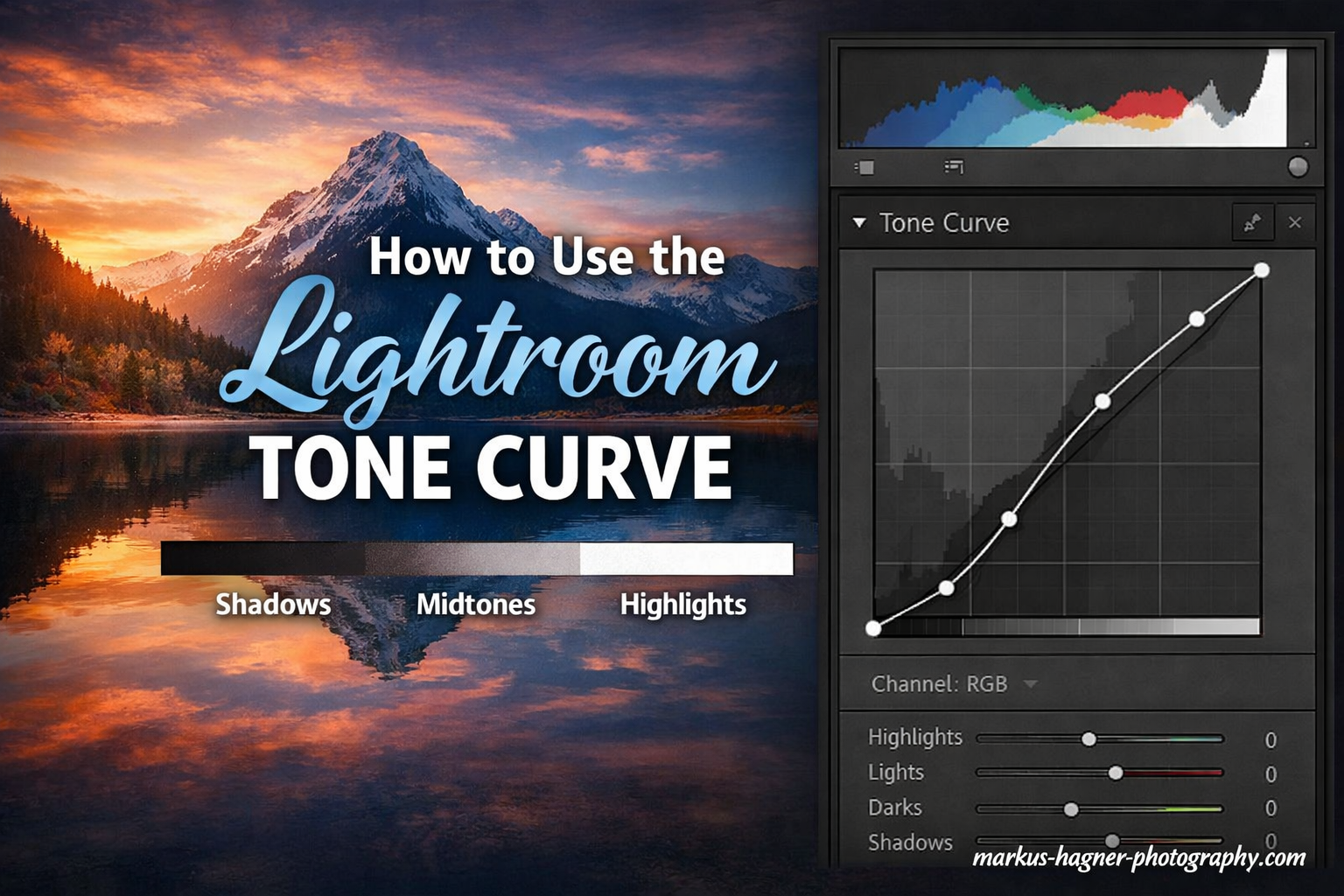
The Tone Curve is a graph-based tool that lets you adjust brightness and contrast across specific tonal ranges of your image. Think of it as a more precise version of the basic exposure sliders.
The graph displays a diagonal line running from bottom-left to top-right. The horizontal axis represents input values, or how bright your pixels are right now. The vertical axis shows output values, or how bright those pixels will become after your adjustment.
When you push the line upward, you brighten those tones. Pull it downward, and you darken them. This simple principle gives you surgical control over highlights, shadows, and everything in between.
What does tone curve do in Lightroom?
The Tone Curve adjusts the brightness and contrast of specific tonal ranges in your image. It graphs input values (original brightness) against output values (adjusted brightness). By manipulating the curve, you can brighten highlights while darkening shadows, or target specific midtone areas for precise control over your image’s tonal range.
Where to Find the Tone Curve Panel In 2026?
Accessing the Tone Curve depends on which version of Lightroom you are using.
In Lightroom Classic, look for the Tone Curve panel in the right-side Develop module. It sits below the Basic panel and above the HSL panel. If you do not see it, click the small triangle next to “Tone Curve” to expand the section.
In Lightroom CC (the cloud-based version), the Tone Curve lives in the Light section. Click the Light panel, then scroll down to find the Curve option. Tap it to expand and see the graph.
On mobile devices, the Tone Curve is also available but with a slightly different interface. Open your image, tap the Light icon, then select the Curve option to access a simplified version of the tool.
How to Use the Parametric Curve Method In 2026?
Lightroom gives you two ways to work with the Tone Curve. The Parametric Curve uses sliders, making it friendlier for beginners.
You will see four sliders under the curve graph: Highlights, Lights, Darks, and Shadows. These correspond to different regions of the tonal range.
Highlights affect the brightest areas of your image. Think white shirts, clouds, or light sources. Lights target the upper midtones, like skin tones in portraits. Darks control the lower midtones, and Shadows affect the darkest regions.
To add contrast using the Parametric Curve, drag the Highlights and Lights sliders upward. Then drag the Darks and Shadows sliders downward. This brightens the bright areas while darkening the dark areas.
The Range sliders below each control let you define where each region begins and ends. By default, they are set to work well for most images. But if you need Highlights to affect more or less of the image, adjust the Range slider to expand or contract that region.
I find the Parametric Curve useful when I want quick, predictable results. It is harder to make dramatic mistakes here because the sliders limit how far you can push each region.
How to move tone curve in Lightroom?
You can move the Tone Curve using two methods. With the Parametric Curve, use the four sliders (Highlights, Lights, Darks, Shadows) to adjust specific regions. With the Point Curve, click directly on the diagonal line and drag points up or down. You can also use the Targeted Adjustment tool by clicking the icon in the top-left of the panel, then clicking and dragging on your actual image to adjust corresponding tones.
How to Use the Point Curve Method?
The Point Curve offers more precision. Click the small curve icon in the bottom-right of the Tone Curve panel to switch from Parametric to Point Curve mode.
You will see the same diagonal line, but now you can click anywhere on it to create control points. Drag these points up to brighten that tonal region, or down to darken it.
The left side of the curve controls shadows. The right side controls highlights. The middle section handles midtones. By placing multiple points, you can create complex shapes that target very specific brightness ranges.
Hold the Alt key (Option on Mac) while dragging to constrain movement to vertical only. This prevents accidental horizontal shifts that can distort your tonal relationships. This is one of my favorite tips from forums, where experienced users swear by this shortcut for cleaner edits.
To remove a point, drag it off the graph entirely or click it and press Delete. You can also double-click the curve to reset it to the default diagonal line.
The Point Curve rewards experimentation. Small adjustments can create subtle mood shifts. Large adjustments can produce dramatic, stylized looks. This is where the Tone Curve truly shines for creative editing.
The S-Curve Technique for Adding Contrast
The S-curve is the classic Tone Curve shape for adding contrast. It brightens highlights while darkening shadows, creating that punchy look many photographers love.
Here is how to create an S-curve step by step. First, switch to Point Curve mode. Click on the upper third of the diagonal line and drag it upward. This lifts your highlights.
Next, click on the lower third of the line and drag it downward. This deepens your shadows. The curve should now look like a subtle S shape.
Adjust the middle section if needed to protect your midtones. You want the S to be gentle, not extreme. A harsh S-curve can clip details in highlights and shadows.
Using the Parametric Curve, you can create a similar effect by dragging Highlights and Lights up, then Darks and Shadows down. The result is nearly identical, though Point Curve gives you finer control over the exact shape.
Can the tone curve be used to adjust contrast?
Yes, the Tone Curve is one of the best tools for adjusting contrast in Lightroom. By creating an S-curve shape, you brighten highlights and darken shadows simultaneously. This increases the separation between light and dark areas, which is the definition of contrast. The Tone Curve offers more precise control than the Contrast slider in the Basic panel because you can target specific tonal ranges independently.
How do you increase contrast in Lightroom?
To increase contrast using the Tone Curve, create an S-curve by lifting the highlight region and lowering the shadow region. In Point Curve mode, click the upper third of the line and drag up, then click the lower third and drag down. For more subtle contrast, use the Parametric Curve sliders by increasing Highlights and Lights while decreasing Darks and Shadows. The Tone Curve provides more control than the basic Contrast slider.
How to Enhance Colors with RGB Channels
The Tone Curve becomes even more powerful when you work with individual color channels. Click the Channel dropdown menu, currently set to RGB, to access Red, Green, and Blue curves.
Each color channel controls two things. Raising the Red curve adds red to those tones. Lowering it adds cyan, which is red’s complementary color. The Green curve adds either green or magenta. The Blue curve adds either blue or yellow.
For warmer shadows, try lifting the Blue curve on the left side. This reduces blue in the shadows, introducing subtle warmth. For cooler highlights, lower the Blue curve on the right side.
Skin tones often benefit from Red curve adjustments. Slightly raising the Red curve in the midtones can give portraits a healthy glow. Just be careful not to overdo it, or skin will look sunburned.
Cross-processing effects are possible by creating opposing curves. Lift the Red curve in shadows while lowering it in highlights, then do the opposite with the Blue curve. This creates the vintage film look popular in 2026 photography trends.
Color grading with Tone Curves takes practice. Start with small adjustments and build gradually. The changes can be subtle but transformative when combined.
How do you enhance color in Lightroom?
To enhance color using the Tone Curve, switch from the RGB channel to individual Red, Green, or Blue channels. Raising a curve adds that color to specific tones; lowering it adds the complementary color. For example, lifting the Red curve in shadows adds warmth, while lowering the Blue curve in highlights creates cooler skies. Combine channel adjustments for professional color grading effects.
Targeted Adjustments with the Selector Tool
Sometimes you want to adjust tones without looking at the graph. Lightroom includes a Targeted Adjustment tool for this purpose.
Look for the small circle icon in the top-left corner of the Tone Curve panel. Click it to activate the tool. Your cursor changes to crosshairs.
Now click and drag directly on your image. Lightroom detects the tonal value of where you clicked and adjusts the curve accordingly. Dragging up brightens that tone range. Dragging down darkens it.
This method feels intuitive because you see the effect on your image in real-time. It is especially helpful when you want to darken a specific area, like a bright sky, without guessing where that tone falls on the curve.
Forum users often recommend this approach for beginners who find the curve graph confusing. It bridges the gap between visual editing and technical curve manipulation.
Tone Curve vs Basic Panel: When to Use Each
Lightroom gives you multiple ways to adjust exposure and contrast. Knowing when to use each tool saves time and produces better results.
The Basic panel offers global adjustments. Exposure, Contrast, Highlights, Shadows, Whites, and Blacks affect your entire image. These are perfect for initial corrections and broad strokes.
The Tone Curve shines when you need precision. The Basic panel’s Highlights slider affects a broad range of bright tones. The Tone Curve lets you target just the brightest highlights or just the upper midtones.
I typically start with the Basic panel to get the image in the ballpark. Then I switch to the Tone Curve for fine-tuning. If a sunset needs the brightest clouds brightened without affecting skin tones, the Tone Curve is my tool of choice.
Another key difference is how each tool handles extreme adjustments. The Basic panel includes built-in protections that prevent clipping. The Tone Curve gives you more freedom, which means you can accidentally lose detail if you push too hard.
For quick edits, the Basic panel wins. For creative control and precision, the Tone Curve takes the crown.
Keyboard Shortcuts for Faster Editing
Speed matters when you are editing hundreds of images. These keyboard shortcuts will make your Tone Curve workflow faster.
Hold Alt (Option on Mac) while dragging a point to constrain movement to vertical only. This prevents accidental horizontal shifts.
Press the Period key to cycle through the Tone Curve channels. This lets you switch from RGB to Red, Green, or Blue without using the mouse.
Double-click any slider or point to reset it to zero. This is faster than dragging back to center.
Use the forward slash key (/) to toggle the Tone Curve panel on and off. This helps you see before and after quickly.
While editing, the Backslash key (\) shows a quick before/after of your entire edit, not just the Tone Curve.
These shortcuts come from years of forum discussions where photographers shared their favorite time-savers. I have found the Alt-key constraint especially useful for keeping adjustments clean.
Common Tone Curve Mistakes to Avoid
Even experienced photographers make these errors. Learn from their mistakes so you do not repeat them.
Over-contrasting is the most common mistake. An extreme S-curve looks dramatic at first glance but destroys shadow and highlight detail. Start subtle and build up gradually.
Ignoring the histogram is another error. The Tone Curve interacts directly with your histogram. If you see clipping warnings, back off your adjustments.
Many beginners work only in RGB mode and ignore color channels. The RGB channel is great for tonal adjustments, but color grading requires individual channel work.
Applying the same curve to every photo is a trap. Each image has different tonal characteristics. A curve that works for a sunset portrait might ruin a moody forest scene.
Forum users often mention flattening the curve too much. When your curve becomes a horizontal line, you lose all contrast. Keep some slope in your curve to maintain depth.
Finally, remember that the Tone Curve works best as part of a complete edit. Fixing exposure first, then white balance, then using Tone Curve for creative adjustments yields the best results.
Tips for Different Photo Styles
Portraits benefit from gentle S-curves that add depth without looking harsh. Protect skin tones by keeping the midtone region relatively flat. Use the Red channel subtly for warmth.
Landscapes often need more aggressive contrast. Lift those cloud highlights. Deepen shadowed valleys. The Blue channel can enhance skies by adding subtle yellow to upper highlights.
Black and white images are where the Tone Curve truly excels. Without color to distract, tonal relationships become everything. Create dramatic curves that would look unnatural in color.
Food photography typically needs soft, appetizing tones. Avoid harsh S-curves. Instead, lift shadows slightly to reduce darkness that makes food look unappealing.
Street photography embraces high contrast. Push those highlights up and those shadows down. The gritty look comes from bold curve adjustments.
Mobile Lightroom Differences
If you edit on mobile devices, the Tone Curve works similarly but with interface differences.
In Lightroom Mobile, tap the Light section, then select Curve. You will see a simplified graph. Touch and drag directly on the curve to add and move points.
The Parametric Curve sliders are available by tapping the curve icon at the bottom. Switch between Point and Parametric modes there.
Color channels work the same way. Tap the channel name to cycle through RGB, Red, Green, and Blue.
The mobile version lacks some advanced features like the Targeted Adjustment tool. However, the core functionality is identical. You can start an edit on mobile and finish on desktop seamlessly.
Creating and Saving Tone Curve Presets
Once you find a curve you love, save it as a preset for future use.
After adjusting your Tone Curve, click the plus icon in the Presets panel. Name your preset and make sure Tone Curve is checked in the settings list.
I keep presets for different lighting conditions. My “Golden Hour” preset lifts shadows and adds warmth via the Red channel. My “Dramatic Landscape” preset creates a steep S-curve with cooler highlights.
Presets speed up your workflow, but treat them as starting points. Every image needs slight tweaks. Apply the preset, then fine-tune the curve for that specific photo.
To organize presets, create folders in the Presets panel. I have folders for Portrait Curves, Landscape Curves, and Color Grading Curves. This keeps my workspace tidy.
What is the best curve in Lightroom?
The best curve depends on your image and creative vision. The classic S-curve works well for adding general contrast. For portraits, a gentle curve protects skin tones while adding depth. Landscapes often benefit from steeper curves. Experiment with both the Parametric sliders and Point Curve methods to find what works for your style. Save curves you love as presets for quick access.
How to master tone curve in Lightroom?
Mastering the Tone Curve takes practice. Start with the Parametric sliders to understand how different tonal regions respond. Then graduate to Point Curve for precision. Learn keyboard shortcuts like Alt-drag for vertical constraint. Study how RGB channel adjustments affect color. Save presets of curves you use often. Most importantly, analyze before and after views to understand what each adjustment does. Over time, reading the curve graph becomes intuitive.
Conclusion
The Lightroom Tone Curve transforms from intimidating to indispensable once you understand how to use the Tone Curve in Lightroom to enhance contrast and color. Start with the Parametric sliders for predictable results. Graduate to the Point Curve when you need precision. Master the S-curve for contrast, then explore RGB channels for color grading.
Remember the fundamentals. Up brightens, down darkens. Left side controls shadows, right side controls highlights. Hold Alt for cleaner adjustments, and never be afraid to reset and start over.
Your images deserve this level of control. Open Lightroom, find a photo that needs more punch, and start shaping that curve. The transformation might surprise you.